


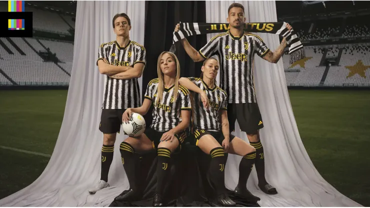
The Juventus 23/24 kits have dropped, and they are definitely different.
Yes, the iconic and traditional black and white stripes are there. But next season’s kit features a blast of yellow/gold that really sets this uniform apart from any Juve home strip in recent memory.
A bold choice

Let’s start with the basics. It’s Juve, and that means black and white vertical stripes. They tick off the most important checkbox on the requirements list. This version has more, and thinner, stripes than what we’re used to seeing. They’re also rendered with a scribbled brushstroke effect the club claims is meant to mimic zebra patterning.
But the standout element is the bold use of yellow. The crest, Adidas markings, trim and Jeep logo all feature the bright yellow color. Yellow was dropped from the Juve identity a few years back when they replaced their old oval badge with the current “J” logo. But even in years past, yellow rarely featured at all on the home kit.
Also, as in 2022/23, for some reason, there are lightning bolts within the “Jeep” lettering.
In addition to the shirts, Juve also unveiled the accompanying shorts and socks, which are both black with yellow trim.
Reviewing the Juventus 23/24 Kits
You have to applaud clubs when they have the courage to do something different. But that courage doesn’t always equate to netting a winner with kit design.
The use of yellow usually looks fabulous paired with black and white, but here it just clashes. The scribbled, narrow stripes don’t mesh well at all with the yellow. It really makes your eyes do some extra work to make out the yellow graphics on the top. Wider, simpler striping would have served this design much better, letting the yellow do the standout work. And that inexplicable lightning in the sponsor logo is just odd.
Points for the squared off v-neck collar and the shorts/socks combo, but overall this is a miss from The Old Lady.
Grade: D+
Browse the Juventus 2023/24 kit on Kitbag.