


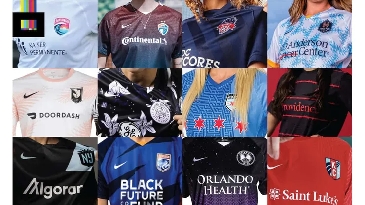
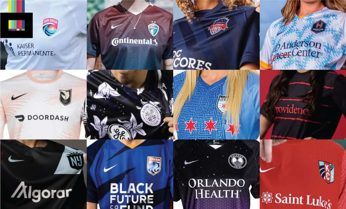
The NWSL season is upon us, with the 2022 edition of the Challenge Cup starting last month. Along with a new season comes new kits for (almost) every team, and as someone who has designed a few kits myself over the years, it’s always fun to take a look when clubs drop new threads and pass judgment. Some are fire, some are fizzles, and some are just somewhere in between.
Without further adieu, let’s take a look at the NWSL kits for 2022 season including the best and worst:
Angel City FC
Home: The black primary option is very sharp, with a “sunrise” inspired Art Deco repeating pattern running down the body of the shirt. This is an example of something that seems simple, but includes just enough of a well-done flourish to really make the overall top stand out.
Grade: A
Away: The more flamboyant secondary is one of the best looks in the league – just garish enough without going over the top. The pink, white and black palm fronds combine to almost create a subtle zig-zag striping, and the contrasting black left sleeve is nice unique touch. Where MLS side Inter Miami CF and Adidas have missed an empty-netter from the penalty spot with their designs (using similar colors and elements), Angel City FC & Nike have hit an absolute screamer from 30 yards into the upper 90 with this one.
Grade: A+
Chicago Red Stars
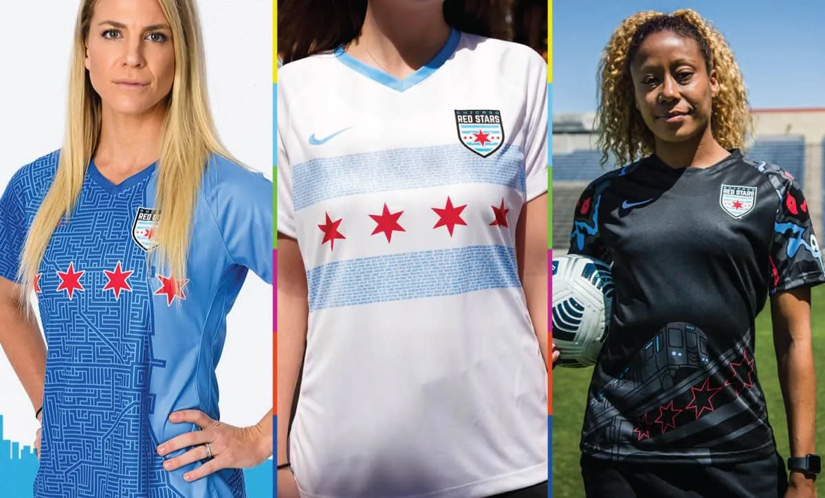
Home: 2019’s blue “Elevated” design featuring a maze-like overhead map of Chicago along Lake Michigan is superb, and the 4 stars from Chicago’s iconic city flag work tremendously well as a chest graphic (and not having a corporate sponsor splashed across the front is always a bonus on any jersey in my opinion).
Grade: A+
Away: The white “Neighborhood” design is also a very solid look, diving even further into the flag-inspired design. The blue stripes feature the names of all the different neighborhoods in the city. Personally I think it would be stronger without the neighborhood words, and instead just solid blue stripes, but still a top-tier effort.
Grade: A-
Third: Finally, what Chicago has dubbed the “Momentum” kit is a little louder, despite being a mostly black top. A red/blue/grey camouflage pattern adorns the sleeves, while the bottom waist area has a large illustration of an elevated train and the 4 city flag stars. I dig concept of using the L Train as a design inspiration, but large graphics like this one always look a little off on jerseys. Without any sponsor or chest graphic, the balance is thrown off a bit by the train at the bottom.
Grade: B-
Houston Dash
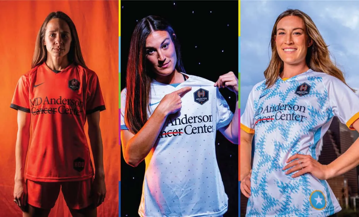
Home:The all-orange primary echoes their sister club on the men’s side, as closely as the differing manufacturers will allow of course. Is it a little boring? Sure, but the orange color is unique in the league and definitely screams Houston soccer.
Grade: B
Away: I’m a sucker for anything space related, and the Dash secondary top delivers. All-white with orange and sky blue quasars (the little 4-pointed star seen in the Dash badge), it’s a really classy look that gets the space concept across without needing rockets flying around on it. The lower left features the slogan “Luv Ya Dash” in the NASA “Worm” font (as also seen on the recently revealed Houston Astros jerseys in MLB). This one is a winner.
Grade: A+
Third: The new alternate option for Houston is another mostly white design (smart choice for playing in the Texas heat), loosely inspired by the Houston city flag, but the distorted star pattern almost gives this a USA ’94 Denim vibe and a light blue overall appearance while in motion. It’s another really sharp look, but I would’ve like to see the star pattern continue onto the sleeves.
Grade: B+
Kansas City Current
Home: The all-white affair is a Nike template special, it does have the squiggly “thumbprint” graphics on the sleeves we’ve seen throughout the Nike-verse over the last few seasons, but you can’t really see them. I can give teams a pass on boring uniforms in a situation like 2021, relocating and needing to get gear on short notice. But with a full year lead time, there is no excuse for simply picking colors from a catalog (and if it’s Nike claiming “lead times are too long for custom designs at this stage”, that’s why league-wide apparel deals with big manufacturers are a bad thing. Many smaller companies can produce quality, fully custom designs in way less time).
Grade: F
Away: The red version certainly stands out more, and shows off more of that Nike Thumbprint™, but still, I’m awarding no points at all for simply being a template design with a badge and sponsor(s) slapped on.
Grade: F
North Carolina Courage
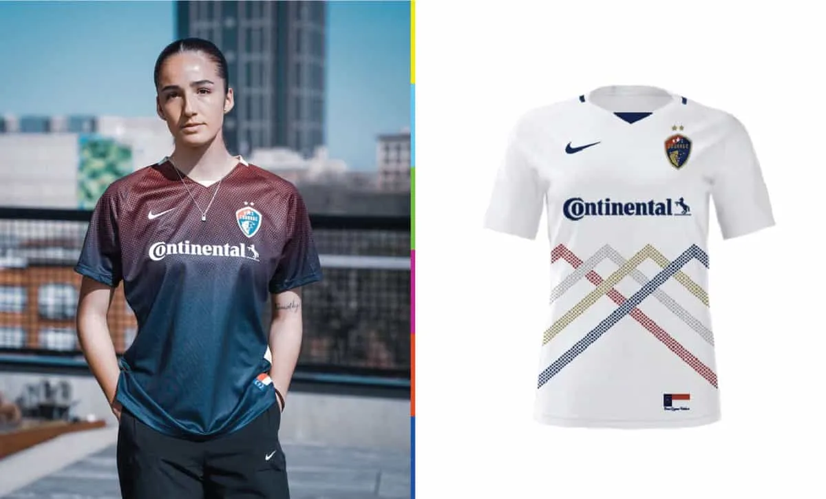
Home: The new home top is a nice look. The blue-to-red gradient is supposed to represent the sunsets seen during games in Cary, but that’s a bit of a stretch if you ask me. That sounds like a classic “This design is cool, now what can we come up with as a meaning behind it” situation. Storytelling aside, the half-tone color fade effect looks good and this certainly a serviceable design. Bonus points for the NC state flag on the lower left.
Grade: B
Away: The white away kit carries over from 2021, which at the was part of a “Mountains to the Sea” set, this one representing the mountains located in the western part of the state. It’s a cool visual effect (reminds me a but of the Vancouver Whitecaps logo, and that Adidas template notably worn by Germany in the early 90s), and I think there is great potential to riff on this theme in future years.
Grade: A-
NY/NJ Gotham FC

Home: The black version is my favorite of the two – the sash looks great and the Statue of Liberty copper patina green really pops. A simple but really sharp look – they nailed it from the start. A little flair on the sleeves or perhaps some texture within the color/sash would be just about the only things that could improve on this.
Grade: A
Away: The white version is ok, but it suffers from the same thing the 2010 USA white sash kits did – you can’t really see the sash all that well. A reverse of the black top (green with a black sash) would have been my choice as the secondary (or perhaps tertiary) design instead of this one.
Grade: B-
OL Reign
Home: The primary “Hope” jersey returns and is bright blue with a darker blue “claw” cutting across, giving a bit of a tiger stripe effect (even though the crest has a lion on it). Both of the Reign’s tops are good examples of taking the basic Nike tailoring template and adding their own flavor to it.
Grade: B+
Away: The white “Honor” top is new for 2022. It celebrates the first decade of the club’s existence by including the names of every player who has played for the team within the vertical stripes down the front of the jersey. The sentimental value is outstanding here, but tiny little letters/words (like in Chicago’s flag jersey) almost always muddle up a design. The gold accents were a great idea, though.
Grade: C
Orlando Pride
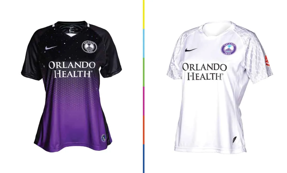
Home: The primary, “Ad Astra” (that’s “To The Stars” in Latin), is black on top transitioning down to Orlando purple at the bottom using a geometric pattern (the pattern reminds me a bit of the solar panels on satellites or the International Space Station). The top is filled with a star field, celebrating Central Florida’s role in space exploration. The bottom left features a mission patch emblem, using the NASA “Worm” font that’s made a ferocious comeback over the last couple of years. This is an outstanding design, and I hope the Pride continue to mix in a healthy does of black in their future designs to give themselves a unique identity different from their brothers on the men’s side.
Grade: A
Away: As of the time of writing, the Pride have yet to announce a new secondary kit, the white “Plume” kits from 2020/2021 are on sale at a reduced price on their team shop, and they’ve yet to wear anything but the black/purple kits in 2022. So I’ll review the old ones! The feather pattern on the raglan sleeves represents the swans of Lake Eola in downtown Orlando, and this is 1000% better than Nike’s weird thumbprint pattern template design. This is(was?) a beautiful secondary top, probably the best “plain” white kit in the league.
Grade: A
Portland Thorns FC
Home: The primary features thin red rose thorn hoops on a black base – a subtle twist on a classic design. The red really pops on the black and the thorn details are in reality super small but incredibly effective. Top class here. Both tops feature a subtle base texture that is reminiscent of tree growth rings, which is a cool tie-in to the Thorns’ sister club the Timbers.
Grade: A+
Away: The white secondary is seemingly plain, but the texture mentioned above does give it a little bit of extra oomph, and the tonal grey and red crest and details work well here. The red/white/black sleeve piping is one of those tiny details that can make a whole kit work. Take that away and this wanders too far into the “plain white t-shirt” territory. Continuing that same piping on the collar would have elevated this one a bit higher, but it’s still very solid for a 2nd option.
Grade: B+
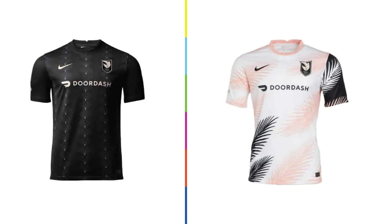
Racing Louisville FC
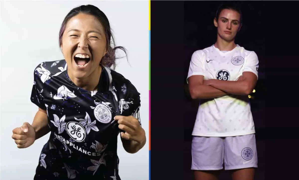
Home: The primary has landed in the hyper-cool echelon of designs, that kind of loud-but-wearable (think Forward Madison or Minneapolis City SC) shirt that American soccer fans gush over. The lilies are literal representations of the fleur-de-lys in the club crest, and the butterflies and bees sprinkled throughout are a nod to Louisville native, the legendary Muhammed Ali. The GE sponsor log works surprisingly well on this too, always nice when the ad on the front doesn’t muck up the design too badly. Perhaps the lilies could be been less bright and more subtle, but honestly that’s being nitpicky.
Grade: A+
Away: The secondary is fine, but I always think simply repeating a small version of the logo (or a single element from the logo) on a shirt is a bit of a cop out. Using the lavender for the shorts really makes this. Like the white jersey is alright, but why wear anything other than that incredible primary?
Grade: B-
San Diego Wave FC

Home: There’s that thumbprint again. The blue version is slightly better than the alternative all-white, but these are a waste of great and unique color scheme. Take the badge off and these jerseys could easily be mistaken for Washington, North Carolina, the Reign, or several dozen other teams around the world. Another case of the “short lead time” excuse from the big suppliers, leaving clubs to launch with sub-par uniforms.
Grade: F
Away: You can’t even see the Nike template details on the sleeves on this one. This is suitable for a training outfit at best.
Grade: F-
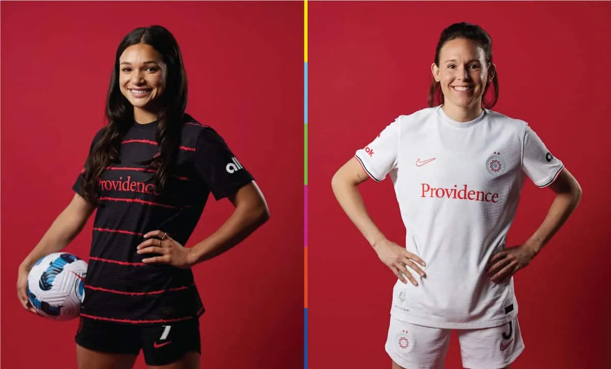
Washington Spirit
Home: The primary shirt, the “10th Anniversary” kit, is the same double blue Nike thumbprint template San Diego is wearing. Not even a sponsor ad on the front to spice things up. It does have a silver badge on the lower right (not pictured here) celebrating the NWSL’s 10th season, but that’s nowhere near enough to save this phoned-in design.
Grade: F
Away: The “Community” kit is also a bit plain, but does offer a bit of unique design flair with the tonal diagonal stripes across the front. It’s actually a good look, but could use a hit of red highlights on the sleeves and/or collar. Additional points for using DC Scores as the front sponsor, a non-profit that helps DMV-area youth experience sports and the arts. The right sleeve features the logo of WAGS, Women and Girls in Soccer, “a charitable organization aimed at promoting confidence, strength, character and leadership in women and girls in the DC area through soccer”.
Grade: B-
Overall, NWSL is a pretty sharp looking league in 2022. It’s a bummer that so many teams are outfitted in cookie-cutter, plain looking kits, but there is certainly enough creativity around the league to make sure that most matches will feature some really outstanding designs.