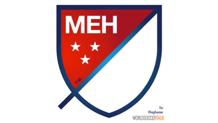
NBC’s Hollywood Game Night. Pleated Dockers khakis. The Chevy Tahoe. Maroon 5’s music. David Cameron’s hair. People magazine. The new Wembley Stadium. Each the pinnacle of blandness in its field, and to these we can now add Major League Soccer’s new logo.
MLS can call upon graphic design’s best and brightest, yet the chosen logo looks like Don Garber ignored them in favor of fishing one from a $5-a-pop site. For all of MLS’ greatly debated strengths and weaknesses its logo was a non-issue. Yet MLS aggressively attacked its non-problem but delivered the equivalent of a mug of room temperature green tea.
Just why is it so bad? Let’s take a look at the logo itself and then its context.
The Logo:
The late, great Billy Mays hustled everything from Mighty Putty to the Big City Slider Station on his infomercials. Like any good huckster he never stopped talking; the words came pouring out of his mouth at such a breathtaking clip that you forgot about the actual piece of junk being sold.
MLS pulls the same trick here with their impressively overwrought and hyperbolic press release. Isn’t the point of a visual brand the fact that it’s, well, visual? Did Caravaggio strut around Renaissance Rome explaining the symbolism in his paintings? Don’t the most respected logos, like the Yankees’ interlocking “NY,” the Cowboys’ star, the Red Wings’ winged wheel, and MLB’s batter silhouette, speak for themselves?
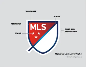
Trust what you see, not what you read. You and I look at the crest and see a giant white space; MLS tells you that it’s a force that “brings you in and out of the MLS world.” No, that’s what my TV remote does when I land on Los Angeles’ KDOC and turn off a Chivas USA match after a few minutes. You and I see the crest’s three stars and think of Jake Locker throwing another pick in his Tennessee state flag-inspired Titans helmet; MLS tells you that they represent the hollow words “For Club, For Country, For Community.” You and I see an overuse of Photoshop’s gradient tool in the line forming the perimeter of the generically shaped crest; MLS tells you that the crest’s border represents the lines that mark off the field of play. Even Bradley-Wright Phillips would have a hard time scoring on a concave crest-shaped field.
You and I see a diagonal line resembling the pestle in the classic pharmacy symbol. Here MLS unloads its most powerful verbal diarrhea to tell you that this innocuous slash “refers to soccer’s speed and energy. The slash begins outside the perimeter and drives upward at a 45-degree angle to illustrate both the nonstop nature of our game and the rising trajectory of our league. It bisects the crest to create a ‘first half’ and ‘second half.’”
Looking at in totality it’s plain that MLS has been trumped by that other MLS again. That other MLS is the Multiple Listings Service put together by real estate brokers to sell houses. That other MLS owns the domain MLS.com, which forces Major League Soccer to use MLSsoccer.com. This logo would be absolutely perfect for the real estate site with its assertive-but-plain sans serif slab lettering, patriotic colors, and its “energetic slash” representing a key opening up the door to your brand new home and fulfillment of the American dream.
The Context:
Modern sports design isn’t a field brimming with originality, just think of all the side-profile angry animal NFL logos, or all the monochrome kits at this year’s World Cup. Back when there was no money in sports merchandise there was more freedom for left-field logos like the Detroit Tigers’ suspiciously amped-up cat, Tampa Bay’s Errol Flynn-esque winking Swashbuckler, the Knicks’ morbidly obese but dandily-dressed ‘bocker, the NASL Oakland Stompers’ grape blob, or the Expos’ mind-tripping “M.”
But now any marginally different design idea is immediately ctrl c’d and ctrl v’d ad infinitum into dullness until another trend pops up to change the herd’s direction. The Charlotte Hornets introduced their distinctive teal-and-purple color scheme in 1988, unofficially ushering the day-glo phunky phresh 90s fashion trend that’s currently undergoing its inevitable next generation revival. Soon enough, teams like the San Jose Sharks, Detroit Pistons, Florida Marlins, Utah Jazz, Carolina Panthers, Jacksonville Jaguars, Seattle Mariners, and Vancouver Grizzlies swiftly lifted the Hornets’ colors. Then, in the late 90s/early 00s, teams like the Knicks, Mets, Blue Jays, Royals, Celtics, Eagles, and Lions realized they could move a lot more merch by ditching their time-tested colors to, as the venerable uniwatch.com calls it, “black for black’s sake.”
Today, there are two concurrent and overlapping trends; super-simplistic streamlined logos like those of the Brooklyn Nets and Tampa Bay Rays, and nostalgic rebrands like those of the Houston Astros, Washington Capitals, and Philadelphia 76ers. The new MLS logo’s closest kin is the Nets; they’re the visual equivalent of Aubrey Plaza’s voice – monotonous and devoid of emotion. Except Plaza’s voice is a put-on, but the Nets and MLS logos were purposefully designed to announce nothing to the world.
The MLS admits as much in their press release, saying that “[t]he new brand’s design is intended to say “soccer” without the literal ball and cleat.” This, despite Major League Baseball’s iconic “literal” batter facing a pitch silhouette, the NBA’s Jerry West dribbling a ball silhouette, and the NFL shield’s “literal” football. Moreover, the MLB, NBA, NFL, and NHL logos can’t be confused with any of their respective teams. Not so for this crest; its shape resembles that of Red Bull New York, FC Dallas, Columbus Crew, Real Salt Lake, Montreal Impact, and Sporting KC.
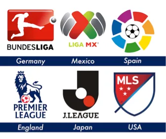
Abroad, we find the Bundesliga perfectly content with an MLS-esque silhouette of a player kicking a ball. England’s Premier League uses literal symbols of its country and sport to create a supreme brand. Spain’s La Liga proves that simple can also be beautiful with its ball ringed by a rainbow of colors. Mexico’s Liga MX, with its fisheye red-and-green “X’, and Japan’s J.League logo with its striking juxtaposition of the rising sun and a ball set against a modernist “J” show how to do abstraction without being boring.
MLS stated goal was a new logo that said soccer without using the old one’s literal ball and cleat. MLS missed like Roberto Baggio in the ’94 World Cup Final. The constant rebranding of its clubs and of itself speaks to a lack of confidence in its own product. Worse, its brand schizophrenia has the potential to alienate both current and future fans who are familiar with the relative stability and history of the MLB, NBA, NFL, NHL, and foreign soccer league brands. For the diehard and casual fan alike, the MLS has little brand identity as the league and its clubs routinely chuck any history built up over 20 years in favor of changing its look more often than David Beckham does his hair.
200+ Channels & Local Sports
- Price: Plans starting at $14.99/mo (Latino)
- Watch Ligue 1, Copa Libertadores & World Cup Qualifiers
Every MLS Match in One Place
- Price: $12.99/mo (Now included with standard subscription)
- Watch every MLS regular season game, Playoffs & Leagues Cup
Many Sports & ESPN Originals
- Price: $11.99/mo (or ESPN Unlimited for $29.99/mo)
- Features LaLiga, Bundesliga, FA Cup & NWSL
2,000+ Soccer Games Per Year
- Price: Starting at $8.99/mo
- Features Champions League, Serie A & Europa League
Home of the Premier League
- Price: Starting at $10.99/mo
- 175+ Exclusive EPL matches per season


