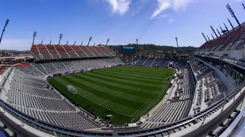


San Diego FC has officially unveiled their team crest and colors on Friday. The club will be Major League Soccer’s 30th team in the division. Although MLS officials awarded the California city an expansion franchise back in May, the club is not scheduled to compete in the league until 2025.
Club crest features a lot of grey
The official crest features the club’s colors of chrome and azul. Team officials claim that they chose these colors for very specific reasons. According to the club, chrome is apparently “a symbol of San Diego’s spirit of excellence and cutting edge innovation.” Azul, on the other hand, represents the city’s deep connection to the Pacific Ocean.
Along with chrome and azul, other various colors feature on the outer edge of the crest. This was included as a nod to the abundant “cultures, languages, experiences, and lifestyles” inside the city. The heart of the crest features a “flow” comprised of 18 lines that represent the 18 different communities of San Diego. The “flow” also somewhat resembles a soccer ball as well.
Design criticized by San Diego FC fans
Many soccer fans took to Reddit to voice their opinion about the club’s logo. It’s safe to say that the crest was not exactly a hit. A majority of people in the discussion labeled the club’s crest as lazy and generic. To be fair, there is quite a lot of grey in the logo.
Nevertheless, San Diego FC CEO Tom Penn, claimed that there was plenty of research and effort into the design. “Our brand identity has been co-created with our fans and supporters over the past six months,” said Penn. “We believe our crest truly reflects the essence and spirit of San Diego. Our Club strives to become the epicenter of football excellence and innovation in North America.”
Along with revealing the crest, official San Diego FC merchandise is available via the MLS store. Items such as t-shirts, scarves, hats, and outerwear are currently available on the website.
Photo credit: IMAGO & Icon Sportswire