


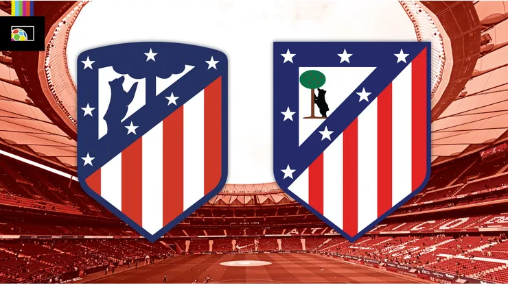
The supporter members of Atlético Madrid will choose which badge the club uses moving forward. A binding vote, set to conclude on June 30, will determine if the club keeps the current logo, or reverts to the previous one.
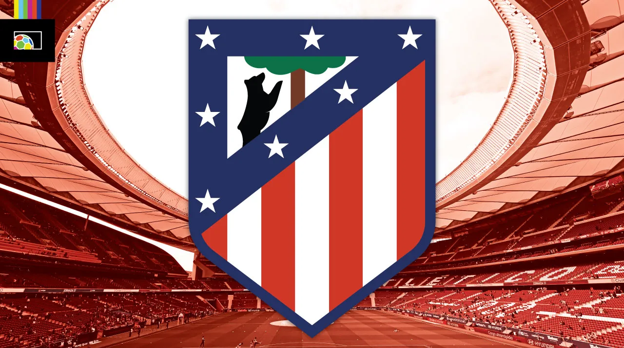
The badge of Atlético Madrid has it’s origins in 1917. Prior to that, the club simply used the logo of Athletic Club Bilbao, who were the inspiration of the Madrid side. The first appearance of the current crest form featured everything we know today. The bear and strawberry tree from the city coat of arms, the seven white stars, and red and white stripes. Except for a brief period in the late 1930s / early 1940s, all of this symbolism has remained.
The choices are between the modernized badge used from 2017 to the present, and a version that went essentially unchanged for nearly 50 years from 1970-2017.
What’s the big deal? They look almost the same!
While the differences between the two choices may seem subtle at first glance, it’s still a huge decision. After all, the crest is at the heart of a club’s identity. It sits over the heart of the players, and lives in the hearts and minds of the supporters and community. Even a small change can cause an outcry from fans.
In 2017, the club updated and modernized the classic badge. The bear and tree elements were simplified, and the number of colors and stripes were reduced. The top of the shield was also rounded. From a purely technical standpoint, this was a big improvement. But it lacks some of the charm of the original.
Watch Atlético Madrid on ESPN+
Our Pick:Includes: Bundesliga, LaLiga, FA Cup, & More |
 |
But charm only goes so far. While there is something often wonderful about retro logos that have that homespun, hand drawn feel, that’s not the case with the old Atlético mark. The bear and tree, specifically, have a “Microsoft Paint” feel to them, despite originating nearly 100 years before such technology existed. Bafflingly, the actual Madrid coat of arms was changed in 1982, more closely matching the incredibly simple Atlético version as opposed to the previous more realistic take.
Option C: What they should do
There’s a happy medium between the two variations that is sadly missing as a choice in the vote.
The cleaned up and streamlined symbols of the 2017 version were an improvement, but the loss of color and rounded shield were downgrades.
So, why not combine the two?
Sadly, that’s not an option (…but feel free to drop me a line if interested, Atlético Madrid people).
So how will the vote shake out?
If I had to guess, the historic version will win and be re-adopted. Technical flaws or not, the old badge no doubt holds a special place in the hearts of the Atléti members who will be making the call. And at the end of the day, their opinion is the only one that really matters.
Many soccer fans around the probably didn’t even notice the change in 2017. And they likely might overlook it again if the logo reverts back. But it’s a fun event for soccer branding aficionados like myself. And the club giving the decision to their supporters should be applauded.