


The 2026 World Cup logo has been revealed by FIFA, and it’s certainly something. The tournament, set to be hosted by the United States, Mexico and Canada in the summer of 2026 will be the largest ever, and the first to feature an expanded 48-team field.
Wednesday night, the tournament branding was unveiled by FIFA president Gianni Infantino and Brazilian legend Ronaldo at an event in Los Angeles. The logo was presented alongside the launch of the “WE ARE 26” campaign and slogan.
As for the logo itself, the main emblem is wildly simple. A stylized “26”and the FIFA wordmark in black and white, overlaid with a photo of the World Cup trophy. That’s it. No colors. No mention of the host names (every other World Cup emblem to date has noted the host[s]).
A closer look
The official style guide includes fonts and some interesting and more colorful visual assets:
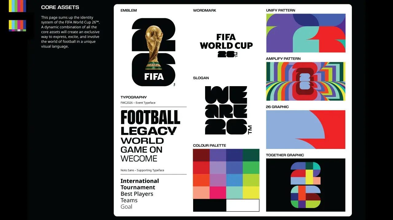
But the logo itself remains incredibly uninspiring. The lack of any visual reference to the three hosts, or North America as a whole, is disappointing. The diversity and beauty of the peoples and natural landscape in our three nations is amazing. But I guess a funky monochrome ’26’ will have to do.
These days, more marketing content is digital as opposed to printed media. But when I was learning the art of graphic design (not that long ago, mind you), a cardinal rule of logo design was do not, under any circumstances, put a photograph in a logo. It’s difficult to reproduce at large and small scales, and it does not work well with mixed media such as embroidery or screen printing. The merchandise production guys can’t be happy with this one.
Prior to 2002, only one World Cup logo featured the trophy – England 1966, which had an image of the now-missing original Jules Rimet Trophy. From 2002-2010, a stylized icon of the current trophy was included in the official World Cup logos. Since Brazil 2014, the main World Cup emblem has been a creative interpretation of the trophy. But now it’s literally just a picture of it.
Troublingly, FIFA seems to be proud of this. In the press release, they note “For the first time in history, an image of the actual trophy and the tournament hosting year is being depicted, forming an innovative design language that anchors the FIFA World Cup emblem for 2026 and beyond.” Even more troubling is the last two words in the above statement, “…and beyond.” Is FIFA going the route of the Super Bowl, with a photorealistic rendering of the trophy as a consistent element/template for each event?
SurveyWhat do you think of the World Cup 2026 Logo?
What do you think of the World Cup 2026 Logo?
already voted 0 people
Room to improve?
While the main logo is rather plain, the official release left open the possibility of a flexible brand package that is customizable. Each of the 16 host cities have their own unique version of the logo, to be revealed throughout the day on May 18. Official materials note the ’26’ shape as a “vessel for self-expression”. Cool, right?
Well, apparently, no. At least not yet, anyway.
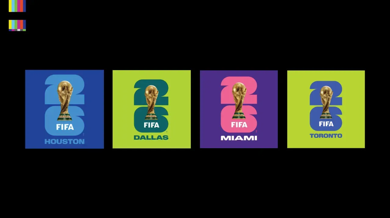
Most host city versions that have trickled out so far appear to be nothing more than colorized versions with the city name underneath. Better than the black & white version? Sure. But still less than inspiring, and with little connection to those cities.
Of course, we’re still three years away from the tournament. So I’d expect additional, more complex and interesting, versions of each city logo to roll out as we get closer to the event. But there’s something else about this design…
Where have we seen this before?
If a relatively simple logo with interchangeable elements, resulting in many official variations, for a major sporting event in the United States seems familiar to you, you’re not going crazy.
The official branding for the 2028 Los Angeles Olympic and Paralympic Games features a very similar concept. ‘LA28’ in bold, black letters, with the ‘A’ interchangeable. Artists, athletes, celebrities and others have created various ‘A’ elements to showcase the diversity and creativity of LA:
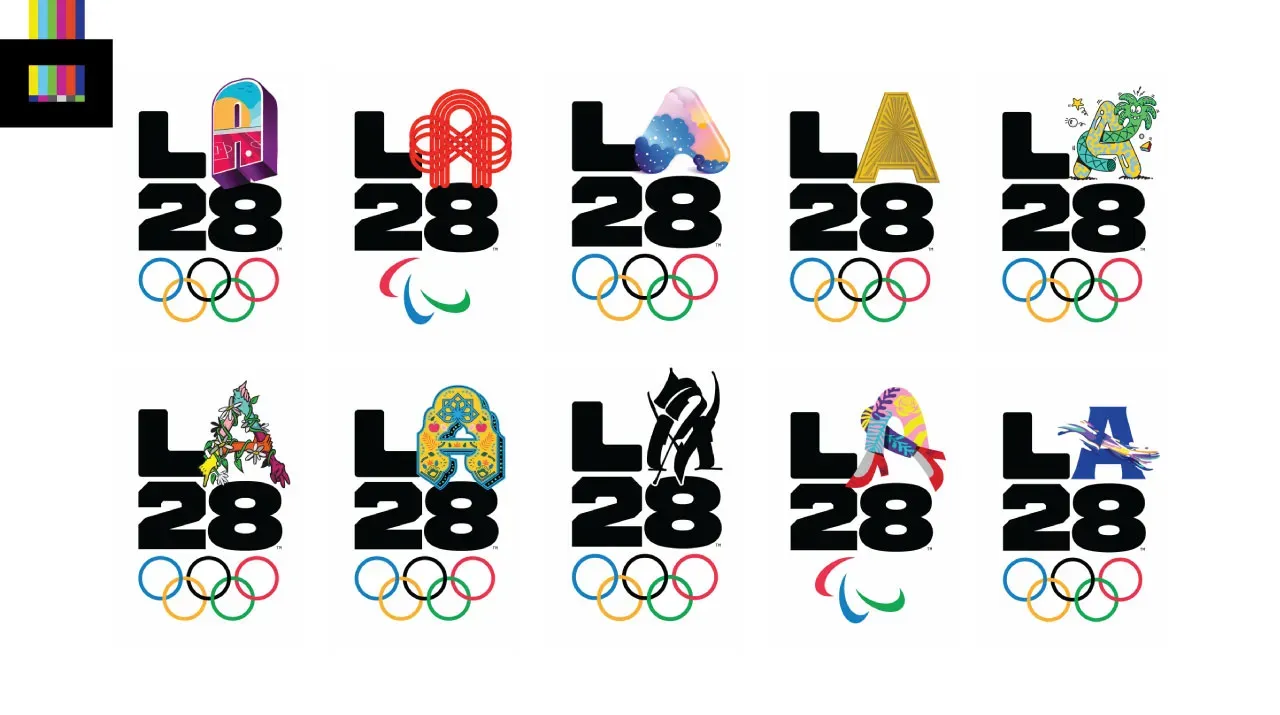
In the words of noted art collector Ongo Gablogian, “Derivative.“
At the end of the day, the competition itself is the most important thing. We know Canada, Mexico and the US are automatically qualified. With 45 more spots still up for grabs, we can assume most of the world’s big teams will be there. Those teams will write new chapters in the history of the game. And the memories they make will be stamped with this visual identity.
We’ve now truly entered the build up to the World Cup returning to North America. And this branding reveal, as well as the unveiling itself, are a bummer to kick things off.