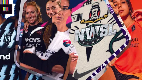
The new National Women’s Soccer League season is nearly here, and that means the 2023 NWSL kits are also hitting the pitch.
The league-wide uniform supplier deal with Nike continues in 2023, with each of the league’s twelve clubs getting at least one new top this season (well, maybe for each team, nothing from the KC Current as of yet).
Without further ado, let’s dive into the new looks:
Angel City FC 2023 Kits
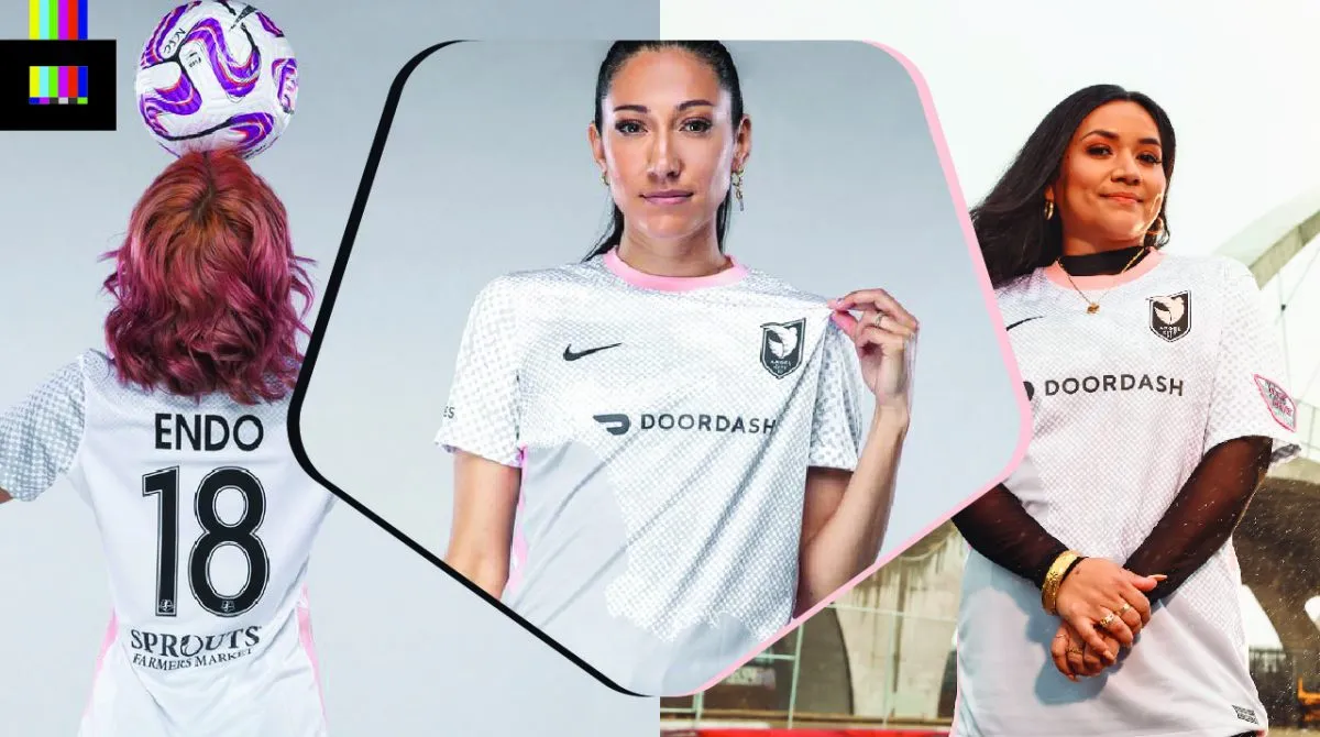
Angel City’s “Represent” jersey takes a literal approach to representing their home community. The main graphic element is an overhead view of the greater Los Angeles region as the California coastline meets the Pacific Ocean.
The map is presented in a halftone effect that fades out onto the sleeves and up and over the shoulders into a white back. Pink trim adorns the collar and sides of the top and shirts. The shorts will match the darker grey color of the “ocean,” creating a seamless transition. The upper back features the rallying cry “Volemos,” which translates to “Let’s fly.”
The most interesting thing about the shirt is that it’s available with one of twelve custom sleeve patches, each representing a slice of the LA community and designed by a local artist. It remains to be seen if the players will wear these patches during games.
Overall it’s a decent idea, but the darker grey section of the shirt makes for an awkward visual effect. Some of that halftone texture in the “ocean” section of the shirt would have served the design well.
Grade: C+
See the shirt design close-up on the World Soccer Shop online store.
Chicago Red Stars 2023 Kits
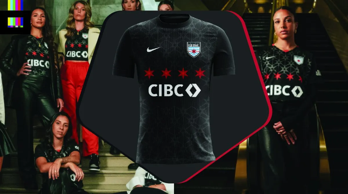
Chicago’s kit release announcement was delightfully free of abundant marketing-speak and over-explanation, but that’s likely due to an apparent production delay resulting in delayed availability of retail shirts.
The black top continues the Red Stars’ excellent track record of riffing on Chicago’s iconic city flag and it’s six-pointed stars.
Four red stars are emblazoned across the front chest, with a pattern of subtle grey stars of the same size repeated across the rest of the front and back of the shirt.
There’s really only two nitpicky critiques for this design. One is the (admirable) commitment to the red stars’ placement above the sponsor logo that creates an awkward placement of said sponsor logo. The second is that there’s no reason the star pattern could not have continued underneath the sponsor logo.
Otherwise, a stellar design.
Grade: A–
NY/NJ Gotham FC 2023 Kits
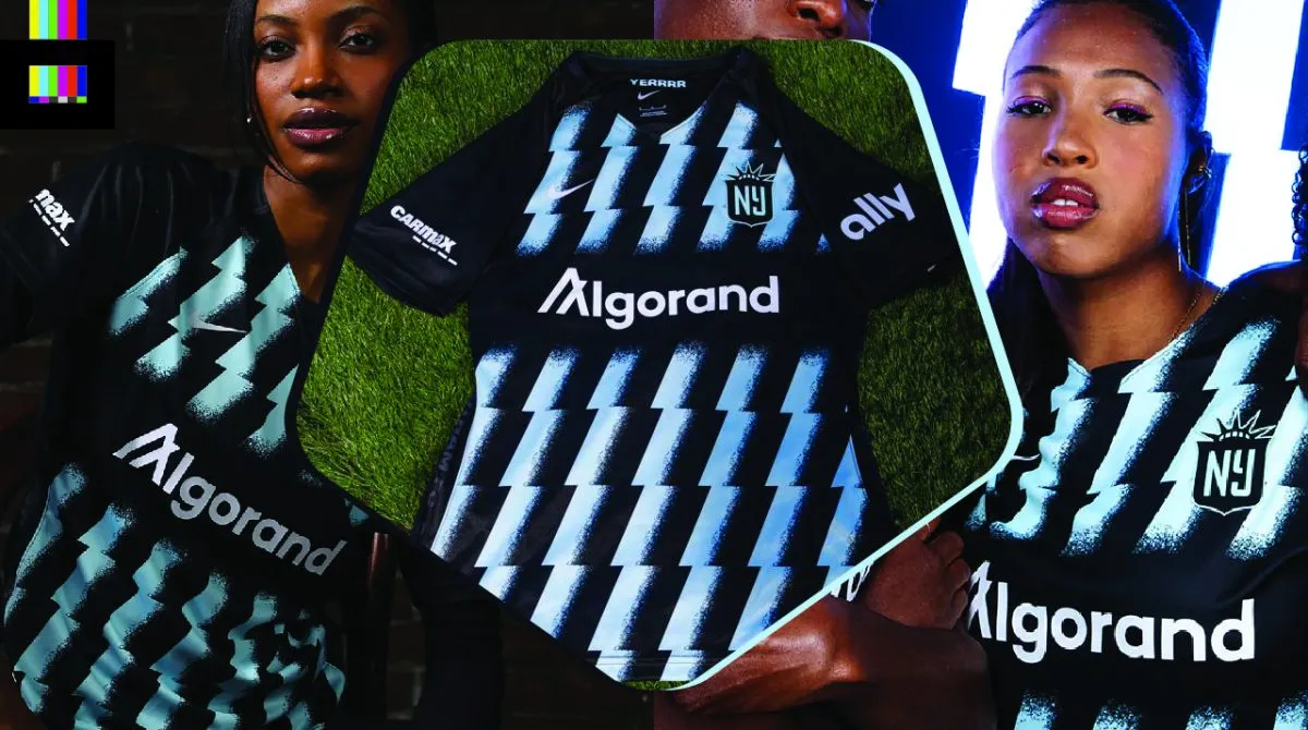
Gotham have evolved their outstanding original sash design into a dynamic zig-zagging affair.
Vertical, jagged stripes repeat across the front with a textured gradient effect applied. The colors may be different, but the vertical stripes, jagged lightning-bolt styling and NY/NJ moniker can’t help but evoke memories of the old MetroStars of MLS.
This is another stellar effort from the club formerly known as Sky Blue – an ongoing example of a rebrand done perfectly.
Grade: A+
Houston Dash 2023 Kits
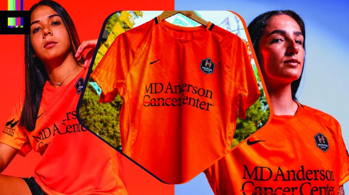
Houston is calling their new primary threads the “La Estrella” kit.
The top features a digital pattern of different orange color tones, which echoes their sibling club the Dynamo’s “El Sol” design from this year. Of course, with this shirt being Nike instead of the men’s Adidas, the pattern itself is distinct but certainly carries over the visual theme.
Black shorts complete the look, which feature an orange stripe that carries over the pattern from the top.
There’s a bunch of silly marketing-speak claiming the shirt mimics the “limitless energy, speed, and intensity of a star” and embodies “the pursuit of excellence and innovation that fueled the exploration of the deepest parts of space.” Riiiight.
At the end of the day it’s a cool pattern that adds some flair to a traditionally plain shirt, so mission accomplished.
Grade: B
Kansas City Current 2023 Kits
At the time of publishing this article, no new designs for the Current have been revealed.
Grade: N/A
North Carolina Courage 2023 Kits
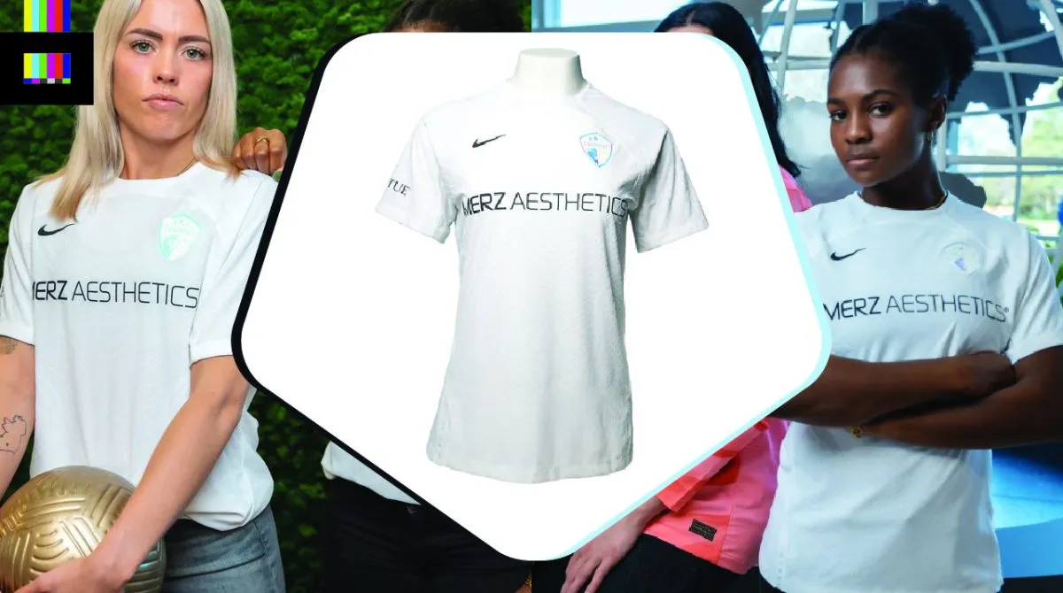
North Carolina are rolling with a very basic secondary kit, using the Nike Vapor IV template. The all-white top, like others that use this template has a wavy, textured-ridge pattern all over but it’s very hard to see in some lighting.
You’ll notice a new primary shirt sponsor this season, which in this case from a purely visual standpoint is a downgrade from the Continental Tire logo. The club badge is done in a raised, iridescent style that shines in purple/blue/pink depending on the angle of the lighting.
Unlike another club’s incredibly similar bare-bones design on this shirt template that we’ll get to later on, for the Courage it just doesn’t work. The chrome-esque badge is great, but it doesn’t tie in with anything else on the jersey. Some trim in those blues and purples elsewhere on the top is dearly needed.
Grade: D+
OL Reign 2023 Kits
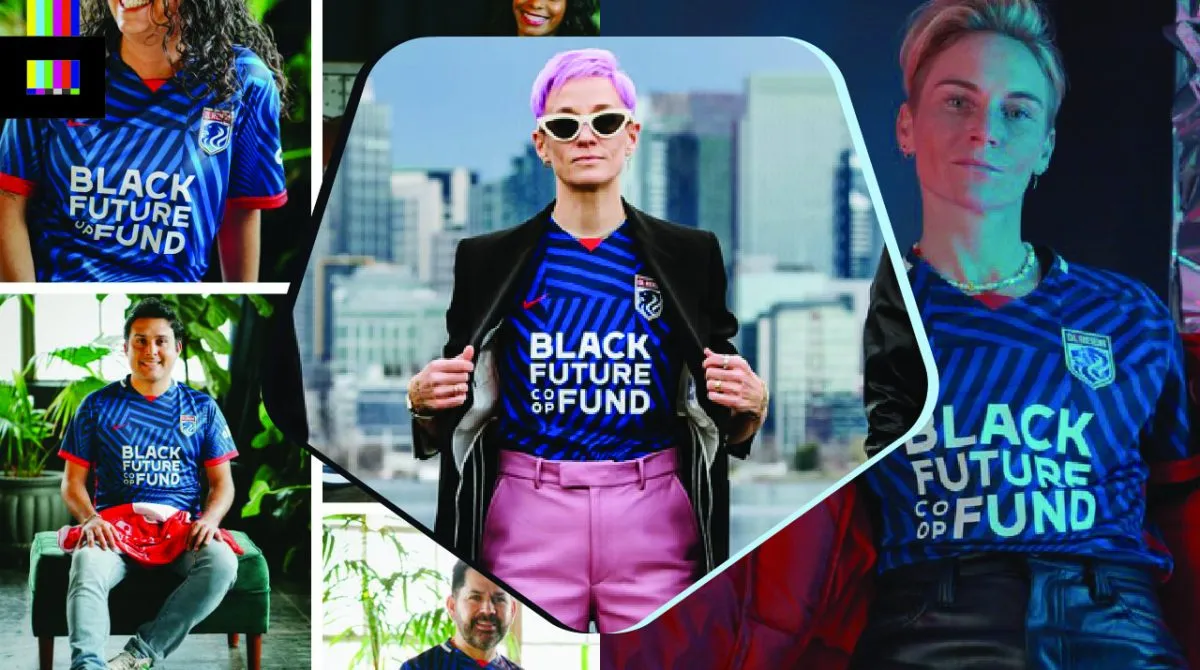
The 2023 OL Reign primaries have been dubbed the “Purpose” kits.
The dazzle camouflage-like pattern across the shirt is meant to evoke the environment surrounding Seattle – the mountains meeting the water of the Puget Sound. The pattern gets more “wavy” and less angular as it goes down to create this effect.
It’s a fine design and isn’t too in-your-face. The team crest and colors shine through. The wavy effect towards the bottom actually plays very well with the lion’s mane in the Reign crest. But the dazzle camo fad is so 2020.
Grade: B
Orlando Pride 2023 Kits
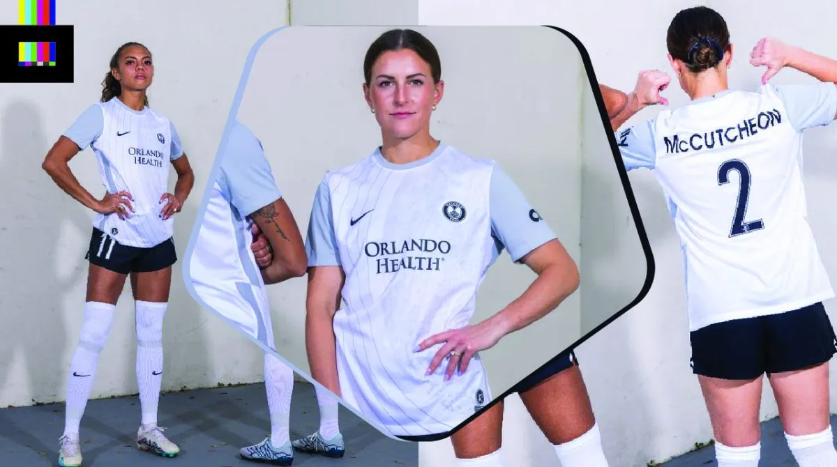
The Pride actually have 1.5 new kits for 2023. First, they’ve tweaked their excellent 2022 “Luna” design for 2023. The moon-themed design has two major changes for this season. The first is a change to black names and numbers on the back of the shirt. The 2022 edition had silver names and numbers, which were almost impossible to read, even in person. The change to black is not only more readable, but also compliments the black logos on the front, a definite upgrade. The team was able to poke fun at itself regarding the old numbers when it unveiled the updated design.
Second is a switch from white to black shorts. This enhances the overall look aesthetically, but more importantly the change was made in consideration of players during their menstrual cycle. Per the team, they are the first NWSL side to switch to dark shorts for this reason, and surely won’t be the last as this has been a growing concern from players throughout the women’s football world.
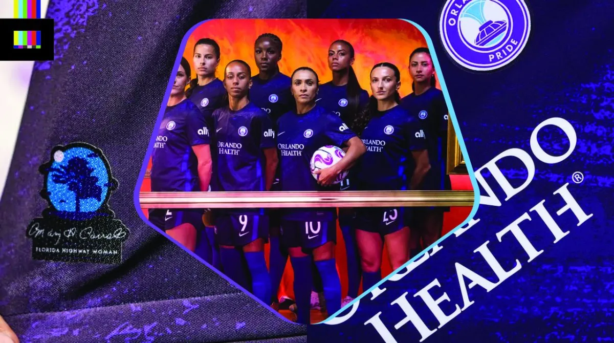
The Pride have a completely new primary kit for 2023. The “Highway Woman” kit is a return to purple after two seasons in the “Ad Astra” space-themed design which was mostly black.
The design is a tribute to one of Florida’s female trailblazers, artist Mary Ann Carroll. The club collaborated with the estate of Carroll on the design. Mary Ann was the only woman in the group of artists known as the Highwaymen. Starting in the 1950s, these self-taught Black artists traveled Florida, painting and selling landscapes out of the trunks of their cars, as galleries would not feature the work of Black artists at the time.
The kit is all-purple, with a lighter purple brushstroke pattern throughout the top. The lower front of the kit is adorned with a small patch featuring a Royal Poinciana tree – Carroll’s favorite and a frequent subject of her work – and the artist’s signature.
The Pride have done a great job in the promotion of the new kit educating fans about the Carroll and the Highwaymen. It’s a compelling and interesting part of Florida history – once which I myself, a Florida native and history aficionado, had never heard about. So mission accomplished there and high marks on that element of the release.
But from a purely aesthetic point of view, the kit itself is a letdown. The generic brushstroke pattern could be spun as a tribute to any artist. And from any sort of distance, it just looks like a plain purple shirt. Carroll’s work featured bold, bright colors and a distinctive style. Aside from the very small tribute patch at the bottom, nothing in the design really pulls from it’s inspiration at all.
They chose wonderful inspiration to draw upon, did a noble job presenting the shirt and teaching local history, but executed the actual shirt design very poorly.
Grades: A (Luna) / C- (Highway Woman)
See the shirt design close-up on the World Soccer Shop online store.
Portland Thorns 2023 Kits
Most people are either going to absolutely love, or totally hate, this one.
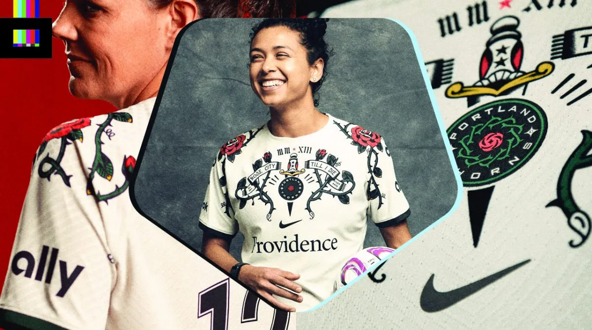
Portland have made a bold statement with their new secondary top, a cream-colored shirt with retro tattoo-style graphics across the upper front and sleeves.
The crest is centered – a first for the Thorns – and returns to it’s full color black/red/green scheme after the last few tops have featured one or two-color applications. Rose and thorn graphics are splashed across the chest, as well as the sleeves where they wrap around to the upper shoulders.
Further detailing the front are three championship stars positioned vertically on and above a dagger (with the 3rd from 2022 in red at the top). The roman numerals MMXIII for 2023 are above a scarf that reads “Rose City ’til I die” and “By Any Other Name.” “(A rose) by any other name (would smell as sweet)” is taken from a line in Romeo & Juliet, and figures into the Thorns’ hashtag #BAONPDX.
The design is completed with matching green shorts that featured an embroidered crest embellished with similar rose graphics around it.
This looked really goofy in early leaks of just the shirt on a hanger, but seeing it on the players and paired with the uniform shorts, it looks much better. Love it or hate it, this one will be long remembered in the American soccer shirt annals. Whether it’s remembered alongside the Caribous of Colorado or the timeless classics category, only time will tell. Still, major points for originality and making something interesting here.
Grade: A
See the shirt design close-up on the World Soccer Shop online store.
Racing Louisville FC 2023 Kits
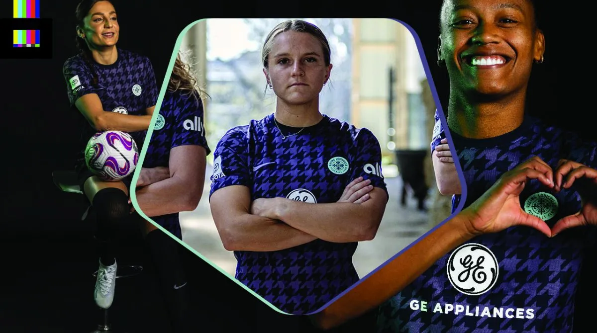
Racing has opted for an homage to a specific person for their 2023 primary. The Houndstooth Kit is a tribute to Penny Chenery, the owner of Triple Crown-winning racehorse Secretariat, 50 years since the feat was accomplished.
Chenery was known for her houndstooth-patterned jackets, and the design is meant as a “celebration of pioneering women.” The pattern is lavender and “midnight” violet (which looks almost black in most of the promo images). The crest is done in mint green, which ties in with their preexisting mint secondary design.
It’s a simple but effective design that looks great. The one thing holding it back is that mint crest. It seems out of place without any other hint of the color on the shirt anywhere. But otherwise, a very solid top.
Grade: A–
San Diego Wave FC 2023 Kits
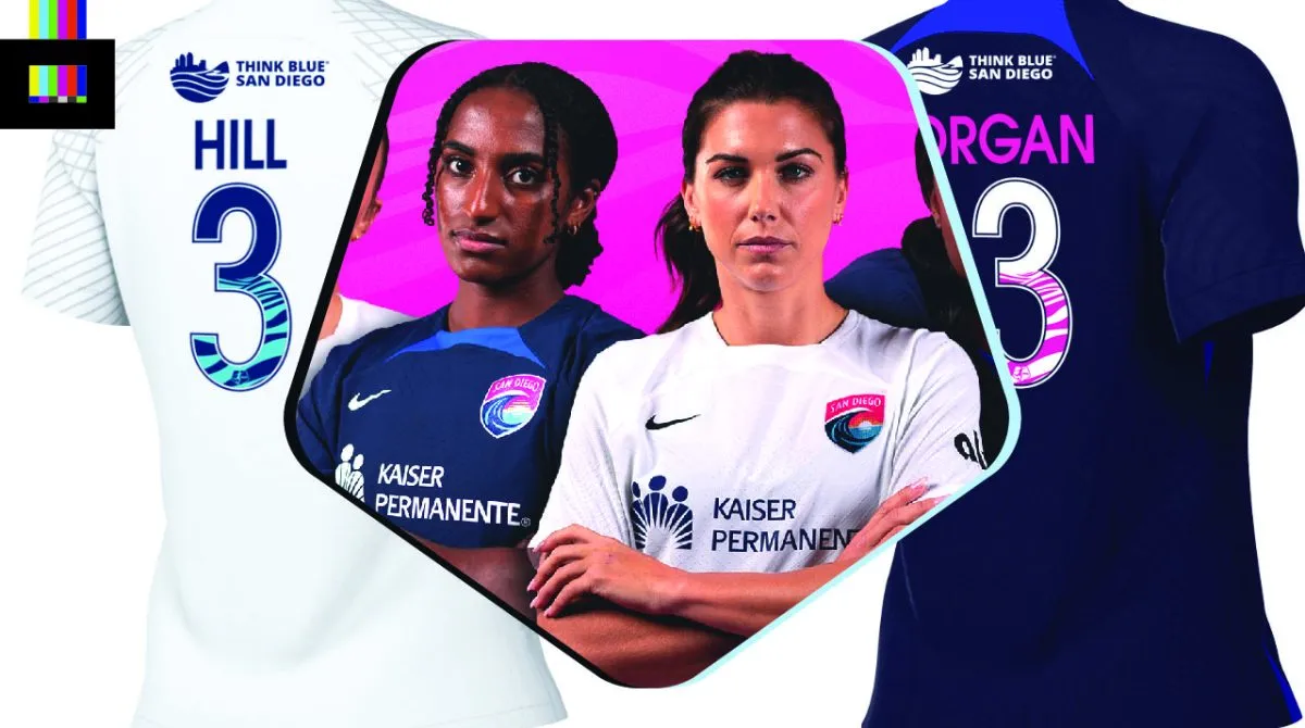
The Nike Vapor IV template strikes again with terrifically lackluster effect.
Much like their inaugural 2022 uniforms, these are off-the-rack Nike templates in off-the-rack colors, with team badges and sponsor logos slapped on. The only bit of visual interest is the number font, which incorporates a wave pattern within the design.
The Wave have a bold, unique color palette, and great local iconography to draw upon, and to date they’ve taken advantage of approximately none of it. These are as bad as the North Carolina tops, but unlike the Courage who at least tried something interesting with the iridescent crest, this is just lazy.
Hopefully sometime down the line the Wave will take their kit design seriously.
Grade: F
Washington Spirit 2023 Kits
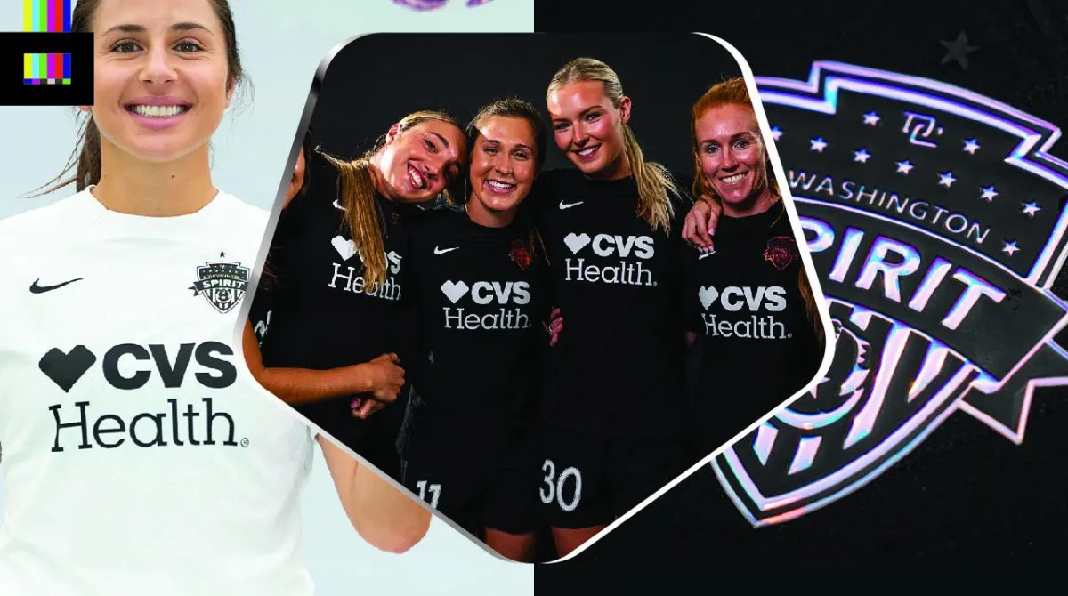
The boldest move in the league this year comes in the form of arguably the most conservative design. The Spirit have unveiled a new black and white color scheme, perhaps a harbinger of a larger brand overhaul to come. The eschewing of their traditional red, white and blue certainly jives better with the DC United-themed environs at the Spirit’s home ground, Audi Field.
Both the black home and white away kit are another appearance of the Vapor template, with the only splash of color coming from a raised 3D “chrome” crest that reflects the natural lighting.
The stripped-down, basic look actually works well in this case, as a broader aesthetic statement for the future direction of the club. It will be interesting to see how this overall look evolves for the Spirit down the line. Really leaning into an Oakland Raiders-esque, super basic identity has potential if a total rebrand is in fact in the cards.
Grade: B
And there you have it, the new looks of the 2023 NWSL. What’s your favorite?

