


![AC Milan Reveal Away Shirt For 2014/15 Season: Official [PHOTOS]](https://media.worldsoccertalk.com/wp-content/uploads/sites/6/2014/07/17052112/ac-milan-away-shirt-crest-740x416.webp)
AC Milan has officially unveiled its away shirt for the 2014/15 season.
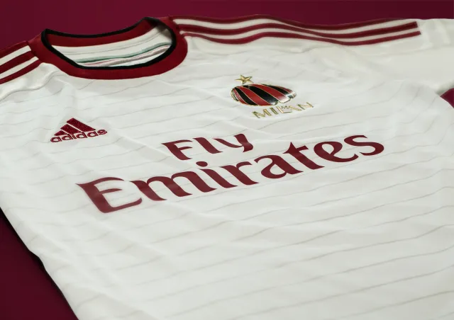
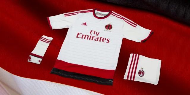
The white away shirt with red and back details completes AC Milan’s collection of new kits — including the classic red and black home shirt, and golden third choice jersey.
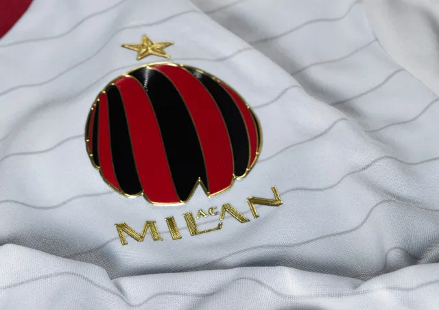
The away kit is a white kit with very thin grey hoops, and red and black bands across the bottom of the shirt. It features red Adidas stripes, which work well in tandem with the red logos of Adidas and Fly Emirates. However, the Milan badge has changed from the traditional Genoan red and white cross Milan usually wear – for a new age, red and black spherical design, with the word MILAN place under it (and an awkward ‘AC’ placed in between the letters). It looks completely out of place on the kit and like a logo for a company founded in the last 10 years, rather than the crest of one of the world’s most historic clubs. It completely misses the mark, and whilst the red and black bands aren’t the most aesthetically pleasing, the badge outright doesn’t fit with the kit or club.
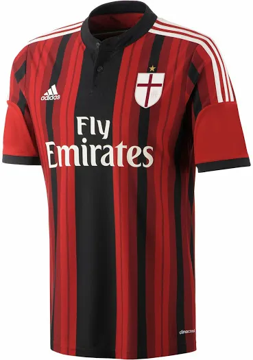
The AC Milan home shirt is likely to divide opinions. To call it ‘red and black stripes’ is doing it an injustice. An innovative design keeps the history of red and black stripes, but with varying width and colour tones, it’s a completely different look from Milan kits we have seen in recent years. It also features the signature Adidas triple stripe on the shoulders, in white, as well as the subtle Italian tricolore on the sleeves. It’s certainly a busy kit, but it works for me. It’s a change from traditional without abandoning the values of the kit and club – which is exactly what Milan need on the pitch at the moment.
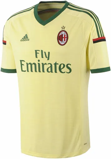
The AC Milan third shirt keeps with the recent trend of gilded change strips for Milan, but opts for a green detailing, with green and gold shorts and white socks. The socks look a little set out from the rest of the kit (kind of like when a local team has to change shirts and still wears their regular shorts) but otherwise I am a fan of the kit. It’s slim fit, like the rest of the kits, is flattering without being too tight and the kit has a certain bespoke, regal nature that suits Milan as a club. It has green logos, stripes and details so doesn’t feel as busy as the rest of the kits, but doesn’t toy with Milan’s logo like the away kit. Overall, this is a much nicer kit than the away strip.
You can follow Jordan Willis on Twitter @JMWillis01