Spring is coming, and that means the American club soccer season is upon us. That also means new MLS 2023 kits are dropping, with new shirts for every team being released as we draw closer to kickoff that’s happening on MLS Season Pass.
We got a breakdown for all 29 teams (well, 28, sorry Montréal, you’re not getting new threads this year), so let’s dive in and see how MLS aesthetics are looking for 2023:
Atlanta United FC 2023 Kit
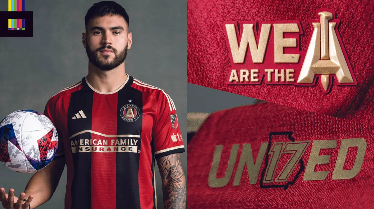
Atlanta United’s new primary is being dubbed “The 17s Kit.” “17s” represents the club’s supporters, who the uniform number 17 was retired for in advance of the club’s first campaign in 2017.
The shirt is an inverse of the original Atlanta United top, which they also wore in the 2018 season in which they won MLS Cup. The original “Five Stripes” design returns, but this time with three red and two black stripes (mirroring the club crest). “We are the A” and “United17” details adorn the jock tag and rear neckline respectively. The gold trim on the Adidas stripes, logo and sponsor marks really pops against the red and black.
The Apple TV logo is displayed under the MLS badge on the left sleeve, which is a feature across every MLS shirt starting this year.
Grade: A
This is a welcome return to a solid look, after straying away from what was a home run debut look for a few seasons. See the shirt in more detail on the MLS Store.
Austin FC 2023 Kit
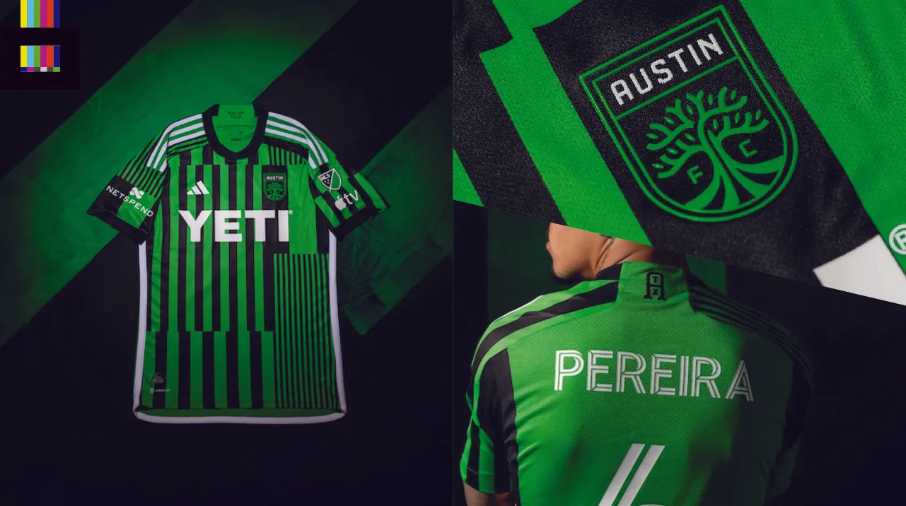
The 2023-24 Austin FC primary, the “Las Voces” (English: “The Voices”) kit, “establishes a uniquely Austin perspective on the coming together of voices from across Austin through the Austin FC community,” per the club release.
The shirt consists of blocks of green (“Verde”) and black stripes of varying widths. A slick new “ATX” alternate logo is featured on the upper back. Adidas trim and sponsor logos are in white, which stand out well enough against the green/black. But in particular the YETI logo across the front, which almost-but-not-quite lies up with the stripes behind it, coupled with the different stripe widths, creates a vibrating visual effect. It’s like a green barcode. Mercifully the rear of the shirt is plain green, making the name/number much more easily readable.
Grade: C-
It’s an interesting attempt, reminiscent of some recent Barcelona tops that played with mashed up stripe sections. But it’s a miss here. Picking one striping pattern and running with that would’ve made for a stronger design. See the shirt in more detail on the MLS Store.
Charlotte FC 2023 Kit
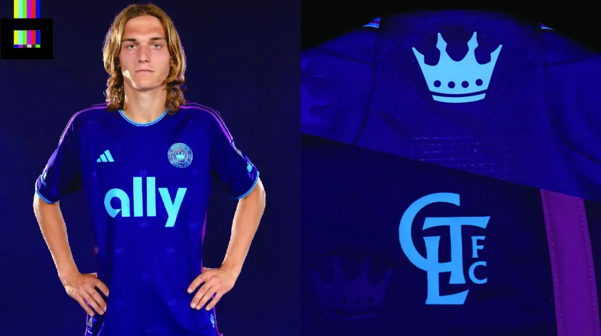
Charlotte is calling it the “Crown Jewel” kit. A regal purple top with brighter purple and Carolina blue highlights, you might be forgiven if you mistook this for an Orlando City Pride shirt at a distance.
A nod to the “Queen City”, the shirt has the crown from the team crest embossed all over the front and sleeves. The same crown appears on the upper back, with the alternate “CLTFC” mark on the lower front.
Grade: B-
A fine shirt, not terribly remarkable, but not terribly terrible either. The brighter blue color is honestly nicer than the club’s standard color scheme they share with the NFL Panthers. See the shirt in more detail on the MLS Store.
Chicago Fire FC 2023 Kit
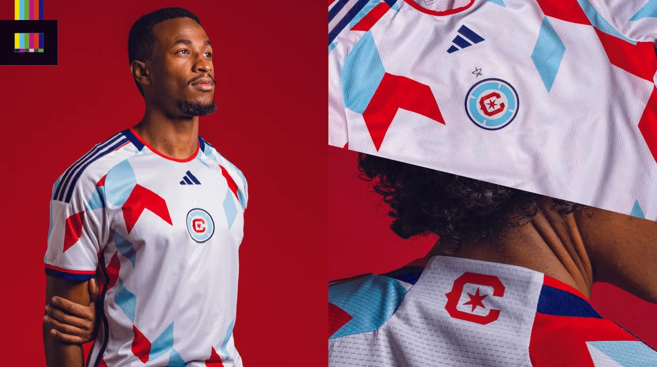
Chicago has a new white top they’re calling the “Kit for All”. This is the first ever Fire shirt to feature a centered crest on the front, done to highlight their new primary logo (that replaced the incredibly poorly received 2020 crest).
The shirt is white, with light blue and red chevron shapes reminiscent of confetti across the front. Trim is in navy blue. The ‘C’ and six-pointed star from the Chicago flag (and centerpiece of the team crest) are displayed on the upper back.
Notably, the shirt has been unveiled without a main front sponsor, which creates an awkward blank space on the front. Presumably that will be filled in sometime later this year.
Grade: D+
The upgraded logo is great, but the shirt designed around it leaves a lot to be desired. The geometric chevron design would’ve been better maybe a little smaller and just on the sleeves. That would have also helped with the glaring lack of a front sponsor (whose addition later on might elevate or further hurt the overall look). See the shirt in more detail on the MLS Store.
FC Cincinnati 2023 Kit
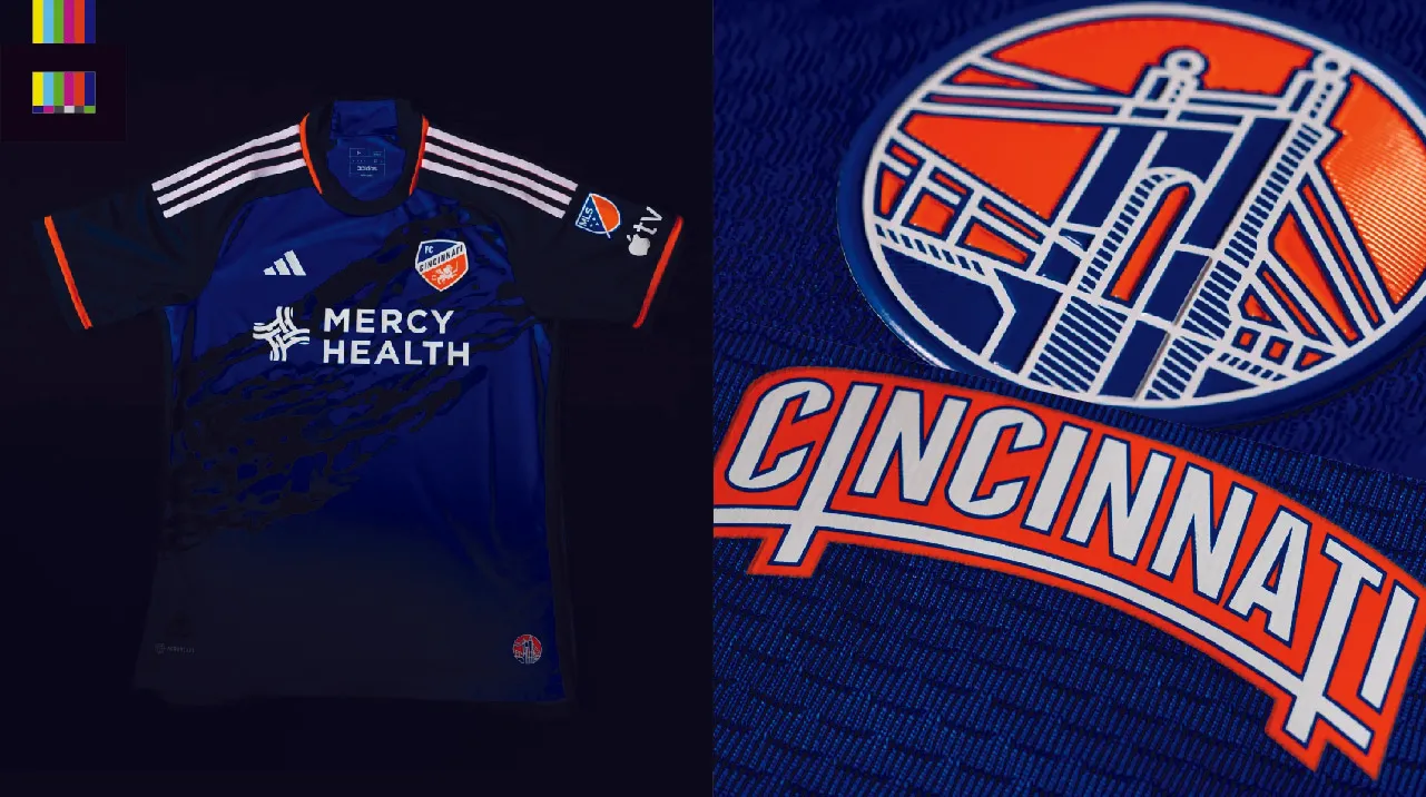
Cincy’s “River Kit” is a two-tone blue affair and a tribute to the Ohio River.
A sublimated blue water reflection pattern slashes across the front of the shirt like a sash. The sleeves are a darker navy blue, which is a nice look. The jock tag features a rendering of the Roebling Bridge, and a neat little “CINCINNATI” bridge-shaped wordmark is located on the upper neck.
The top will be paired with navy blue shorts and socks.
Grade: B-
This is a welcome return to a solid look, after straying away from what was a The double-blue look is quite nice, and the hint of orange trim on the sleeves and collar is just right. And the bridge-themed details are great little pieces of design. But the splashing water “sash” across the front is unneeded and clutters up an otherwise sharp shirt. The mostly blue color palette would have been enough to sell the “river” storyline. See the shirt in more detail on the MLS Store.
Colorado Rapids 2023 Kit
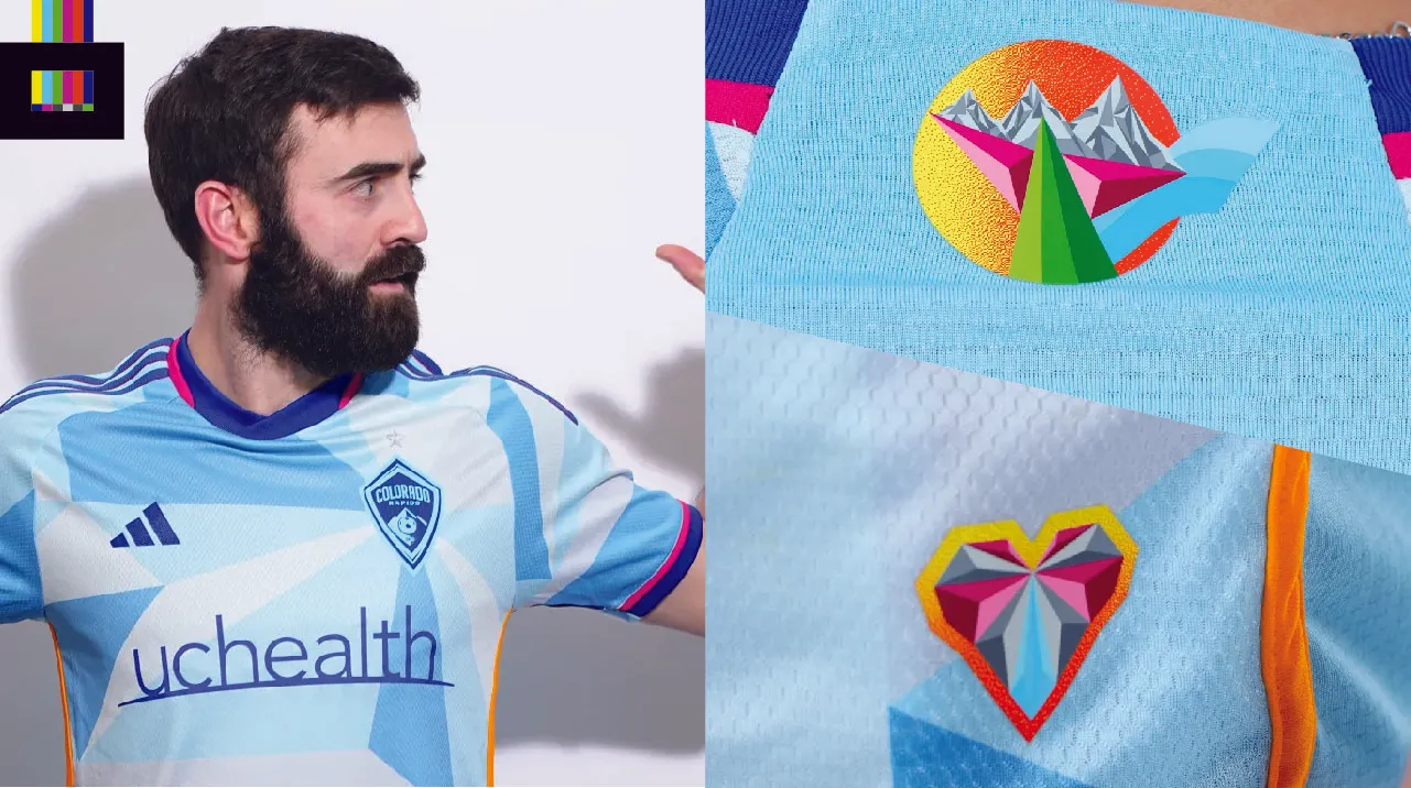
The Rapids will be wearing a new shirt designed to bring awareness to mental health issues in 2023. The “New Day” kit is light blue with a geometric pattern throughout the front and sleeves. Designed by local street artist Pat Milbury, the shirt’s fuchsia and gold highlights represent the sunsets and sunrises of the Colorado skies.
A new custom sunset icon is on the upper neck area, with a similar heart shaped emblem on the lower left front of the shirt. The back is plain light blue with no pattern, with name and numbers in the darker blue of the crest, sponsors and collar.
Grade: C
This is a welcome return to a solid look, after straying away from what was a The faceted geometric shapes are intriguing, but there’s nothing terribly remarkable about this one. Textbook example of a secondary shirt being a place to try really different ideas. But it doesn’t always work out. See the shirt in more detail on the MLS Store.
Columbus Crew 2023 Kit
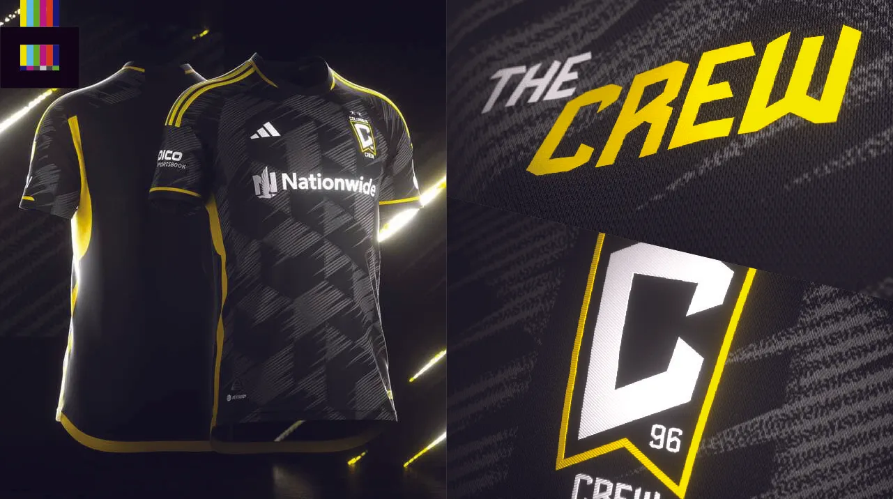
The inferior Ohio state flag/pennant logo remains (bring back the circle, Columbus!), but the Crew have released an otherwise terrific top for 2023.
The “VeloCITY” kit, as it’s been dubbed, is mostly black with yellow and white detailing. I’ll spare you the silly marketing spiel explaining the so-called inspiration for the design. Bottom line, it looks cool.
A dark grey triangular take on the checkerboard pattern (sorely missing from the club identity since the Crew abandoned the aforementioned circular crest) is distorted with a grain texture and speed lines to evoke movement. This is well done background texturing – visible enough to be seen but subtle enough to not be too busy.
An italicized “The Crew” wordmark adorns the lower front. Yellow tape down the side of the shirt is embossed with the slogan “Never Stand Still”.
Grade: A
The black/yellow/white color scheme shines here and it’s overall just a quality shirt. See the shirt in more detail on the MLS Store.
FC Dallas 2023 Kit
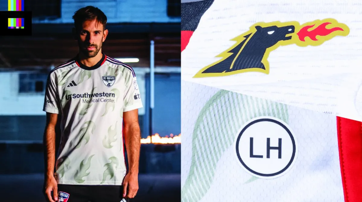
Dallas is harkening back to the goofy roots of 90s MLS with the “Burn Baby Burn” kit.
The mostly white top adopts the black/red/yellow/white scheme of the club’s original “Dallas Burn” identity from 1996-2004. Flame graphics run across the body and sleeves of the top, with mostly black trim. The upper back of the shirt features a slightly modified version of the original Burn logo, and the lower front has a “LH” patch to honor Lamar Hunt, the American soccer pioneer and original Burn owner.
Grade: B+
A nice acknowledgement of the team’s MLS origins, without going full-on 90s kitsch. See the shirt in more detail on the MLS Store.
D.C. United 2023 Kit
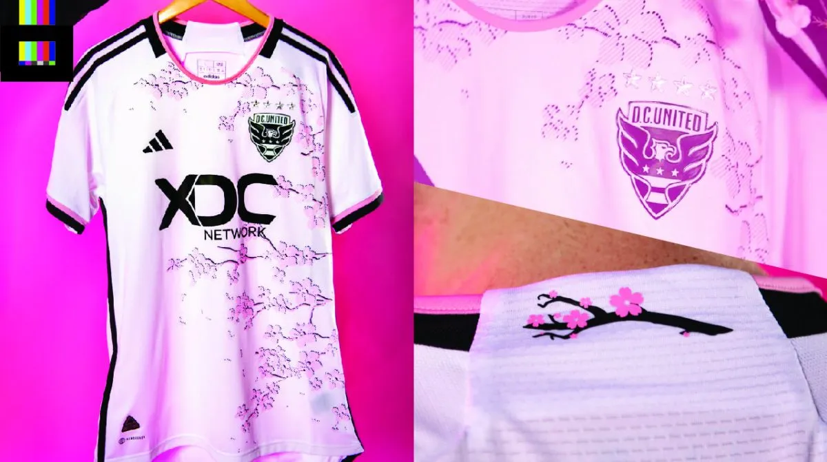
D.C. United has unveiled a look fans have been clamoring for for awhile now. The new away top is themed around DC’s iconic cherry blossom trees.
Easily the US capital’s most famous landmark that isn’t a building, the blossoms spread across the shirt from the wearer’s left to right. The front design is rendered with a thin lined texture that lets the white background of the shirt show through a bit. The rear neck area has a little tree branch with blossoms. Trim is in DCU black with pink accents.
Grade: B-
The inspiration is great, the execution though seems just a tiny bit lacking. Having literal cherry tree branches slapped on the front just seems too obvious. Still, a fun local alt top that joins the District’s other sports teams, the Nationals and Wizards, in the cherry blossom jersey club. See the shirt in more detail on the MLS Store.
Houston Dynamo FC 2023 Kit
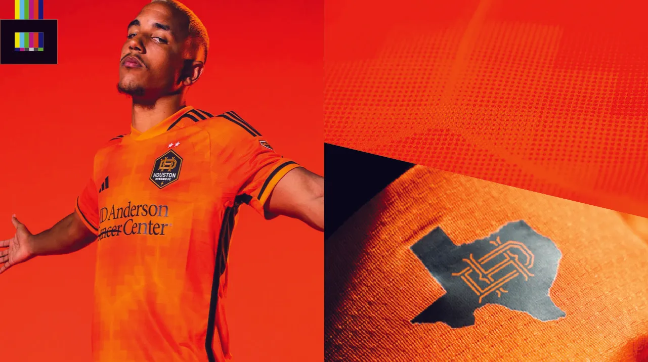
The Dynamo return in orange, in the “El Sol” kit. The jersey features multiple hues of orange in a digitized hexagon pattern, which gives the impression of a heat map.
The pattern sadly does not continue around the back of the shirt, which is a disappointment. Still, it’s a great example of doing something interesting with a traditionally plain shirt design, while still keeping the spirit the same.
Grade: A–
The black trim looks great against the orange, and the little “HD”/Texas silhouette on the upper back is a bit phoned-in, but still a nice touch. Really not much to dislike from Houston this go around. See the shirt in more detail on the MLS Store.
Inter Miami 2023 Kit
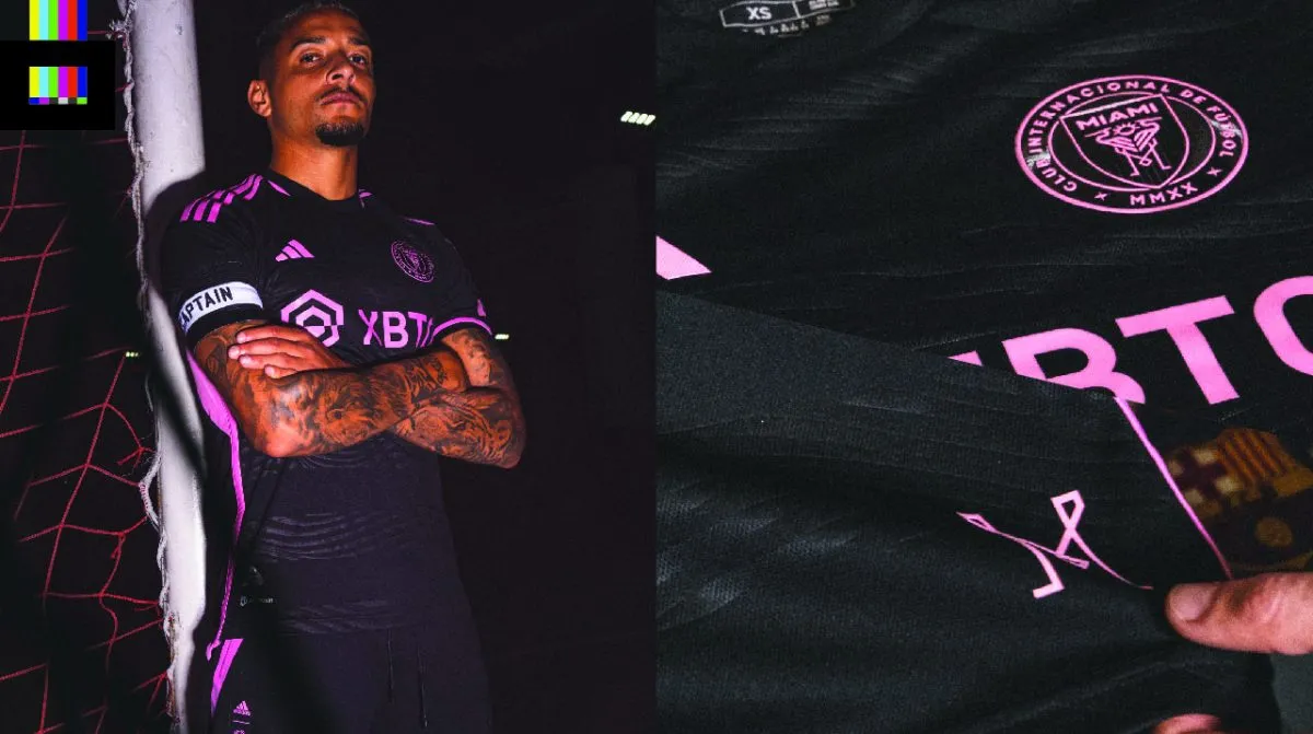
Inter Miami rolls into their fourth season with a new black and pink away top.
The shirt is mainly black with a new “Bliss Pink” color for all the logos and trim – no white from their normal color scheme to be found. The body of the shirt features an embossed wave pattern set in wide horizontal stripes.
The bright pink trim and wave patterns, per the club, represent the “iconic City of Miami skyline during RosaNegra nights.” The lower front of the shirt is capped off with a stylized “M” from the club’s main logo as an additional “ode to the City”. A lot of love for the 305 for sure. It is a bit disappointing that in the club’s press release or launch video there isn’t a single reference to the broader South Florida community nor the city they actually play in (and the one that made MLS in the region possible at all – twice) – Fort Lauderdale.
Grade: A
This is the best kit yet from the David Beckham’s bunch. The brighter pink really shines against the black base and the subtle stripes are a nice touch (black-on-black hoops look familiar for some reason to this former FTL kit designer 😉 See the shirt in more detail on the MLS Store.
LAFC 2023 Kit
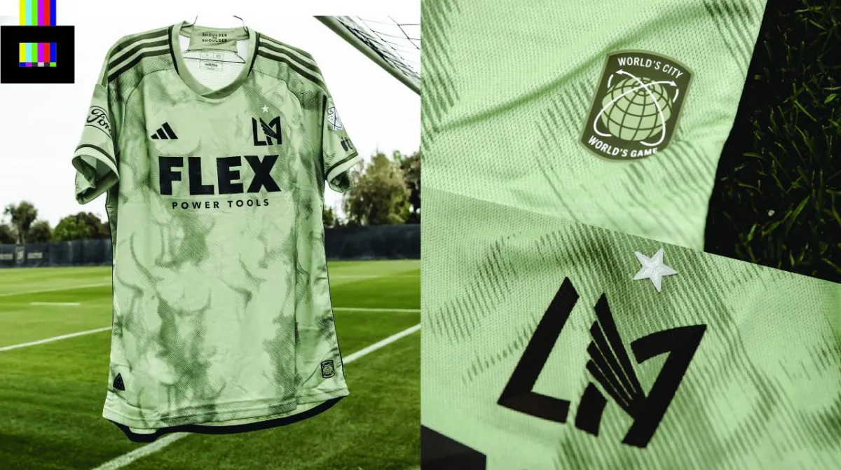
The reigning MLS Cup champs LAFC are going with a smoke-themed design for their new 2023 kit.
The “Smokescreen” kit is done up in an army-green color scheme (the club release offers no real logic behind the color choice), with a sublimated smoke design across the front and sleeves. The smoke theme honors the “iconic” goal celebration of LAFC supporters (nobody else popped smoke before LAFC, apparently).
The “LA” monogram from the main crest stands alone with a spiffy star added for LAFC’s first title last year. A “World’s City, World’s Game” badge sits on the lower front, which “reflects the teams global aspirations, away day culture, and commitment to marching together into uncharted territory”. Ok, sure.
Grade: A–
The reasoning behind the design choices may a bit of a stretch, but regardless, this is a good looking shirt. See the shirt in more detail on the MLS Store.
Los Angeles Galaxy 2023 Kit
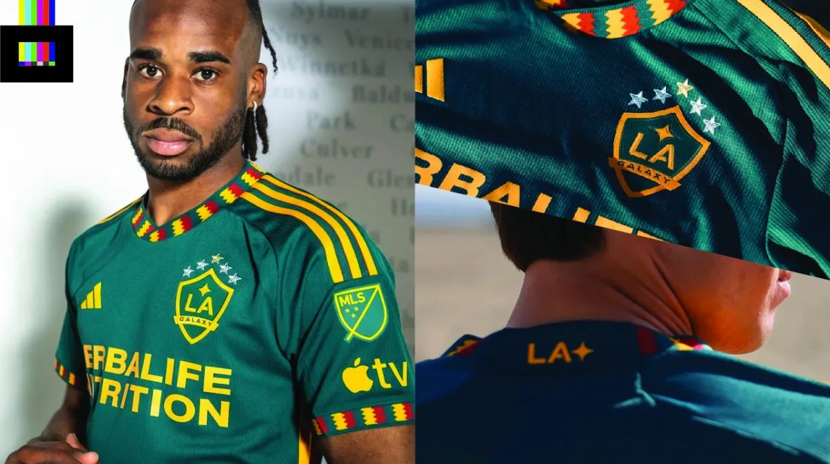
The LA area’s original MLS side has a bold new number brimming with civic pride. Ironically for the team that has never actually been based in the City of Los Angeles itself, the kit is themed around the Los Angeles city flag, which is green, yellow and red and features a distinctive zig-zag design.
The jagged stripes from the flag are repeated around the collar and sleeve cuffs.
The city flag itself features on the lower front of the shirt, the the “LA” monogram and quasar symbol from the Galaxy logo on the upper back.
As a side note, you don’t get the sleeve cuffs, flag and other design details like championship stars and jock tag designs on this or any other MLS kit if you buy the replica version of the shirt. You have to fork over an almost criminal extra $70 for an authentic version to get the same look the team wears. Usually for most sports jerseys the difference in authentic vs replica retail tops is a matter of materials used, but the two styles of jerseys look identical with all the details. The trend of MLS and some other soccer jerseys giving fans on a budget an inferior looking top is pretty sad.
Grade: A
An excellent alternate top with great visual cues to their community. As a bonus, it lines up pretty well with the club’s original pre-Beckham identity (we see you out west still repping that green and gold, Galaxians). See the shirt in more detail on the MLS Store.
Minnesota United FC 2023 Kit
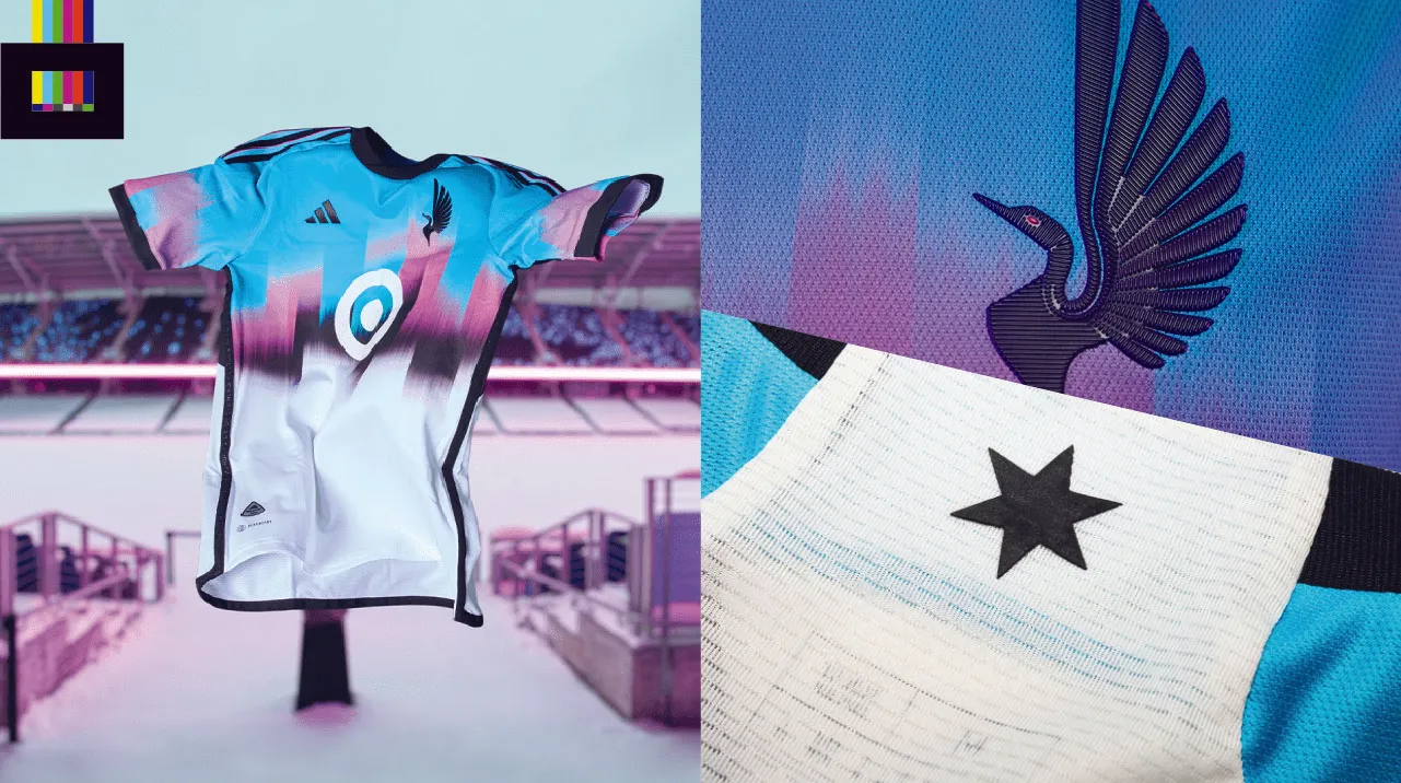
MNUFC: Aurora borealis?! At this time of year? At this time of day? In this part of the country? Localized entirely within Allianz Field?
You: May I see it?
MNUFC: Yes!
Minnesota is going extra bold with their 2023 “Northern Lights Kit”. The abstract, colorful, design mimics the jersey’s namesake natural phenomenon, with bright blue, pink, and black fading into white at the bottom (and back) of the shirt. The design is also meant to mimic the facade of Allianz Field, MNU’s home stadium.
The upper back features the six-pointed North Star from the club badge, and speaking of badge, for the first time the MNUFC loon is presented by itself on the front, with no surrounding shield or details.
Grade: B
Kudos for really leaning into the bright and vibrant colors. Not sure anything will ever beat their original 2013 wing kit from their first season as United in the NASL, but this is certainly a fun effort. See the shirt in more detail on the MLS Store.
Nashville SC 2023 Kit
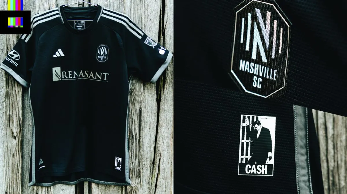
Nashville has collaborated with the estate of music legend Johnny Cash on the aptly-named “Man in Black” kit. They’ve even cooked up two Cash cover singles with new artists as part of the release, available, of course, exclusively with MLS partner Apple’s Music service.
All black with silver trim, the shirt celebrates the legacy of the iconic Tennessee-based musician, and was inspired by the first ever tifo display at a Nashville MLS game, which featured Cash.
The lower front features a photo of Cash at Folsom Prison, and the upper neck has his signature in white.
Grade: A+
Take the essence of one of the coolest people to ever do it and make it into a kit? Winner. It’s basic and simple but it fits the theme perfectly. See the shirt in more detail on the MLS Store.
New England Revolution 2023 Kit
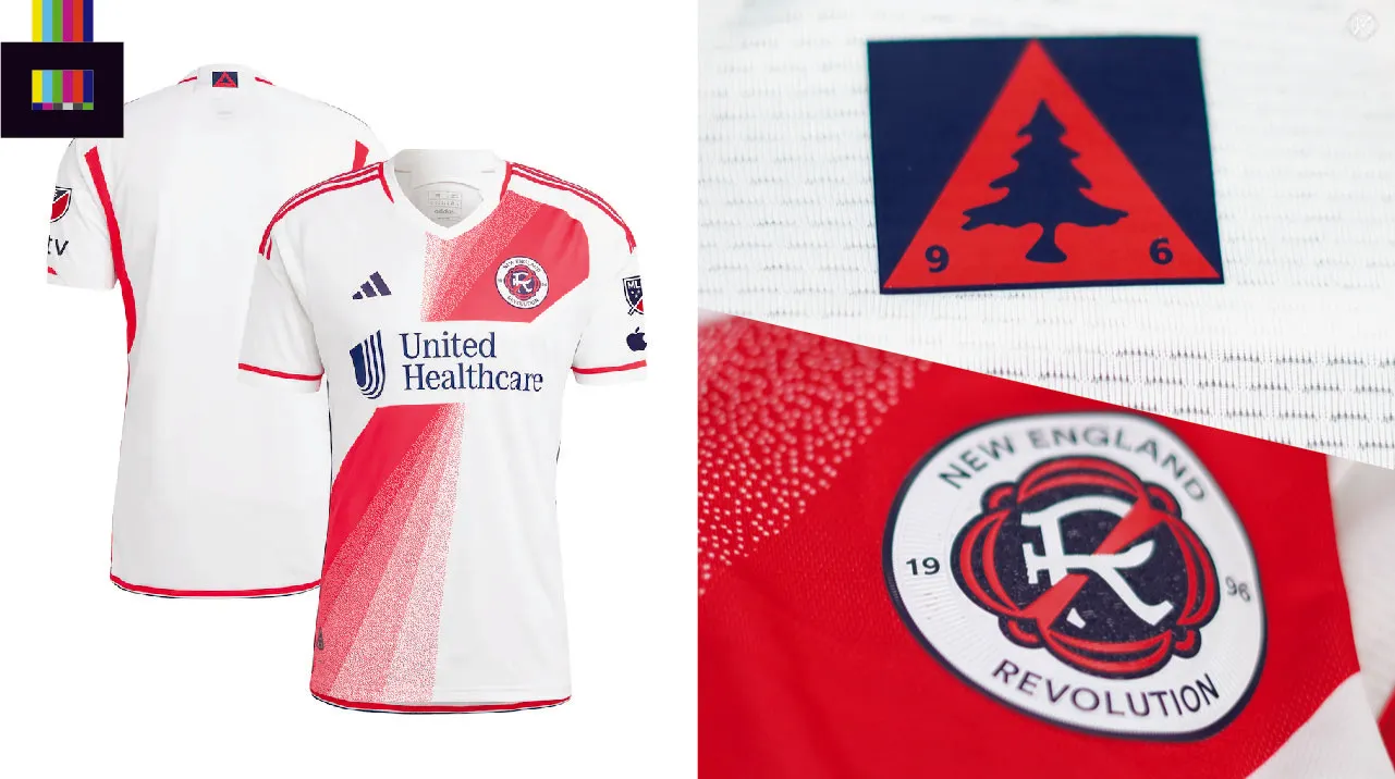
The Revs are coming in hot with a very nice white kit for 2023. The mostly white shirt features a red sash across the front. But you won’t mistake this shirt for River Plate or Peru – as the sash has a twisted, fading effect to it which is really striking.
The upper back features the appearance of New England’s “Heritage Tree” icon, a nod to the flag of New England and the club’s founding in 1996.
Grade: B+
The only knock against this design is the intrusive break in the sash so as not to disturb the sponsor logo. Ads on jerseys are inherently kinda gross, but sometimes they don’t get in the way, or can even compliment the aesthetics of a shirt on occasion. But here it just ruins what could be a classic top. See the shirt in more detail on the MLS Store.
NYCFC 2023 Kit
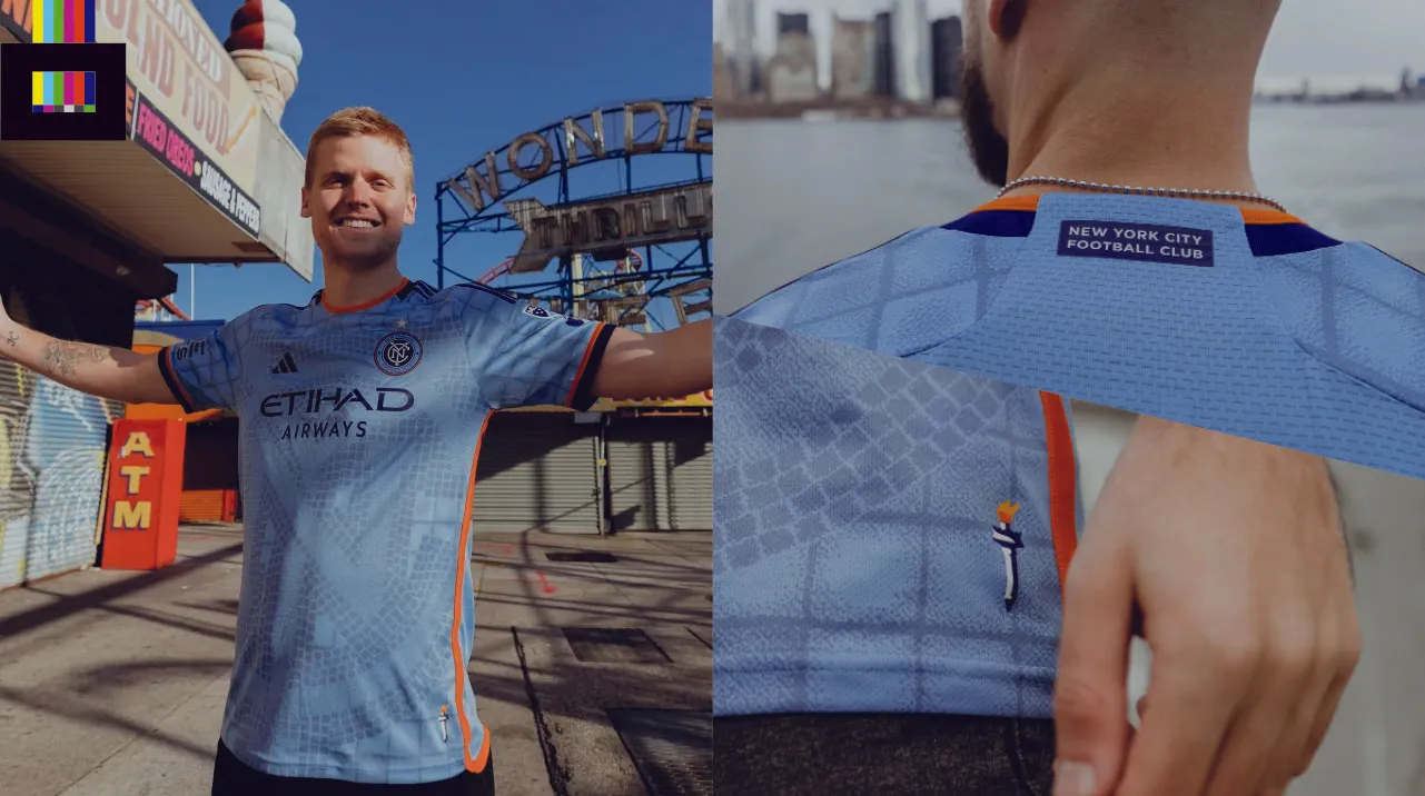
New York City has a new primary for 2023/24, and they’re calling it the “Interboro Kit”.
Primarily City blue, like their parent organization Manchester City, the shirt features navy and orange trim, the colors of the New York City flag.
The detailing features a mosaic theme, like some of the tile work you’d find in the NYC Subway, and it’s the kind of effortlessly cool local design reference you can only get in a city like New York…
…BUT…
…the use of the interlocking “NYC” from the primary logo as a giant background to the front of the shirt is borderline tacky.
Grade: C+
A simpler, abstract mosaic pattern could have made for a much classier design. Little details like the “New York City Football Club” sign and Statue of Liberty torch pull this one back from the brink of “bootleg Real Madrid shirt with a giant sublimated logo sold at a mall kiosk” territory.
Bonus points for giggle-inducing “DUDE WIPES” sleeve sponsor.
See the shirt in more detail on the MLS Store.
New York Red Bulls 2023 Kit
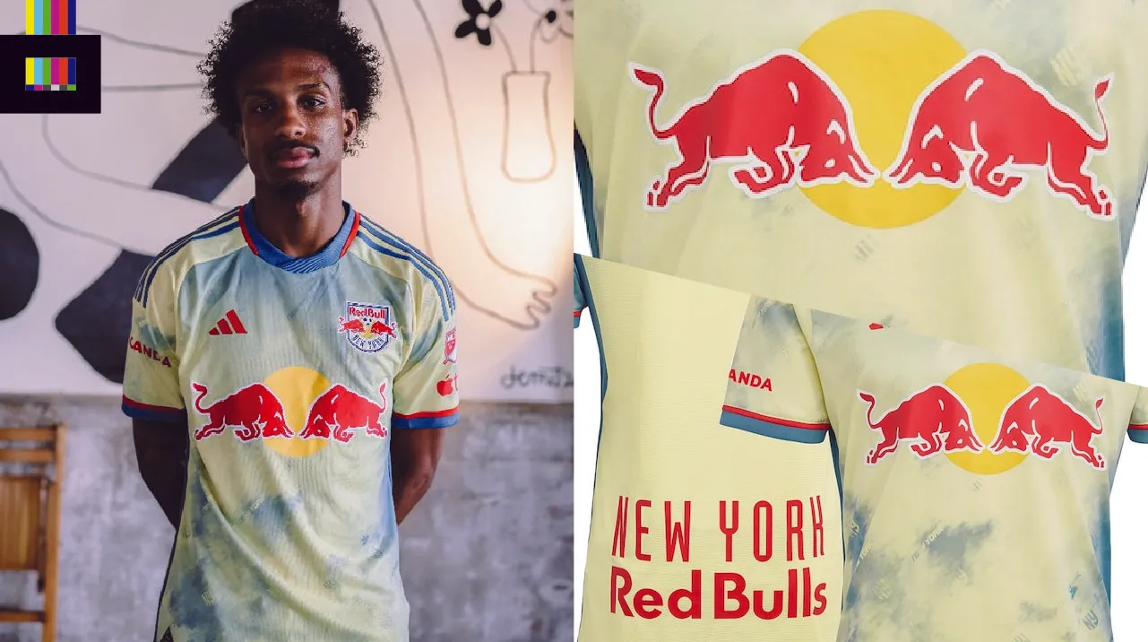
NYRB is going yellow with their new secondary shirt, a collaboration with luxury sportswear designer Daniel Patrick.
It’s a faded tie-dye look, with light yellow and blue throughout the body of the shirt. The design is reminiscent of Leeds United’s similar tie-dye shirt from this season, though not nearly as bold.
Grade: A-
It’s really hard to look past the blatant advertising angle when it comes to anything Red Bull (a company logo or name appears four times on this shirt promoting the energy drink), but from a purely visual standpoint this shirt just works. The lighter shades of the shirt itself compliment the bright red, yellow and blue of the Red Bull branding surprisingly well. See the shirt in more detail on the MLS Store.
Orlando City SC 2023 Kit
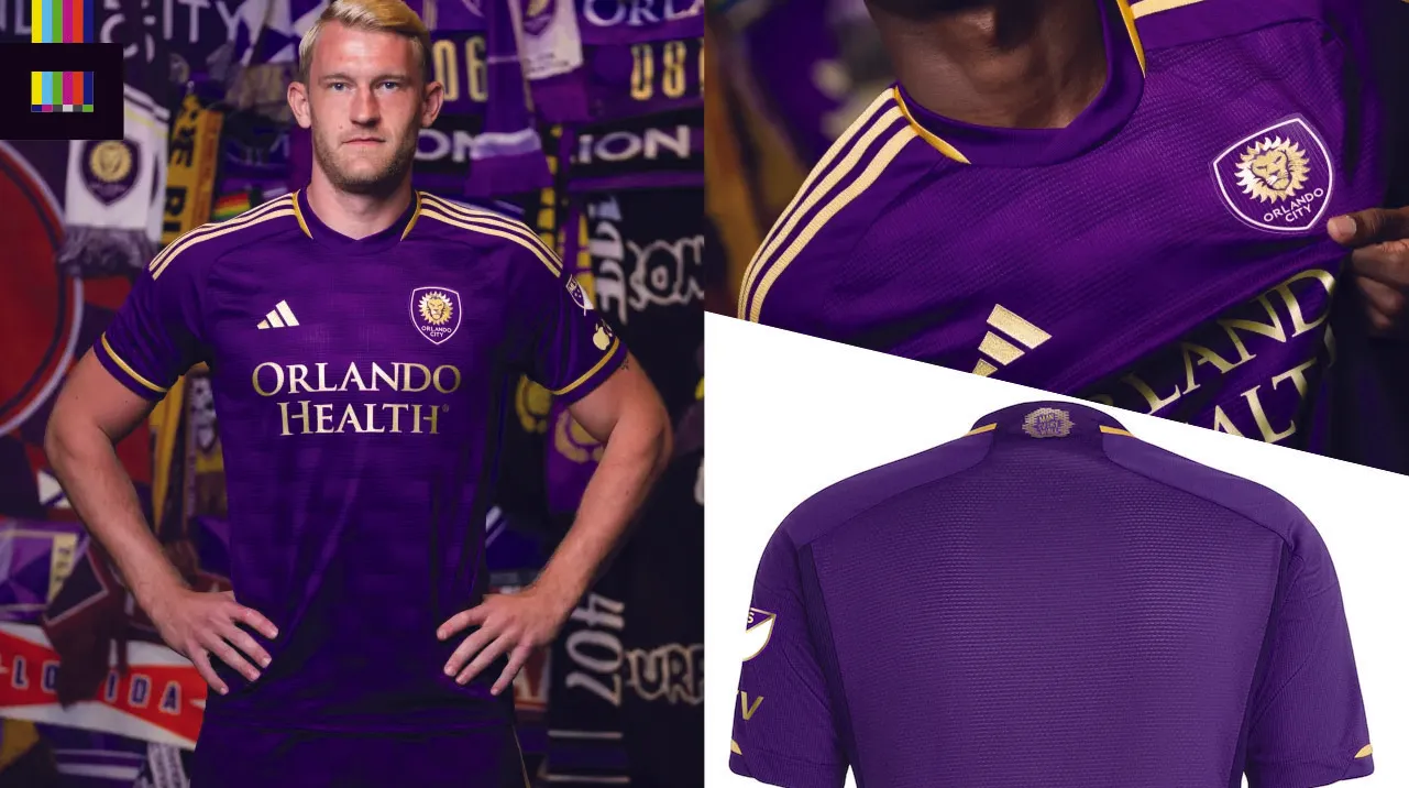
OCSC’s new primary is called “The Wall Kit”.
No, Pink Floyd didn’t have some sort of connection to Orlando you didn’t know about, this kit is named in honor of the supporters standing section on the north end of Exploria Stadium.
The purple top features a brick wall print on the front body, with metallic gold trim and detailing. The gold worked out for Orlando, as they ended up winning the 2022 U.S. Open Cup so its sort of a gilded celebration of the trophy (even though that particular trophy is silver).
The upper back has a gold brick wall icon with the mantra “Man Every Wall” inscribed, a further nod to the theme and the supporters.
Grade: A-
Straight to the point in club colors, with a pattern design that’s just right – distinctive enough to be seen and get the theme across but not too over the top to the point where it’s tacky. See the shirt in more detail on the MLS Store.
Philadelphia Union 2023 Kit
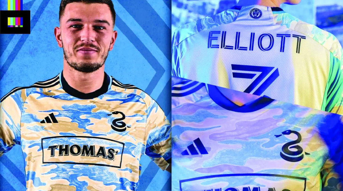
Philly has a new camo secondary, and it’s definitely one of the more distinctive new looks in the league.
They’re calling it the “For Philly” kit, inspired by the *2019* MLS Cup playoff run which saw them notch their first ever playoff win. That season the club had a campaign that featured a camo pattern. No doubt having designed this shirt before the Union made a run to MLS Cup in 2022, they’ve spun that 2019 season as the first spark of success that led them to last season’s near-title.
Like seemingly every MLS design this year, the front pattern doesn’t extend to the back, which is a letdown on this particular design.
Grade: B
Design-wise, it’s a pretty decent shirt. The soft yellow and blue (from the city flag) works well against the dark navy highlights in the trim. The standalone snake from the Union badge works great as the crest, here’s hoping they do that again. See the shirt in more detail on the MLS Store.
Portland Timbers 2023 Kit
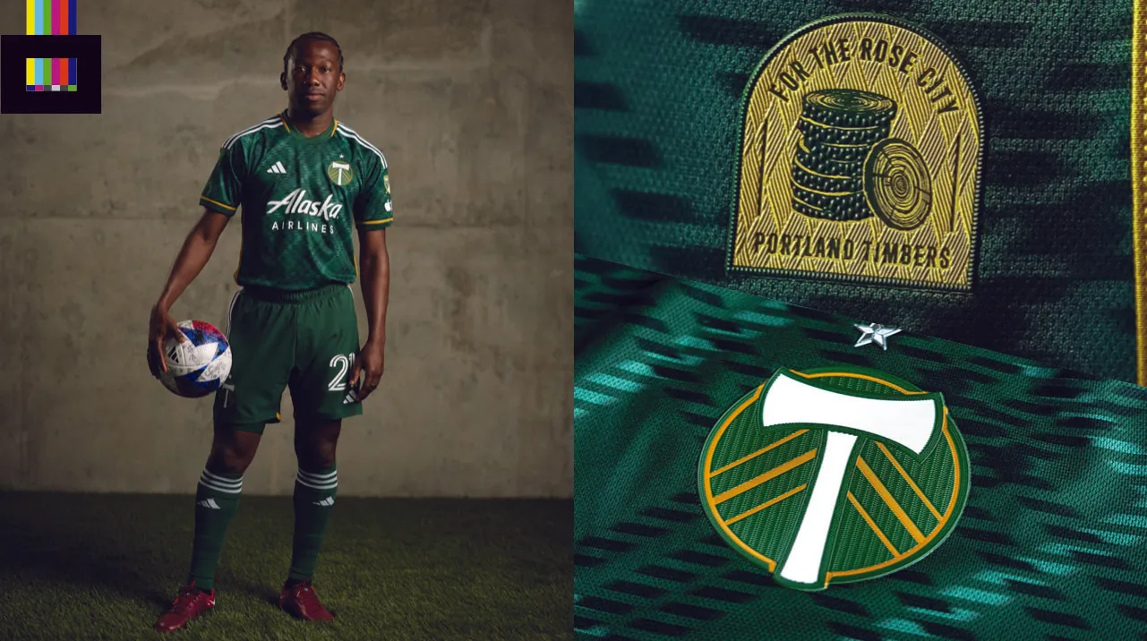
“Portland Plaid” is the look in Timbers country this year, and it’s a fine visual.
The plaid pattern throughout the green top is just right. It’s not quite the famous PDX airport carpet, but it’s pretty sharp. A hint of gold trim at the sleeve cuffs and collar accents the overall look. The mostly white trim on the rest of the strip (stripes, sponsor, numbers, shorts, socks) gives this a bit a retro flare, perfect for a club that has roots in the 1970s NASL, A-League and USL.
Inside the collar is a 2-man crosscutter saw representing teamwork, and the lower front features a little badge with slices of the “victory log”, something you may have noticed watching games played in Portland.
Grade: A+
A crisp design with a bit of a retro vibe from a heritage club. What’s not to love? See the shirt in more detail on the MLS Store.
Real Salt Lake 2023 Kits
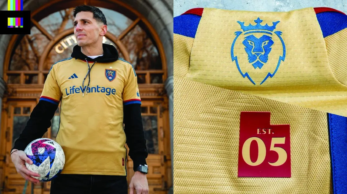
RSL is going gold in 2023 with their new secondary. The “Beehive State” kit represents, unsurprisingly, Utah, the Beehive State.
The main color is a new golden hue, different from the normal RSL yellow, with trim in a brighter-than-usual blue and the standard dark red. The main feature is the hexagonal texture throughout the front, representing a beehive. The very sharp lion head alternate logo is on the rear neck, with a silhouette of Utah and “EST. 05” adorning the jock tag.
The new top has the option to be paired with either gold or blue shorts.
Grade: A+
Top-tier stuff here from Salt Lake. Great local inspiration, well executed in a bold color scheme. See the shirt in more detail on the MLS Store.
San Jose Earthquakes 2023 Kits
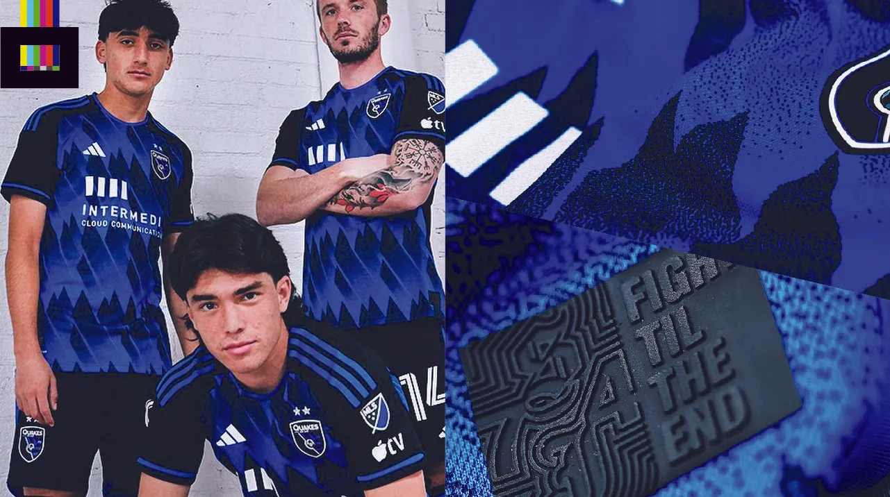
The Quakes revealed the “Active Fault” kit as their new primary for 2023-24.
The blue and black design is made up of gradient diagonal streaks, meant to evoke a tectonic, seismic pattern. It almost looks like mountains, or the famous Vasquez Rocks that have featured in countless films and tv shows over the years.
The shirt features what appears to be a rubberized jock tag design in black, with the slogan “Fight Til The End” and “SJ74”, a nod to the first year of the original NASL Earthquakes.
Grade: C+
It’s… alright? The pattern is somewhat interesting but it really competes with the solid black sleeves for where your eye wants to focus. Also, the unbalanced, asymmetrical sponsor logo on the front isn’t doing it any favors. See the shirt in more detail on the MLS Store.
Seattle Sounders 2023 Kits
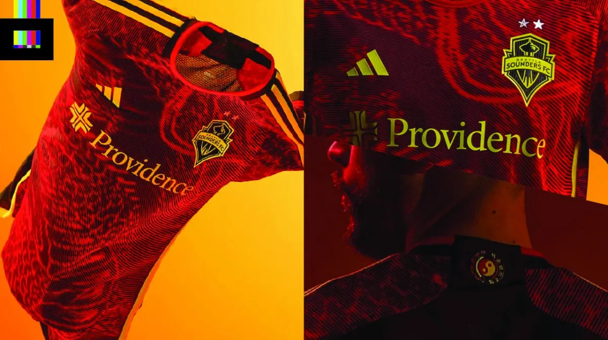
Seattle is eschewing their traditional green and blue scheme in favor of a stunning red, black and yellow design for their secondary that will sure to be one of the more popular shirts this season.
This new alternate top is the “Bruce Lee Kit,” inspired by the martial arts icon and former Seattle resident on the 50th anniversary of his death.
The design features a hand drawn dragon pattern on the main body, with yellow and black trim throughout. The upper back has the core symbol of Lee’s martial art form, Jeet Kune Do. The lower front is stamped with Lee’s signature.
Grade: A
Pairing a cool design, popular club and a global pop culture icon is a recipe for a winner, and they’ve done just that here. See the shirt in more detail on the MLS Store.
St. Louis City SC 2023 Kits
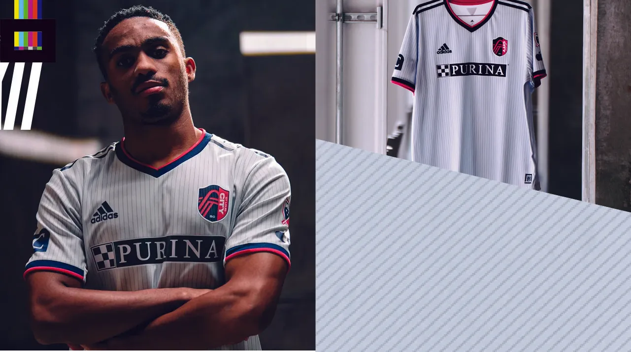
MLS’s newest team, St. Louis, revealed their home shirts back in November, and now we get a look at the away top.
The “Spirit Kit” is inspired by the “metallic and modern design” of CITYPARK, the team’s stadium. Thin vertical stripes in “Arch Gray” are a nod to the steel beams that make up the stadium and of course, the Gateway Arch, St. Louis’ famous landmark. An inaugural season jock tag design is shaped like an aerial view of the stadium, and an upper back icon shaped like the keystone of the Gateway Arch finishes the details.
Trim is in blue and red.
Grade: B+
A fine debut effort for a road shirt. Nothing necessarily Earth-shattering, but a classy look and a nice compliment to the bright red/magenta home top. See the shirt in more detail on the MLS Store.
Sporting Kansas City 2023 Kit
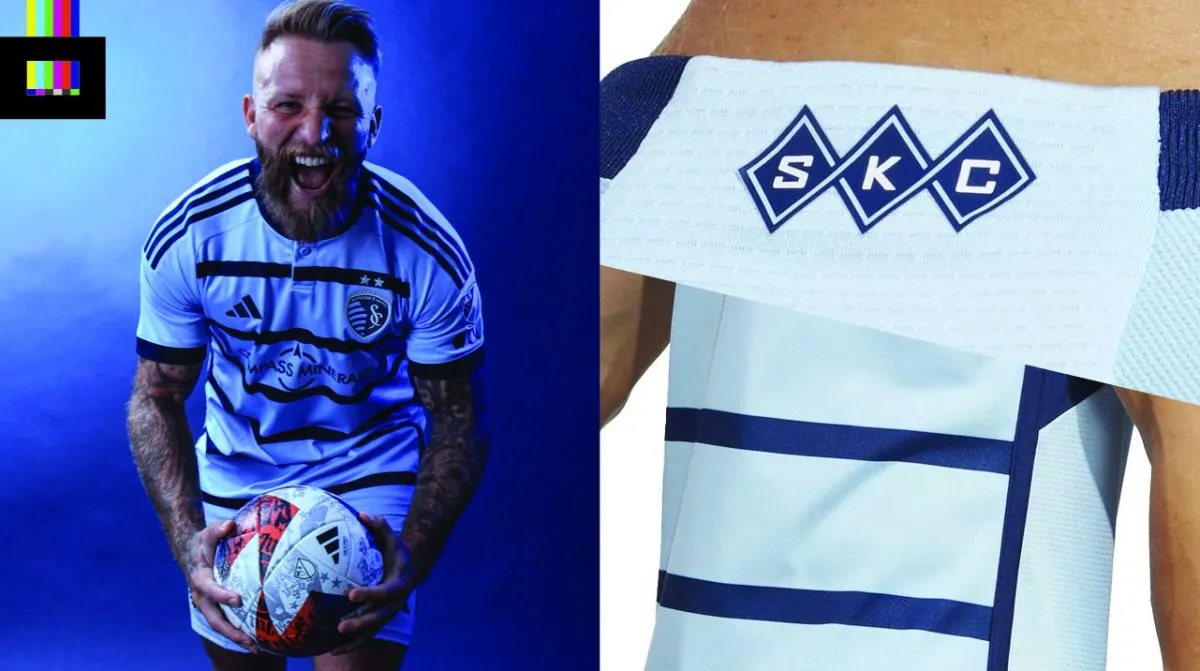
SKC’s is bringing back a variation of a popular past style with “Hoops 4.0”.
The new primary is light blue with wide navy hoops across the front (but only the front, so in reality, they aren’t true hoops, they’re just stripes). Either way though, it’s very sharp.
Adidas branding, the sleeve cuffs and button up henley collar are trimmed in navy. A small argyle-diamond “SKC” mark is in the back of the neck which is one of the better simple little details added across the league.
Grade: A
A really nice design. Took something popular with the fans that’s become a bit of a standard look for the team and riffed on it. The only nitpick is that the sponsor logo’s thin weight doesn’t jive the best with the wide stripes, but that’s a minor gripe. See the shirt in more detail on the MLS Store.
Toronto FC 2023 Kits
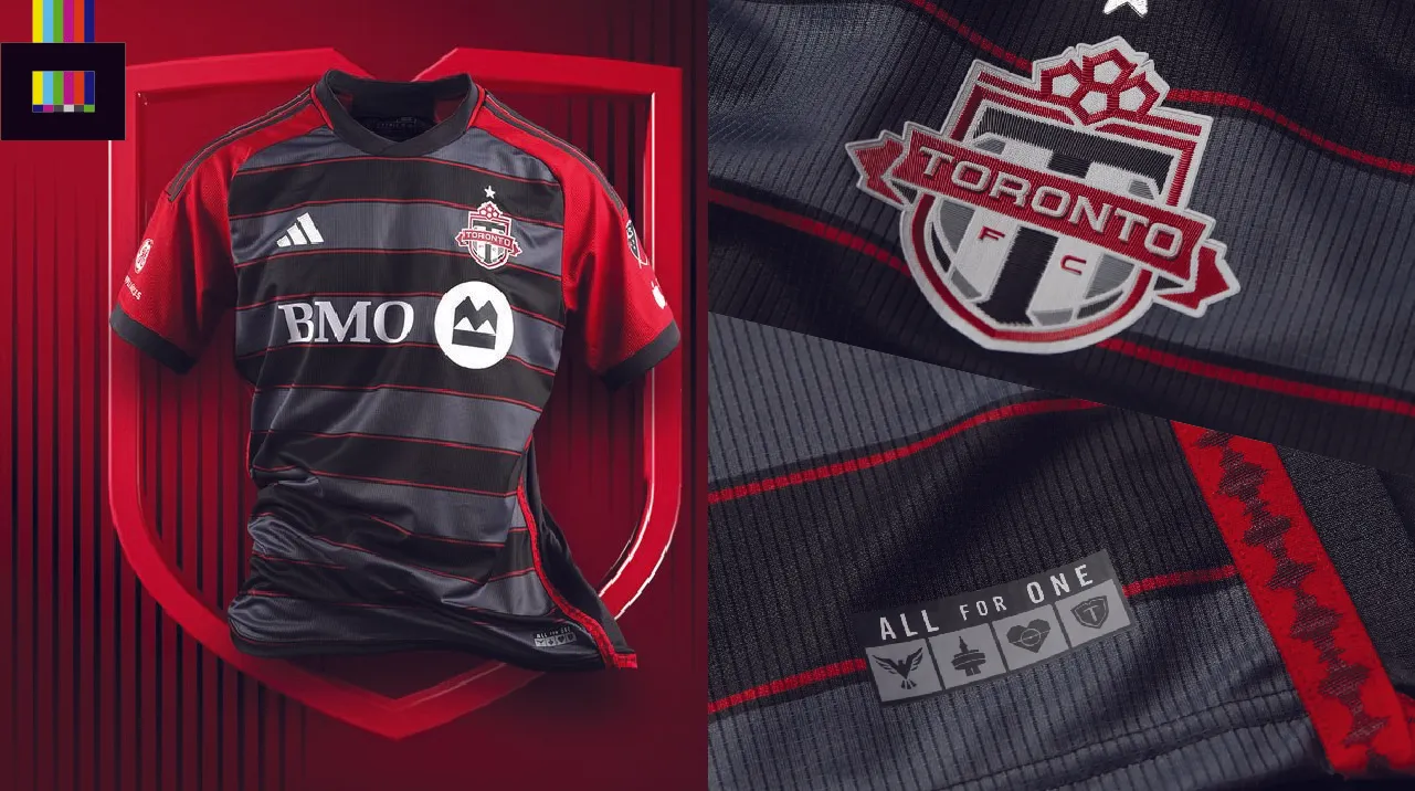
For the first time ever, Toronto FC’s primary shirt is *not* primarily red.
The new top’s main attraction is two-tone grey horizontal stripes across the front accented by thin red pin stripes. The back of the shirt is the same darker grey, or “onyx” as the club is calling it. The sleeves are solid red with grey trim.
Red taping goes down the sides of the shirt, which features the image of the soundwave of a recording of the supporters drums. This detail idea was apparently submitted by one of the club’s fans. The lower front jock tag is the same design from their previous primary shirt, and features the club motto “All for One”, with icons representing the four “pillars”: club, city, house and supporters.
Grade: C
Much like San Jose’s latest, but to even greater effect here, the contrasting color solid sleeves clash with the front design. The dual grey stripes look great – why not continue that onto the sleeves and back as well? Or if they need to keep the primary red in someway, do the stripes but in two-tone red. See the shirt in more detail on the MLS Store.
Vancouver Whitecaps 2023 Kits
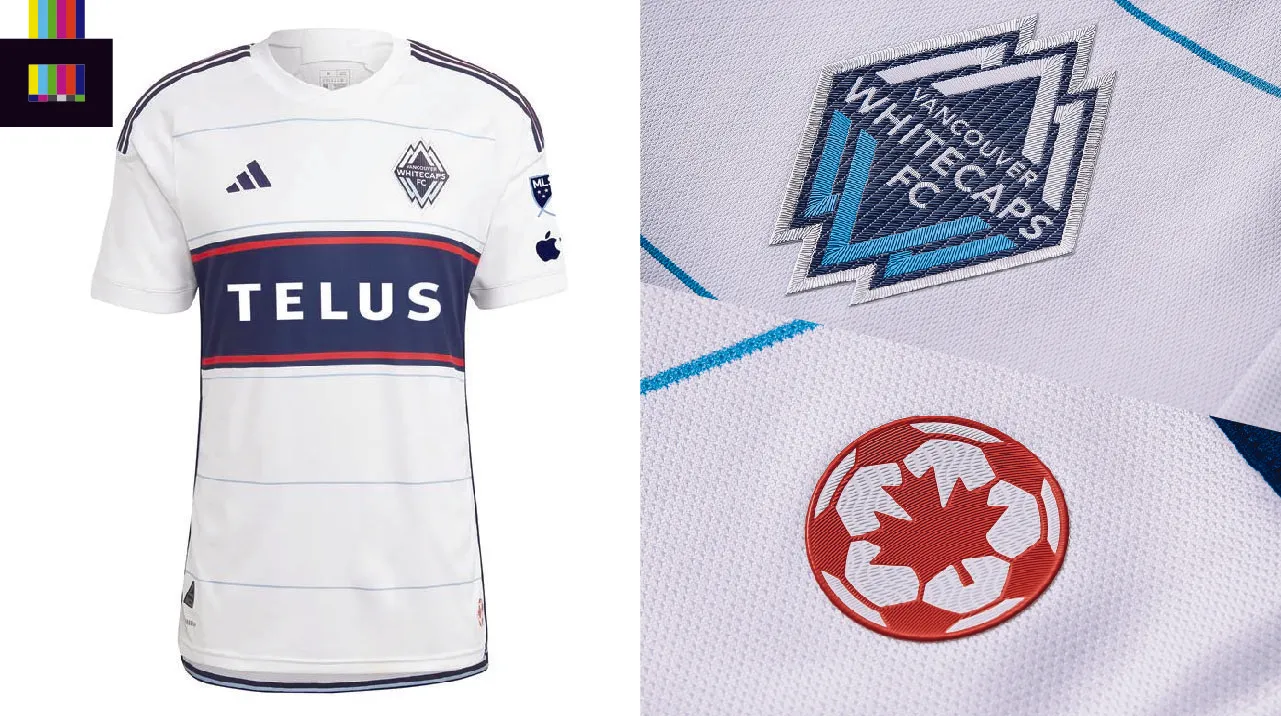
Vancouver is calling this the “Bloodline” jersey, tying in the history of the club with a campaign to support Canadian Blood Services.
The white shirt features five thin light blue stripes across the front, representing five decades of the Whitecaps (which first appeared in the NASL in 1974). A wide navy blue hoop (though again, doesn’t go all the way around, so not a hoop) is a throwback to classic Whitecaps shirts from the NASL and USL days.
Red trim, on the front hoop and also the original maple leaf/ball Whitecaps logo from 1974, is an unexpected highlight on the design.
There’s a bit of superfluous piping down the sides that really doesn’t need to be there. And the thin stripes coming so close to the main hoop design clashes a bit.
Grade: B-
So close to being a classic. Lose the thin stripes and pop that navy/red colorway from the main hoop as trim on the collar and sleeve cuffs and this would’ve been a true stunner. See the shirt in more detail on the MLS Store.

