


The Manchester City 23/24 kit is here, and it’s a classy, modern design with a historic context. The blue side of Manchester is commemorating the 20th anniversary of the move to the Etihad Stadium in 2003. City’s fortunes have certainly changed dramatically in the ensuing two decades, and their new shirt is a tribute to the ground their new era of success has taken place in.
At first glance, it’s a simple design. The classic City sky blue is the base color. A simple v-neck collar in white featuring a double blue pinstripe accent is a nod to the 2003/04 home shirt, the first worn at the stadium.

The main design element are four tonal vertical stripes down the front of the top. Made up of smaller individual horizontal stripes, they evoke the four giant spiral ramps that are on each side of the stadium.
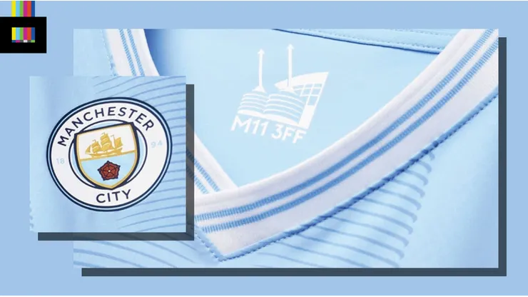
On the inner neckline, there is a rendering of the stadium along with its postcode.
Reviewing the Man City 23/24 Kit
Puma have done very well here. At face value it seems very basic. But they’ve made very little, in terms of actual visual elements, go a long way. The simple striping and collar designs look great, and tell the story they are trying to get across.
Also, the Puma logo and Etihad mark rendered in white really don’t stand out that much against the light blue. The eye focuses right to the club badge and the overall look of the shirt in general. That’s the way it should be.
Could they maybe have replicated the collar design or the tonal striping on the sleeve cuffs? Maybe. But honestly there is not much noteworthy to complain about here.
Grade: A
Love the new Man City look? You can order it online from Kitbag and get it delivered to your door.