

The Liverpool 23/24 kit is here, and it’s a trip into the past.
The new design, which debuts at Anfield in the club’s final home match on May 20, is a tribute to the 1973/74 Liverpool shirt. That season was the legendary manager Bill Shankly’s final with the club. 50 years on from that FA Cup-winning side, Liverpool are bringing back the classic look.
Of course, it’s Liverpool, so the top isn’t *that* dissimilar from most of their shirts over the years. Let’s take a closer look:
Classic simplicity
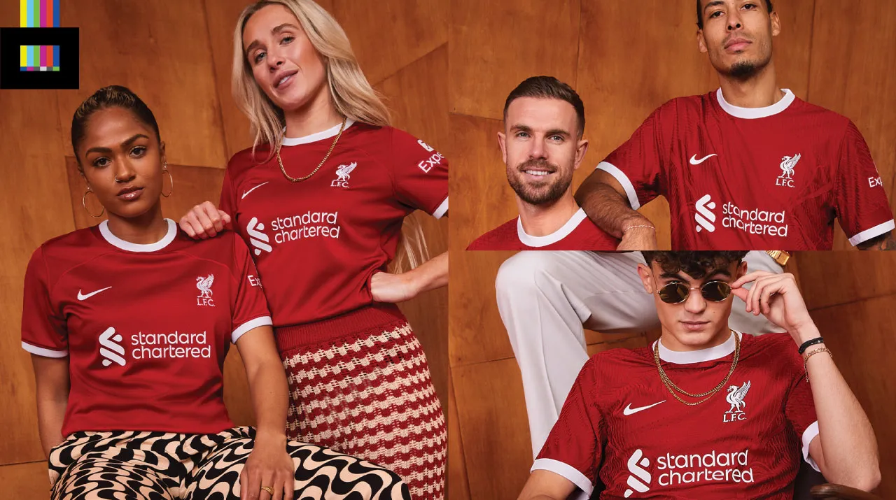
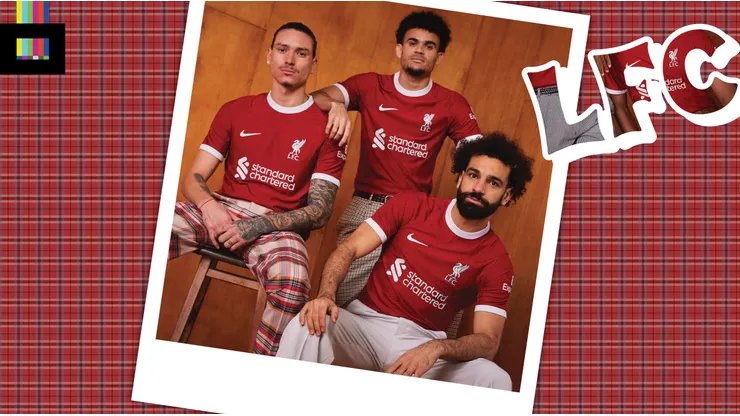
This is about as straightforward as kit design gets. A simple red top, with a white ring collar and sleeve cuffs. Sponsor and Nike detailing is also in white.
The original shirt from the 70s, of course, did not have sponsor logos. And that strip was made by Umbro. But the new version is about as faithful of a modern recreation as you could hope for. The standalone Liverbird and L.F.C., in lieu of the full crest, always looks great on the kits.
The top features a wavy embossed texture throughout, similar to other recent Nike efforts, which gives a bit of additional up-close interest. It’s not clear if they are wearing different retail versions of the shirt (match vs stadium versions), but the shirts worn by members of the LFC women’s team in official photos do not feature this texture.
While the design of the shirt itself doesn’t scream 1970s, the team photo shoot sure did. Complete with wood paneling and goofy pants, it looks like they had some fun playing into the theme.
Official photos provided by the club did not showcase these details, but the eternal flames and “97” will once again adorn the upper back of the shirt, in honor of those lost at the Hillsborough disaster. In addition, there is a custom number and name font for cup competitions and friendlies, based on Liverpool’s street signs.
The 23/24 Liverpool shirt is available now online.
Reviewing the Liverpool 23/24 kit
It’s hard to screw up a classic design like Liverpool‘s, especially one based on a historic top from a winning team.
The Reds and Nike have done the job here, recreating a classic Liverpool look in modern style. It’s nothing remarkable, but given the limitations when working with an iconic club with a traditionally simple shirt, it’s just fine.
It would’ve been nice to see them go the extra mile with the 70s tribute and do without sponsors (or at least render them in tone-on-tone red). But in today’s modern, cash-driven sport, that’s an unrealistic dream. Either way, Liverpool will be looking sharp.
Grade: A-
Like the shirt? Hate the shirt? Hit us up in the comments.
Photos: Liverpool FC