


The AC Milan 23/34 has been released onto the world, and it’s a slick new variation of an iconic shirt.
Per the club, the new top is “Inspired by the city of Milan and the unstoppable spirit of its people.” It delivers on the traditional Rossoneri red and black look, but rendered in a series of modern tonal horizontal stripes.
The Milan 23/24 home kit
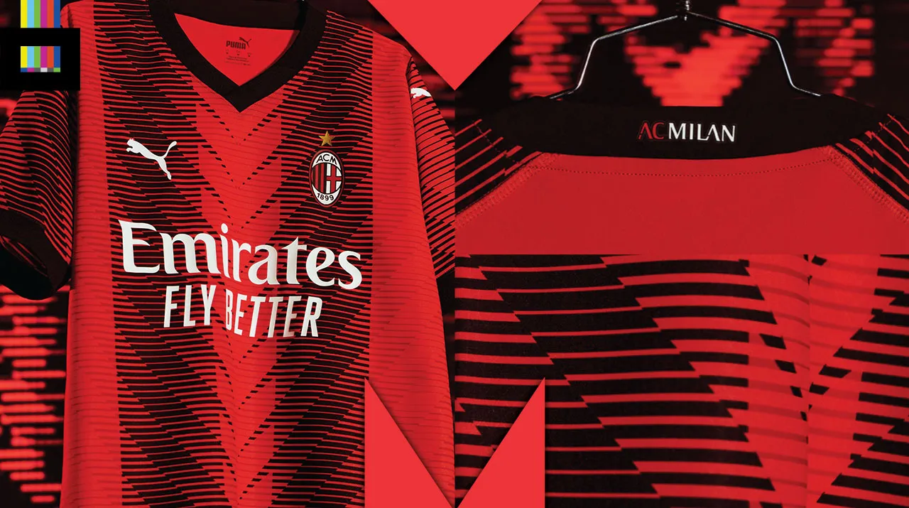
The shirt has a red base with a plain black v-neck collar and sleeve cuffs. The main (and only) design element are the vertical black stripes. Thinner, horizontal lines in varying thickness and tone actually create the illusion of the vertical stripes. At the center of the shirt, the angular sections come to a point to give the impression of a repeating ‘M’ down the front. The same striping pattern is repeated on the sleeves.
In the official release, the club notes: “The innovative design introduces a repeat tonal graphic that celebrates the vibrant energy of the city, the enduring legacy of the Club, and its central role within an evolving community that’s always looking forward. That’s the Milan way. The unique new stripes create a repeat ‘M’ visual in the centre of the jersey through the tonal stripes that represent the city of Milan and the progressive nature of the Club.”
That’s a lot of words to basically say “We did some cool-looking stripes that make an ‘M’.”
The club name adorns the rear collar, and sponsor and Puma logos are in white. The Puma leaping cat appears in the front chest but also on both sleeves. But open the right sleeve, it’s not reversed, so it looks like it’s leaping towards the back of the shirt.
Also unveiled, but not mentioned in the press release, was a green goalkeeper shirt featuring an angular, almost dazzle-camo look. The new home shirt will be worn for the first time by Milan in Sunday’s Serie A finale against Hellas Verona.
Reviewing the Milan 23/24 Kit
Contrived club marketing lingo aside, this is a great looking shirt. It’s often tough to do something interesting with an iconic design, when you can’t really get away with changing too much. But they nailed it.
The use of the smaller tonal horizontal stripes to create the traditional vertical ones is terrific. And the ‘M’ is there, but not over-the-top obvious to the point of being obnoxious and tacky.
Really, really nicely done.
Grade: A+
AC Milan’s new home shirt is available to order online from Kitbag and other soccer sites.