FC Barcelona has released their new 2022/23 away kit, and they’re truly “going for gold” with this design.
Like the 2022/23 Home Kit, the away is being promoted with the tagline “The Flame Lives On”. Both shirts celebrate the 30th anniversary of the 1992 Barcelona Olympics and their impact on the city. But the away design definitely directly references the Olympics whereas the home featured only subtle design cues.

It’s a top-of-the-podium look for Barça
Reviewing the Barcelona 2022/23 away kit
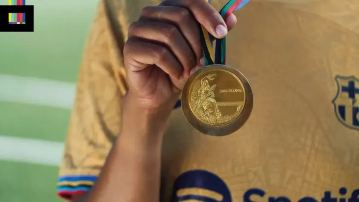
The full strip is in Olympic gold, with a textured topographical map / street plan of the city of Barcelona overlaid throughout the entire uniform. The club badge, Nike swoosh, and sponsor logos are all rendered in navy blue. The single color application a good choice here as it lets the gold shine through.
The best bit of this design is the sleeve trim. Each cuff has five stripes in red, green, black, yellow and blue representing the five Olympic rings. The five colors on the sleeve adds a nice splash of color without being too noisy.
The map of the city is woven into the shirt using a slightly metallic thread. This gives it a shimmering effect under certain lighting, which is perfect for a shirt that is supposed to evoke a gold medal. The texture is just subtle enough so as to not be distracting or tacky. The sleeves and shorts pattern is more of the topographical map of the surrounding hills and natural environment which is a nice transition.
Grade:🥇
A perfect execution of the theme, with great details. There references aren’t too over-the-top, but also not so obscure as to seem like something they came up with after the fact. In addition to being a nice standalone design, this is a good counterpoint to the standard(ish) 2022/23 blue and burgundy home shirt. Play the Catalonia national anthem because this really is a gold medal performance.

200+ Channels With Sports & News
- Starting price: $33/mo. for fubo Latino Package
- Watch Premier League, Women’s World Cup, Euro 2024 & Gold Cup

The New Home of MLS
- Price: $14.99/mo. for MLS Season Pass
- Watch every MLS game including playoffs & Leagues Cup

Many Sports & ESPN Originals
- Price: $10.99/mo. (or get ESPN+, Hulu & Disney+ for $14.99/mo.)
- Features Bundesliga, LaLiga, Championship, & FA Cup

2,000+ soccer games per year
- Price: $5.99/mo
- Features Champions League, Serie A, Europa League & Brasileirāo

175 Premier League Games & PL TV
- Starting price: $5.99/mo. for Peacock Premium
- Watch 175 exclusive EPL games per season