Every soccer crest embodies a team’s history, part of the reason why redesigns, like the one Manchester City recently undertook, become such noteworthy changes. The balance between old and new, or the choice to go in a completely different direction, can be captured by a few new artistic choices, for better or worse.
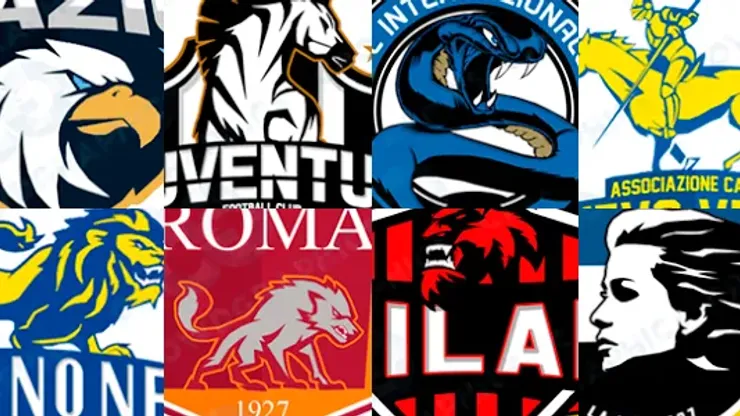
That weighty history can give innovative projects, like this one from Crowd Graphics, intrigue beyond the designs themselves. With an admiration for both Serie A’s history and American sports’ unique style, this Rome-based designer has reimagined the crests of Italy’s top flight clubs, giving a North American sports look to some of the most historic teams in world sports.
Between the lettering, mascots, crest designs and element layouts, Crowd Graphics fast-forwards an 80-year-old league into the present, asking how these clubs might present themselves if born into one of the most competitive sporting markets in the world. While some fans will prefer the legacy laced in the current crests, the new looks provide a window into a complete different, alternative Serie A.
Crowd Graphics’ original designs can be found here. Below you can see the project’s original presentation, along with an explanation of how the designs came about.


200+ Channels With Sports & News
- Starting price: $33/mo. for fubo Latino Package
- Watch Premier League, Women’s World Cup, Euro 2024 & Gold Cup

The New Home of MLS
- Price: $14.99/mo. for MLS Season Pass
- Watch every MLS game including playoffs & Leagues Cup

Many Sports & ESPN Originals
- Price: $10.99/mo. (or get ESPN+, Hulu & Disney+ for $14.99/mo.)
- Features Bundesliga, LaLiga, Championship, & FA Cup

2,000+ soccer games per year
- Price: $5.99/mo
- Features Champions League, Serie A, Europa League & Brasileirāo

175 Premier League Games & PL TV
- Starting price: $5.99/mo. for Peacock Premium
- Watch 175 exclusive EPL games per season