Germany may have triumphed on the pitch, but today we’re concerned with crowning the champion of a more esoteric field. Which World Cup country wore the best crest? The criteria for ranking each nation’s badge of honor is the quality of graphic design, uniqueness, suitability for sport, its rendering on the shirt, and how well it conveys an aspect of national identity.
The Crème de la Crests:
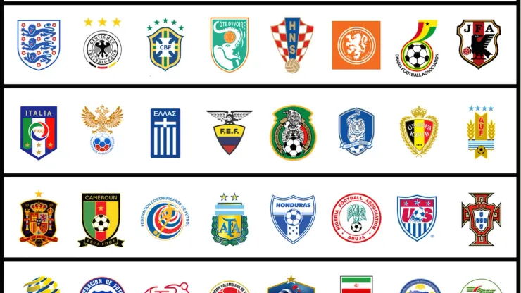
1. England: Nobel Laureate David Trimble, appearing in a Visa World Cup ad, trotted out the cliché that “sport is a continuation of war by other means.” While it may be a strained analogy it does account for the origin of England’s iconic badge. The three lions have been used as the national symbol since Richard the Lionheart’s 12th century reign. Each lion came from a royal union by his father Henry II and great-grandfather Henry I. The crest conveys history’s grand sweep while specifically representing an enduring national identity. A few years ago the F.A. needlessly added the word “England” in a horizontal bar above the badge. It’s gone now and whether on their crisp whites or iconic reds, this simply rendered badge with the immediately recognizable imagery lets you know that “This is England.”
2. Germany: This diesel Eagle flexing his buff wings could double as an Axe body spray logo but its proud display of strength befits the four-time champions known as Die Mannschaft. The crest rates among the best because of its perfect composition. The intense imagery is barely constrained by a stark black roundel subtly highlighted by the bright German national colors. This year’s shirt puts those colors to great use in a chevron that livens up their normally staid look.
3. Brazil: When Charlie Finley changed the colors of his Kansas City Athletics to green and gold, 14 of the other 19 teams in Major League Baseball used red, blue, or a combination of the two. Soon enough, the bold green and gold came to stand for the most fun, and most dominating, team in the bigs. Somewhat similarly, Brazil ditched their white shirts for their now legendary look after their disastrous 1950 World Cup final loss. Brazil’s better take on the Portuguese cross, ringed by five stars and rendered in the sport’s most distinctive colors, visually defines o jogo bonito.
4. Ivory Coast: Their official crest isn’t nearly as clever as the one that appears on their shirts. It’s friendly look features an adorable elephant whose trunk cleverly curls to be the “C” in “Cote d’Ivorie” while holding a vintage ball aloft and constrained within an outline of the country. To appreciate how well done this logo is compare it to the similar Thai football logo. Adding to its appeal are the national colors of a bright, light green paired with orange.
5. Croatia: The letters “H.N.S.” stand as a bulwark against the encroaching global domination of the English language. After all, the country’s name is “Hrvatska,” not “Croatia.” True fact: more people have compared their singular shirts to picnic blankets than have actually been on picnics.
6. The Netherlands: The current shirt’s plus-size crest harkens back to the days of Johan Cruyff turning past desperate defenders. Their all-oranje look now boasts an enormous Lion Rampant – the heraldic term for a lion standing on its hind legs with its paws ready to strike. But their new official logo, which places the lion in a roundel with brush marks to his right and left, is almost a complete ripoff of Scotland’s badge. The shirt’s large lion, as opposed to the smaller lion’s head from years past, makes it look like an Express polo you’d see at Target.
7. Ghana: Ethiopia’s resistance to colonization served as an inspiration to the rest of Africa as it sought to shirk European shackles in the 19th and 20th centuries. Many nations subsequently adopted Ethiopia’s national colors of red, green, and yellow. Ghana’s crest makes the best use of them, with all three colors dynamically flowing to envelop a ball. In a World Cup drowning in boring white shirts, theirs is among the best because of their national print flair along the sleeves and collar.
8. Japan: From Godzilla to Optimus Prime to their national flag, the Japanese excel in producing visually striking pieces of graphic design. The Samurai Blue’s crest carries on this proud tradition with its three-legged crow from ancient mythology. His name is Yatagarasu, and he appears ready to take flight or offer wise counsel from within the frames of this uniquely-shaped badge.
The Second Division:
9. Italy: For a country with such a proud history, they’ve yet to settle on a venerable crest. In years past they wore the Scudetto – a shield comprised of Italy’s tricolore traditionally worn by the Serie A champions. Then they succumbed to the horrors of 1990s graphic design before settling on the current disjointed affair. The Red, White, and Green are rolled out in banners but are then repeated in a distracting center circle. The four beveled stars, one for each World Cup title, seem arrayed around the badge as an afterthought. Most importantly, there doesn’t look like there’s room for a fifth; so another championship would likely necessitate yet another design. Then again, nothing looks bad when worn by Andrea Pirlo.
10. Russia: This double-headed eagle keenly scanning for threats in all directions is the visual embodiment of The GZA’s warning that “I gotcha back but you best to watch your front.” Russia wisely ditches the superfluous soccer ball from its crest when sewn onto their shirt. With so many teams rocking red, Russia has smartly switched to a darker maroon shade. Adding to the shirt’s majesty is a subtle shout out to Moscow’s architecturally-striking Monument to the Conquerors of Space.
11. Greece: The Greeks once wore blue shirts with white shorts, like their Italian neighbors across the Ionian Sea. But after their shocking Euro 2004 triumph while wearing all-white, they adopted the look full-time. Their crest is a simplified version of the national flag. The sparse symbol befits a team whose disciplined and non-flashy style has earned them unprecedented success over the past 10 years.
12. Ecuador:Ecuador’s logo is best judged when compared to that of their neighbors to the north. In branding, simple is best. But Colombia’s takes it to the extreme by sporting a red ball thinly ringed by their national colors. Ecuador takes the same colors and crafts a far classier and far more effective logo. But the poorly-rendered bird atop its crest doesn’t properly represent what is supposed to be a condor from the Ecuadorian coat of arms.
13. Mexico: Adidas’ iconic Telstar ball – the white one studded with black pentagrams – hasn’t been used since the 1970s. Yet it’s the de facto ball used in countless national team crests. But if any nation has a right to use it in its logo, it’s Mexico, as the Telstar ball is forever associated with the country in which it debuted. The 1970 World Cup is Cup fondly remembered for its high-scoring, high-temperatures, Pele’s swan song and for introducing a ball that finally looked different from those used in water polo and volleyball. The eagle in Mexico’s crest could do with some sprucing up, especially when compared with the epicness of the one on its national flag. But one look at this crest and you know instantly that it’s El Tri.
14. South Korea: Many economically-emergent nations have laid claim to the title “Asian Tiger.” The South Koreans appropriate the image for the national team’s crest despite their ‘Red Devils’ nickname. It looks a tad sedate though, especially set against the calming blue background. Most importantly, it lacks the balance of the red-and-blue yin/yang symbol from their flag.
15. Belgium: The august seriousness of a venerable college crest tempered by the vague threat of its Germanic colors. In a nod to its French and Flemish heritage the crest displays the name of the national FA in both languages – the Union Royale Belge des Societes de Football-Association and Koninklijke Belgische Voetbalbond.
16. Uruguay: Like most mortal enemies, Uruguay and Argentina have more in common than they’d like to admit. They were both provinces of the short-lived Liga Federalin the early 19th century and the Argentines were instrumental in helping Uruguay eventually achieving independence from Brazil. The two have played each other more times than any other two countries have, which is an indictment on the relationship between the English and Scottish FAs. They’re the only international powers to rock sky blue. And their crests are remarkably similar. Uruguay’s is a Bauhausian take on wrapping a laurel around sky-blue-and-white-stripes and the national association’s letters. The generic ball detracts from the effect but props for boldly including championship stars to represent their two Olympic titles. But if they include those, shouldn’t they also represent their 15 Copa America championships?
Meh:
17. Spain: While Spain’s crest contains meaningful heraldic elements like many other European powers, it’s too busy to be effectively rendered on a shirt. The details jumble together leaving no lasting impressionable image like Germany’s buff eagle, England’s three lions, or Scotland’s Lion Rampant.
18. Cameroon: Here’s a case where England’s branding could be an inspiration. Cameroon’s official crest is just a tame version of Ghana’s. Because so many African nations use Red, Green, and Yellow, simply putting those three colors in a generically shaped crest with the ubiquitous Telstar soccer ball and a boring font doesn’t convey anything unique. Which is why they should build their official identity around their shirt’s intense and intimidating forward facing lion’s head. Cameroon could own this distinctive look but at present it’s drowned out on their shirts by the busy background pattern, the giant Puma logo, and the superfluous official crest.
19. Costa Rica: An absolutely terrifying crest. It looks like the Wicker Man coming for you while lurching out of a “Twilight Zone” wormhole.
20. Argentina: Each of the elements in Argentina’s crest is striking. But when combined together it’s a mess. The sky blue and white stripes appear slapped on to the crest as an afterthought. The “F” in “A.F.A.” oddly stands apart from the other letters and is covered in a sheen not seen on the albiceleste stripes. The crest looks even weaker when compared to Argentina’s other national teams. Its rugby team sports an adorable puma who’s looks like he’s about to devour you for calling him adorable. Its basketball logo features a sky blue and white basketball at the center of the traditional Sun of May. But Argentina’s best sporting logo belongs to its cricket squad, who sport a lithe and lordly llama on their shirts.
21. Honduras: Harmless and ultimately forgettable. Almost unforgivable considering the grand mélange of beautiful imagery contained in its national coat of arms, which among other things, contains arrows, hammers, a lush forest, and at its terrifying heart, a Masonic eye ice-grilling you from a pyramid.
22. Nigeria: In a world where marketers can issue Dickensian-length press releases packed with Orwellian doublespeak just to herald a stripe’s addition or removal, Nigeria’s crest stands as a beacon for simplicity. But there’s simply elegant, like Germany’s or Ghana’s, and then there’s the kind of crest you’d expect from your daughter’s AYSO team. The generic font, roundel, and ball are one thing, but what hurts most of all is the basic bird supremely unworthy of a team nicknamed “the super eagles.” But their delightfully light green shirts are another matter. They’re pleasingly reminiscent of that first dreamy sight of an open field ready to play on after a barbarous winter.
23. U.S.A.: In the mid-90s America looked back upon the dreary grunge of the early 90s, the wild excess of the 80s, the hazy hedonism of the 70s, and the radicalism of the 60s and whispered “Enough.” A weary America turned bland, which explains the rise of the Dave Matthews Band, Hootie and the Blowfish, khakis, golf, fast casual chain restaurants, SUVs as status cars, those pre-distressed plain white college hats, Tim Allen, and the USMNT logo.
24. Portugal: The kind of crest you’d see in a politely condescending rejection letter from an august academic institution. It’s a classy logo full of the heraldic elements other European powers use but with no hint of athletic intimidation. Just like on the pitch, Portugal’s crest has been surpassed by the similar one sported by its former colony Brazil. But their linear gradient shirts were the most striking of the tournament.
Relegation-fodder:
25. Australia: Its official logo is a mess of attempted modernity. It could be a discarded Frank Gehry design for the Disney Concert Hall. Thankfully, the Socceroos’ shirts use the unique national coat of arms with its jovial Kangaroo and Emu standing amidst a welcoming wreath of Golden Wattle. Soccer may only be the fourth most popular sport in Crocodile Dundee’s dominion but at least they can lay claim to the 2nd-best looking green-and-yellow shirts in the world.
26. Chile: Their logo looks like a cop badge. Not a pleasant mental association as best summed by David Crosby in “Almost Cut My Hair,” “it increases my paranoia, like looking in my rear view mirror and seeing a police car.”
27. Switzerland: A pictogram worthy of a pedestrian signal – “Walk/Don’t Walk/Kick Football.” It’s the Euro equivalent of the White Sox’ “batterman” or the NBA’s Jerry West silhouette logo without cleverness or cohesion. They seem aware of their logo’s weakness because the shirt shunts the crest aside in favor of the iconic Swiss cross worn over the heart.
28. Colombia: Colombia is a land of breathtaking beauty with beaches facing the Caribbean and the Pacific, part of the Andes Mountains, and part of the Amazon. They gave us Gabriel Garcia Marquez and HAM-es Rodriguez. So how could a land of such dynamism have a crest that’s so bland?
29. France: Little known fact: the official Les Bleus crest was originally designed by Sammy Hagar for his Chickenfoot band in a coke-and-Cabo-Wabo-tequila-fueled haze while he messed around with Photoshop’s gradient levels. It’s a complete disaster of a logo. The French wisely avoid wearing it on their shirts. Instead they sport the classically-illustrated rooster facing towards the heart.
30. Iran: The Iranian team played with strength and resilience. Their red shirt with green trim with the sublimated cheetah design was among the most beautiful in the tournament. But the crest is as uninspired as they come. The national flag is slapped in there with the ubiquitous Telstar football half-encircled with the words ‘Football Federation Islamic Republic of Iran,“ which is repeated again in Farsi. And, for good measure, the word “Iran” is repeated again on the ball.
31. Bosnia: In light of all the talent to emerge from the Balkans over the past 20 years there’s no doubt that Yugoslavia would be one of the world’s strongest sides had the nation survived. Instead it, well, balkanized, into Bosnia, Croatia, Kosovo, Macedonia, Montenegro, Serbia, and Slovenia. That’s a lot for the CIA to keep track of, let alone casual footie fans. Thankfully, the Bosnian crest features a map of the country. But that’s about all that it has going for it.
32. Algeria: Props for using the “Blade Runner” font for the letters “FAF” but that’s about all there is to give this crest credit for. It has three disparate elements thrown together with no regard for space or interaction with one another. On Algeria’s shirt, its crest is overpowered by the Puma logo and national flag roundel.

200+ Channels With Sports & News
- Starting price: $33/mo. for fubo Latino Package
- Watch Premier League, Women’s World Cup, Euro 2024 & Gold Cup

The New Home of MLS
- Price: $14.99/mo. for MLS Season Pass
- Watch every MLS game including playoffs & Leagues Cup

Many Sports & ESPN Originals
- Price: $10.99/mo. (or get ESPN+, Hulu & Disney+ for $14.99/mo.)
- Features Bundesliga, LaLiga, Championship, & FA Cup

2,000+ soccer games per year
- Price: $5.99/mo
- Features Champions League, Serie A, Europa League & Brasileirāo

175 Premier League Games & PL TV
- Starting price: $5.99/mo. for Peacock Premium
- Watch 175 exclusive EPL games per season