This time of year it’s hard to keep up with all the new kit releases, and we’ve had a quintet of big drops from some of the biggest clubs in Europe this past week.
Let’s take at the latest looks that will grace the EPL, Bundesliga, Serie A and LaLiga next season:
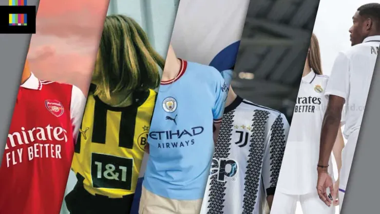
Arsenal

The Gunners will look like, well, the Gunners next season with a fairly straightforward adaptation of their iconic top. A plain red body with white sleeves, and the Adidas 3-stripes on the shoulders. A white polo collar sets off the look, with the only bit of real flair in the design coming from the red zig-zag trim around the neck. A good collar and button does tend to help carry a basic design like this. A plain shirt with a v-neck or crew neck would look like a plain shirt. But the fancy collar can make a plain shirt look like a classy top. £5 from every home shirt they sell will go to the Arsenal Foundation to support local community initiatives, which is a nice move from the club.
Grade: A
A no-nonsense effort that does what it needs to. It looks like Arsenal and it looks good. Nothing too fancy but it doesn’t have to be. It’s a safe design, but there’s not necessarily anything wrong with that when working with an iconic club look like Arsenal.
Borussia Dortmund

Without a signature design template that needs to be followed on your home shirt, you’ve got more flexibility to go in different directions each year, and Dortmund certainly does mix things up. This year they’re going with vertical black stripes on a yellow base. Square sponsor logos are always tough when you have a background design, but they’ve done a decent job here of working it into the overall design of the shirts. The 1&1 logo could perhaps do without the thin white outline, and the text in yellow may work better than in white, but that’s a nitpick. The stripes feature a subtle texture of windows of the “Wildschütz” – the restaurant where the club was founded – within them that’s hard to see unless you get up close. It adds little to the overall look from afar but it’s a cool little detail.
Grade: B-
The yellow-and-black always looks terrific, and it’s a serviceable design, be I prefer it when Dortmund gets a bit wild with their kits. This one is alright, you could do almost anything in those colors and make it work, but hopefully come 2023/24 they take a chance and do something a little more outlandish.
Juventus

Juve is coming in hot with a twist on their traditional stripes. The classic black and white stripes are made up of a triangular geometric pattern that comes from the architectural design of Allianz Stadium (I guess from the roof support girders?). The effect is a bit on the busy side – the zig-zag stripes without all the internal triangles (or perhaps having them rendered as a dark grey tonal effect instead of a grid/outline) would have made for a stronger design.
The Jeep sponsor logo is really interesting. It’s filled with an image of lightning bolts, and the official club release makes no mention as to why. Certainly a discussion point but I’m scratching my head on this one.
Grade: C-
It’s an attempt, but a mediocre one. Maybe from afar, on TV, it’ll look alright, but it just seems like they forced this one and tried to do too much. But I will give them props on their minimalist crest (a few years late, I know, but still), it’s a brilliant piece of design and far superior to the club’s classic oval badge.
Manchester City

Designed as a tribute to the club’s successful late 60s sides, the new Manchester City home top will definitely stand out, despite being relatively simple. The centered crest and maroon sleeve and collar trim make this a departure from recent City shirts, and it’s a refreshing change when so many shirts follow the same manufacturer on the left, club badge on the right, sponsor underneath format. The stack of logos on the front does hurt this one I think though, the Puma mark gets in the way even more than the big Etihad logo does, diminishing the retro effect they’re going for (shirts in the 60s, of course, had no sponsor or maker’s mark on them). Making the Puma logo smaller and perhaps moving it on top of the City badge, and shifting Etihad up a bit, would help.
Grade: B-
Points for trying to bring back a more classic look, but the mechanisms/realities of the modern corporate football world muddle it up with clumsy-looking company logos.
Real Madrid

Nothing sensational from Los Blancos here. The all-white top has a polo color with light purple and black trim, with the purple coloring carried thru on the shoulder Adidas stripes. Throughout the top (difficult to see in many images) is a repeating pattern of the club crest embossed into the fabric. That Extra Texture(™ 1975 George Harrison) probably makes the shirt itself feel nicer to the touch, but simply repeating the club badge over and over is super lazy design.
Grade: C+
Ok, it’s Madrid, it’s a white shirt, fine, it works. But it really could have popped with the sponsor logos and name/number in that purple color instead of black, and the repeating logo texture is wholly unnecessary.
The kits for Arsenal, Borussia Dortmund, Real Madrid, Manchester City and Juventus are available via World Soccer Shop and other fine sellers.
Photos: Arsenal / Borussia Dortmund / Juventus / Manchester City / Real Madrid

200+ Channels With Sports & News
- Starting price: $33/mo. for fubo Latino Package
- Watch Premier League, Women’s World Cup, Euro 2024 & Gold Cup

The New Home of MLS
- Price: $14.99/mo. for MLS Season Pass
- Watch every MLS game including playoffs & Leagues Cup

Many Sports & ESPN Originals
- Price: $10.99/mo. (or get ESPN+, Hulu & Disney+ for $14.99/mo.)
- Features Bundesliga, LaLiga, Championship, & FA Cup

2,000+ soccer games per year
- Price: $5.99/mo
- Features Champions League, Serie A, Europa League & Brasileirāo

175 Premier League Games & PL TV
- Starting price: $5.99/mo. for Peacock Premium
- Watch 175 exclusive EPL games per season