Fresh off their UEFA Champions League semifinal triumph, and in the midst of their hunt for not only the UCL crown but also the FA Cup and Premier League trophies, the Liverpool home kit for 2022/23 has dropped.
Spoiler alert – it’s red.
Of course, there’s only so much you can do design-wise with a club that has such a massive history and a tradition of a relatively plain, solid color shirt. And there’s a boatload of great examples of straightforward, “less is more” kit designs over the years, but this one feels like it could use just a little bit extra to make it shine.
“Scouse solidarity”
Per the club’s press release, the shirt is “inspired by the attitude of ‘Scouse solidarity’” and “the fresh design reflects the mentality of its people, a mentality that makes Liverpool truly unique”. We’ll take your word for it, Nike marketing department.
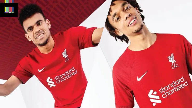
The Liverpool all-red top features a detailed texture throughout, almost reminiscent of snakeskin, that adds a bit of style to the shirt but it mostly just blends into the background – in most scenarios it will never be seen (even in many of the club’s high-end promo shots it’s partially or entirely invisible). These sorts of textures on the material add a nice physical feel to the shirt – but only if you splurge for the authentic version as the less-expensive replica, or “stadium” style, don’t appear to feature it. I fully expect to see this texture pop up again over the summer as more of the Nike family of clubs and national teams release their next kits.
What is included on both retail versions of the top are two nice details – the eternal flames/97 emblem, honoring those who tragically lost their lives in the Hillsborough Disaster, and a subtle “YNWA” pattern on the sleeve cuff, a shoutout to the club’s iconic “You’ll Never Walk Alone” motto/anthem.
Liverpool home kit for 2022/23 reviewed
The club logos, sponsors, and maker’s mark are all rendered in white, including the stripped down version of the crest with just the liver bird icon and “L.F.C.” (which in this observer’s opinion is visually superior to the more ornate full version of the crest). The club also unveiled a new custom name and number font to be used in cup competitions and friendly matches (the yellow highlights on the font really lift the overall look of the shirt).
A small splash of the teal/aqua from the club’s main badge on the sleeve cuffs (perhaps in contrast with the YNWA lettering done in white), alongside a matching collar would be something that could elevate this design to a higher level. Also it will be nice to see the entire kit out on the field, as many of these unveilings only showcase the top (the team online shop does show the uniform completed with all-red shorts and socks, but seeing it in action on the pitch does really allow for a proper judgement).
Grade: B-
Overall this is a serviceable entry, especially considering the design constraints of delivering what is essentially a plain red top every season. But it certainly feels like this could be the first of many in the annual parade of Nike templates, and a little more color would have put it over the top.
Liverpool’s kit is available via World Soccer Shop and other fine sellers.
It’s one day past May the 4th, but I’ll sum this one up with a Star Wars reference anyway. In the words of Rogue One baddie Orson Krennic – We were on the verge of greatness. We were this close!
Photos: Liverpool FC

200+ Channels With Sports & News
- Starting price: $33/mo. for fubo Latino Package
- Watch Premier League, Women’s World Cup, Euro 2024 & Gold Cup

The New Home of MLS
- Price: $14.99/mo. for MLS Season Pass
- Watch every MLS game including playoffs & Leagues Cup

Many Sports & ESPN Originals
- Price: $10.99/mo. (or get ESPN+, Hulu & Disney+ for $14.99/mo.)
- Features Bundesliga, LaLiga, Championship, & FA Cup

2,000+ soccer games per year
- Price: $5.99/mo
- Features Champions League, Serie A, Europa League & Brasileirāo

175 Premier League Games & PL TV
- Starting price: $5.99/mo. for Peacock Premium
- Watch 175 exclusive EPL games per season