With the new season comes plenty of rituals — getting your Fantasy Premier League team ready, making predictions about the upcoming season, and looking through the new jerseys that have been released for each club.
Some of what we have seen really stand out, many are middle of the road efforts but very few kits — thankfully — are just plain ugly. Also of note is that Nike is only providing kits for one team in the Premier League this season. Wait until you find out who it is.
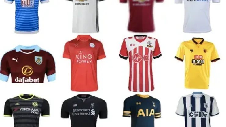
Here are the Premier League jerseys for the 2016/17 season, ranked from best to worst (click on the photos to see more details regarding each jersey):
1. Southampton
Kit maker: Under Armour
Kit maker Under Armour has really made its mark with the Southampton’s home jersey. They took everything traditional about the club as well as the sponsor’s logo, and then came up with this stunning blend. Nothing is overpowering in the home design and I may say that this could be a classic jersey that others should look at for inspiration.
The away design is just as good in that the grey panel stands out. And again there is no one logo that overpowers the others. This is a real stand up effort by a company based in my hometown of Baltimore, Maryland.
Overall grade: A+
2. Stoke City
Kit maker: Macron
Not to be outdone, Stoke City’s home jersey has a beautiful, synergistic design. It almost looks like Under Armour and Macron took the same class in Kit Making 101. In this jersey, we find Stoke City’s classic red and white stripes with a hint of blue throughout the jersey design. The manufacturer’s logo breaks it up a little but it’s not a bad effort. What really stands out is the under collar of the shirt with the red and white stripes. This is an excellent effort by Macron.
The away jersey is decent too. Truth be told, this pattern would have made a good home jersey for Manchester City. However this jersey is reminiscent of the jerseys worn by The Potters from 1977 until around 1982. I like how the Henley collar stands out as well as the blue and white vents on the left and right sides of the shirt.
Overall grade: A+
3. Leicester City
Kit maker: Puma
The Premier League champions return in style, and I’m sure many of Leicester’s supporters will get these jerseys adorned with the redesigned, gold champions badge on the sleeve, and deservedly so. Starting with the home jersey, Puma again incorporated the same design in which they have used with several other jerseys. But, this one is an excellent design. The raised gold accents on the collarbone as well as the gold Puma logo really give synergy to this jersey. Also, I really like the striping pattern woven into the shirt itself.
The away jersey is a bold, red with a gradient on the front of the shirt that is certain to make the champions stand out as they defend their title. Equally impressive is the third jersey with its white color and blue pinstripes. It looks like Leicester is dressed for success this year.
Overall grade: A
4. Crystal Palace
Kit maker: Macron
For the Crystal Palace home jersey, I have to say that I like this design more than I liked last year’s offering. Instead of the medium stripes, this jresey has a big, bold two-tone red and blue design, which meshes well with the sponsor’s logo. The away jersey this year follows a different path than last year. Instead of the white, this year’s jersey is a bright yellow with the red and blue sash running diagonally across the shirt. Again, the sponsor logo matches well with the shirt. It’s something like that I wish other sponsors would do.
Overall grade: B+
5. Tottenham Hotspur
Kit maker: Under Armour
Under Armour makes another solid effort with the Spurs home jersey. Again, the kit maker doesn’t go crazy with embellishing weird patterns. Instead, their design team went with navy blue on the shoulders and just a touch of gold trim in the collar. Again, the team crest and manufacturer logo follow suit with the overall jersey design with the sponsor logo showing up in red, setting it off smartly.
Tottenham’s away jersey also is a well assembled effort with the dark blue base and gold accents. Again, there’s no crazy pattern and the sleeve striping on the shirt keeps it all uniform. Again it’s another great effort without going overboard.
The third jersey takes a bit of a tumble. Again, I love the uniform coloring and design but I’m not sure how I feel about the pinstripes. I feel like if you’re going to use them, do it throughout the entirety of the shirt or don’t use it at all.
Overall grade: B+
6. Arsenal
Kit maker: Puma
Even though Arsenal seems to flirt with being at the top of the table every year, at least they do so while looking good. Puma, who has been working with the Gunners since 2013, keeps Arsenal looking modern while being minimalist in their approach. The home jersey looks like classic Arsenal, with very few changes although the darkened red stripe running down the middle is a “take it or leave it” issue.
The away jersey also boasts the simplistic approach as well with a tidy ebony and yellow collar. The body of the shirt has very subtle yellow stripes giving it a ‘ribbed’ look with the Gunners emblem finishing out this design.
The third jersey is adventurous, and reminds me of a training shirt that Barcelona had a few years ago. But at least Puma didn’t go overly crazy with the neon green. Again, the design is subtle and doesn’t go overboard with garish designs.
Overall, even if Arsenal falls short again, the Gunners will look do so looking good.
Overall grade: B
7. Burnley
Kit maker: Puma
No, your eyes are not playing tricks on you. Aston Villa were relegated last season, and Burnley was promoted. Burnley’s home jersey is similar in design and cut to Arsenal’s away jersey with the same clean, minimalistic design.
The away jersey flips the two-tone design and provides a rounded collar to finish the effect. My only thought was that maybe Puma could have incorporated their logo on the right side of the jersey into the shirt color theme.
Overall grade: B
8. Middlesbrough
Kit maker: Adidas
Middlesbrough is making their first start in the Premier League in nearly a decade, and their jersey designs by Adidas show real flair. The home jersey is dominated by the ‘power red’ color with a white slanted panel and blue trim. To be honest, there are a lot of teams that use red, white and blue in their choices, and it’s interesting that Adidas decided to do something different to help such a common pattern stand out.
The away jersey reminds me of Chelsea’s away jersey from 2012 but instead of using the checkered pattern, which really broke up that jersey, Adidas gave it a somewhat gradated 3 stripe design in a V-neck form with the Adidas 3 Stripe design on the sides for a really nice look.
Overall grade: B
9. Chelsea
Kit maker: Adidas
While I liked the design for the home and third jersey, the away jersey looks too busy. The home jersey however, is classic Adidas. I really like how they incorporated the team’s crest into the shirt itself with the 3 Stripes going down the sides of the shirt. The 3rd jersey (which should have been the away jersey) also boasts of a similar clean yet basic, design, which is probably one of the best white Chelsea jerseys I have seen since the 2013-14 season. But the away jersey is too busy with the hoops. It’s not enough that Adidas has their hoops running across the shoulders but the hoops running across the front of the shirt just adds too much. But, at least they aren’t the same colors.
Overall grade: B-
10. Hull City
Kit maker: Umbro
The Tigers home jersey for this year loses the pinstripes from last season for a much bolder look with the broad amber and black stripes. I also like the white collar and cuffs, which gives a striking appearance as well. The away jersey is a basic black affair with amber accents and doesn’t really stand out. It’s not the greatest thing in the world but it’s not a nightmare either. Some jerseys can be clean and stand out, but this isn’t that jersey.
Overall grade: B-
11. Watford
Kit maker: Dryworld
Dryworld is the new kit maker for Watford, and they show how effortless it is to create a shirt that doesn’t have to go all out to be noticeable. Let’s start by what you can’t see. By looking at the shirt closely, you can see the pinstripe pattern which is very subtle followed by a decent black and red trim on the sleeves and collar. And for those that want to ‘pop the collar,’ the underside is red as well. That, I think could have been left alone as when the collar is down you really won’t see much of it.
The away jersey is based on the same template just done in white. Overall, it’s a pretty decent job by Dryworld.
Overall grade: B-
12. West Brom
Kit maker: Adidas
Adidas has had this thing for using big bold stripes for West Brom for years, and this time is no different. This season, it returns but instead of red accents as seen on past jerseys, sky blue is the trim. It’s done with some subtle tones but the problem comes with Adidas’ logo. In a few iterations, Adidas has opted to insert their logo in the center without breaking up the stripes. In this one, it’s positioned in its normal upper right position, which breaks up the flow of the stripes and nearly disappears in the white stripes. It’s a nitpicking to be sure but I think the look would have been better if Adidas opted to pick a better position for the logo.
The away jersey is a much better effort with the pinstripes as well as the white accents that stand out in the team badge and the Adidas logo. Again as I stated about Tottenham’s jersey, I am at odds with the pinstripes not running through the entirety of the shirt panels. But regardless of that, I think this is still a good effort.
Overall grade: B-
13. Everton
Kit maker: Umbro
Umbro, thanks for getting rid of the white V collar that could have passed for a bib last year. But with this year’s Everton home kit, was it really necessary to add neon highlights? The piping looks like safety stripes and are totally unnecessary. The away jersey fares a better as it’s based on the jerseys worn during their 1890 campaign.
Overall grade: C
14. Liverpool
Kit maker: New Balance
A few years after Warrior’s jersey run, it looks like New Balance is trying to give Liverpool supporters more nightmares. The home jersey is fine as it’s a clean iconic design in bright, bold red and gold accents. It looks strikingly similar to Warrior’s 2012 effort sans the collar. The away jersey is a nice effort as well with the black, white with red accents. New Balance also took a page out of Nike’s playbook with the black stripes running down the back. But things took a turn with the third jersey. Design-wise, it’s nowhere near as horrendous as Warrior’s 2013 design but the colors are bright. If Liverpool wins all of their games with these jerseys, it will be because of the bright green of these shirts. It’s nicknamed ‘toxic’ after all and you will not miss any of the players in this jersey. Outside of the colors, the design is simple enough but that neon green needs to be toned down a lot.
Overall grade: C
15. Manchester City
Kit maker: Nike
It’s interesting to note that we have gone this far into the list and this is the first time Nike has been featured. This year’s home design looks to be more futuristic with a hint of a ‘back to basics’ look. Instead of the mostly powder blue jerseys we have seen over recent years, this year’s home jersey is one of the biggest departures we have seen in years. The two-tone look is a big turn from the mostly monochromatic jerseys of the past as well as the new crest that really stands out on the front of the jersey.
The away jersey is even more interesting. Over the years, Manchester City has incorporated red and black into some of their away designs with the last time being in 2011 with Umbro. Instead of the big bold stripes, City’s jerseys are mostly black with muted red sleeves with yellow accents. On one hand, the yellow stands out and I kind of wished gold was incorporated instead since the colors are muted but then, the yellow does brighten up the color scheme.
This brings us to the third jersey. The last time I recall seeing something like this was Barcelona’s 2013 jersey. Back then, Barca looked like they were on fire, this design looks like an LSD trip gone bad. I would wear Liverpool’s Toxic kit before I would wear this.
Overall grade: C
16. Manchester United
Kit maker: Adidas
Someone needs to sit down and have a really long talk with Adidas and Chervolet. In the past two years since Adidas took over from Nike in making kits, I, as a supporter, have had a hard time getting on board. Admittedly, I own 2 jerseys, one being the black jersey worn by the club during their brief foray in the Champions League last season as well as a FA Cup final kit I recently purchased. My biggest problem is with the gaudy Chevrolet logo. Unlike the AIG and AON logos, which blended seamlessly into the jerseys, the Chevy logo is a stark contrast to its predecessors. If it were a solid color similar to how the others were done, it wouldn’t be so bad but again, unless something significant happens, I can’t see myself getting another jersey.
That being said, the home jersey is a basic clean design (Chevy logo notwithstanding) with a two-tone red design. Its inspiration comes from the Newton Heath green and yellow design. This year, Adidas opted to get rid of the V-neck and using a basic rounded color design as well as stripes on the sides as opposed to being on the shoulders.
The away jersey I am not too crazy about as it reminds me very much of the AON training shirts that United used last year. Truth be told, I wish they would use those instead.
The third jersey may be a love it or hate it jersey for fans. While it boasts a “Bold Onyx” color pattern scheme incorporated on the sleeves, the grey just leaves the jersey feeling flat. This may be the one time the Chevy logo actually stands out on this jersey by adding a touch of color. It’s not a bad jersey overall but a touch of red would not have hurt here.
Overall grade: C
17. Sunderland
Kit maker: Adidas
Sunderland’s home jersey is a nice design which incorporates red, white and gold into the shirt but it also suffers the same flow issues similar to the Manchester United jersey. The sponsor logo takes away from the design. It’s not bad though it’s just distracting. If the “D” was done in a gold trim, it may blend better in the overall design, but it stands out more than everything else.
Sunderland’s third jersey is yet another eyesore. The color combination could be forgiven if it wasn’t for the hoops on the front of the shirt. When you have two colors that will clash like pink and purple, anything more just makes it worse.
Overall grade: C
18. Swansea City
Kit maker: Joma
Under Adidas, Swansea has had some interesting jersey designs over the years. And now with Joma stepping in, it’s going to take some time to see what they can really do. The home jersey, while having an interesting cut with the high color, is unassuming in its design. Without the sponsor logo, it’s just a white shirt with the team badge. It feels like something more could have been done like such as black panels on the sleeve.
The away jersey has more flair in that the gradient design really gives life to this kit that is missing in the home kit. The collar and sleeve accents give it more life and it’s still nice that Joma and the sponsor logo don’t overpower the jersey with the white color.
Overall grade: C
19. West Ham
Kit maker: Umbro
In some cases, the ‘if it ain’t broke don’t fix it’ approach may work. West Ham’s home jersey doesn’t show much change from last year’s effort except for the collar and sleeve trim. Otherwise at first glance, it’s the same jersey all over again.
The away jersey fares better. Instead of using the sky blue coloring from last year’s effort, Umbro went along with using a white base with the claret and blue trim for a really unassuming looking jersey.
The Special Commemorative West Ham United 2016 Thames Ironworks jersey is very interesting. It’s a solid dark navy blue 4-button polo shirt with a unique Union Jack badge commemorating the founders. On the back is a subtle red Hammers symbol. The only issue is that the sponsor logo is virtually invisible on this kit. It’s a very striking kit to be sure, but this is one that would have been better without the corporate sponsor.
Overall grade: C
20. AFC Bournemouth
Kit maker: JD Sports
JD Sports are manufacturing AFC Bournemouth’s jerseys. While JD Sports provided a clean design for Bournemouth’s jerseys, did they have to put such a huge patch on the sides of the jersey? The home jersey reminds me of AC Milan’s look. And while the synergy is there, those JD patches just ruin it.
The away jersey boasts a nice design as well with the hooped blue alternating on the front of the shirt. The third jersey boasts a neon green and black design with the JD Sports patch in black overpowering the shirt, which nearly dwarfs the team’s badge
All of the jerseys boasts clean designs that are not overpowering, but their sponsor’s logo and patches are just garish.
Overall grade: C-

200+ Channels With Sports & News
- Starting price: $33/mo. for fubo Latino Package
- Watch Premier League, Women’s World Cup, Euro 2024 & Gold Cup

The New Home of MLS
- Price: $14.99/mo. for MLS Season Pass
- Watch every MLS game including playoffs & Leagues Cup

Many Sports & ESPN Originals
- Price: $10.99/mo. (or get ESPN+, Hulu & Disney+ for $14.99/mo.)
- Features Bundesliga, LaLiga, Championship, & FA Cup

2,000+ soccer games per year
- Price: $5.99/mo
- Features Champions League, Serie A, Europa League & Brasileirāo

175 Premier League Games & PL TV
- Starting price: $5.99/mo. for Peacock Premium
- Watch 175 exclusive EPL games per season