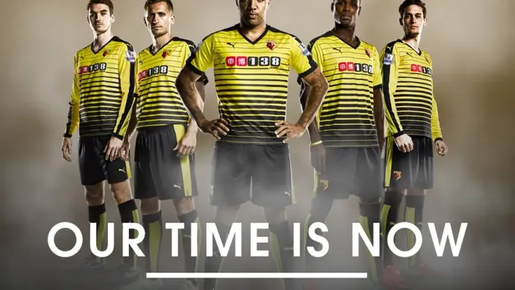
Watford’s home shirt for the 2015/16 season is one of the most modern and eyeopening designs we’ve seen thus far.
This is definitely not an old-school Watford shirt design that the Hornets wore during the Elton John days of the late 1970s. Instead, it’s a modern yellow shirt design with bands of black up and down the shirt.
it also helps that the shirt sponsor’s logo fits in with the design and isn’t as distracting as other sponsor logos on club shirts (hello Newcastle).
SEE ALSO —
Primer on Watford and Bournemouth; teams promoted to Premier League
An American travels to Watford to experience Premier League promotion party.
Here are close-ups of the front and back of the Watford home shirt:
And here’s the promo video to, umm, promote the video!

200+ Channels With Sports & News
- Starting price: $33/mo. for fubo Latino Package
- Watch Premier League, Women’s World Cup, Euro 2024 & Gold Cup

The New Home of MLS
- Price: $14.99/mo. for MLS Season Pass
- Watch every MLS game including playoffs & Leagues Cup

Many Sports & ESPN Originals
- Price: $10.99/mo. (or get ESPN+, Hulu & Disney+ for $14.99/mo.)
- Features Bundesliga, LaLiga, Championship, & FA Cup

2,000+ soccer games per year
- Price: $5.99/mo
- Features Champions League, Serie A, Europa League & Brasileirāo

175 Premier League Games & PL TV
- Starting price: $5.99/mo. for Peacock Premium
- Watch 175 exclusive EPL games per season
Loading...