New York City FC has unveiled its home shirt for its debut MLS season. And other than having a NYCFC crest and a design by adidas instead of Nike, it makes the team look like Manchester City in disguise.
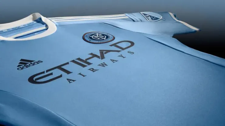
The shirt features a sky blue color and white rounded-collar as well as white trim. The only significant differences between the NYCFC and Manchester City shirts are the MLS logos on the sleeve, the NYCFC crest and the adidas logo. Even the shirt sponsor is the same for both clubs (Etihad Airways).
If Manchester City didn’t exist, the shirt — by itself — is a clean, sleek design that features white shorts and white socks to complete an aesthetically pleasing kit.
However, a team’s shirt is the identity of the club. And even though the club is owned by Manchester City and the New York Yankees, the organization’s decision to marry itself so closely to the look-and-feel of Manchester City is a unwise decision. The team needs to create its own identity, so that when people think of NYCFC, they don’t automatically think of Manchester City FC — for good or bad.
By approving the design of a soccer kit that screams Manchester City, the club automatically disenfranchises supporters in the Big Apple who may have a favorite second team of Manchester United, Chelsea, Arsenal or another big Premier League club. Plus, and more importantly, it reduces New York City FC to feeling like a second-rate team — a club that is an orphan or product of Manchester City.
If Manchester City wants to expand its global reach and win over new fans, buying teams to wear kits that mimic the parent club is not the path to take. Neither is playing at a baseball stadium for the foreseeable future, but that’s another story.
H/T Leaked photos @hudsonriverblue.

200+ Channels With Sports & News
- Starting price: $33/mo. for fubo Latino Package
- Watch Premier League, Women’s World Cup, Euro 2024 & Gold Cup

The New Home of MLS
- Price: $14.99/mo. for MLS Season Pass
- Watch every MLS game including playoffs & Leagues Cup

Many Sports & ESPN Originals
- Price: $10.99/mo. (or get ESPN+, Hulu & Disney+ for $14.99/mo.)
- Features Bundesliga, LaLiga, Championship, & FA Cup

2,000+ soccer games per year
- Price: $5.99/mo
- Features Champions League, Serie A, Europa League & Brasileirāo

175 Premier League Games & PL TV
- Starting price: $5.99/mo. for Peacock Premium
- Watch 175 exclusive EPL games per season