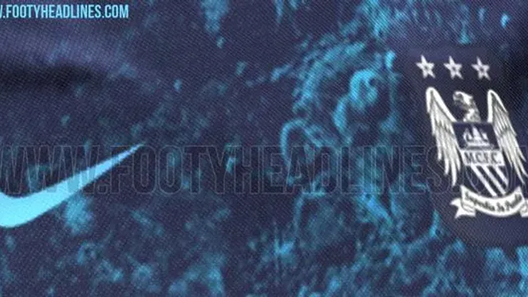
Manchester City’s away shirt for the 2015-16 season will be a one-of-a-kind design that features a closeup of a Blue Moon.
The unique design features a dark blue shirt with the Blue Moon design splashed across the upper chest and around the v-neck collar of City’s away shirt for next season.
Whether you love it or hate it, there’s no denying that Nike’s design is quite remarkable. And it’s a whopping departure from the way that we think about soccer shirt designs.
One of the classiest (and very understated) aspects of the design is how the Manchester City crest stands out in white (or is it gray?) on the shirt.
Plus hats off to Manchester City and Nike for deciding to put the Etihad Airways shirt sponsor logo in the same blue/cyan color so it’s a seamless part of the design — instead of being featured in a distinct different color and ruining the look of the shirt.
H/T FootyHeadlines

200+ Channels With Sports & News
- Starting price: $33/mo. for fubo Latino Package
- Watch Premier League, Women’s World Cup, Euro 2024 & Gold Cup

The New Home of MLS
- Price: $14.99/mo. for MLS Season Pass
- Watch every MLS game including playoffs & Leagues Cup

Many Sports & ESPN Originals
- Price: $10.99/mo. (or get ESPN+, Hulu & Disney+ for $14.99/mo.)
- Features Bundesliga, LaLiga, Championship, & FA Cup

2,000+ soccer games per year
- Price: $5.99/mo
- Features Champions League, Serie A, Europa League & Brasileirāo

175 Premier League Games & PL TV
- Starting price: $5.99/mo. for Peacock Premium
- Watch 175 exclusive EPL games per season