Shudder the thought, but imagine what the crest of your favorite Premier League club would look like if it featured the colors of your team’s closest rival.
Reddit user TheTruth1777 has gone ahead and recolored the crests of 19 Premier League clubs (except for Burnley; sorry Clarets) in the colors of the team’s host hated rival.
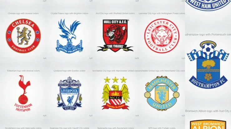
Some of the reimagined crests look better than their originals. Newcastle United’s crest looks bolder and more exciting with Sunderland’s colors. The one for Queens Park Rangers looks more sinister with Fulham’s red and white colors, while Tottenham’s cockerel in red looks just wrong.
The creator gets the hated rivals correct except for the West Bromwich Albion one that says it features the colors of Hull City, but we think he meant Wolverhampton Wanderers whose golden shirt and black trim would be the scorn of any Baggies supporter.
Here are the 19 reimagined crests:
Arsenal
Aston Villa
Chelsea
Crystal Palace
Everton
Hull City
Leicester
Liverpool
Manchester City
Manchester United
Newcastle United
QPR
Southampton
Stoke City
Sunderland
Swansea City
Tottenham
West Bromwich
West Ham United

200+ Channels With Sports & News
- Starting price: $33/mo. for fubo Latino Package
- Watch Premier League, Women’s World Cup, Euro 2024 & Gold Cup

The New Home of MLS
- Price: $14.99/mo. for MLS Season Pass
- Watch every MLS game including playoffs & Leagues Cup

Many Sports & ESPN Originals
- Price: $10.99/mo. (or get ESPN+, Hulu & Disney+ for $14.99/mo.)
- Features Bundesliga, LaLiga, Championship, & FA Cup

2,000+ soccer games per year
- Price: $5.99/mo
- Features Champions League, Serie A, Europa League & Brasileirāo

175 Premier League Games & PL TV
- Starting price: $5.99/mo. for Peacock Premium
- Watch 175 exclusive EPL games per season