As they prepare for their 2016 move to the Olympic Stadium, West Ham United are considering a change to their club crest.
In an official statement, the East London club have expressed the need to “better reflect and celebrate the things that make West Ham so special, particularly its rich history.”
As soccer becomes even more globalized, and clubs realize the importance of international branding, a trend has emerged for simpler, sleeker crests.
To avoid the fiasco Everton suffered last summer, Hammers fans have been extensively polled, both online and in person, as to what they’d like to see in the new emblem. Three separate open days for fans were even held at the Boleyn Ground, to view and discuss the proposals.
Last week, West Ham published preliminary findings, which indicated that supporters in general were keen to ditch the castle from the current crest, but almost all who responded said the crossed hammers had to be retained.
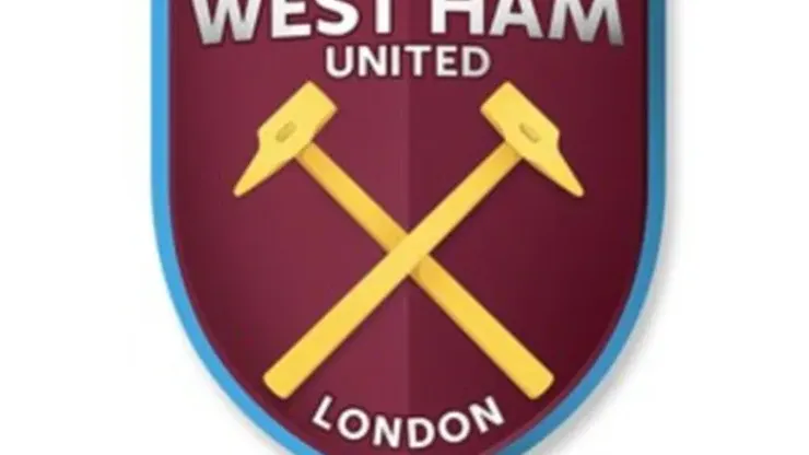
The new badge would only be adopted once the club leaves the Boleyn Ground, and as such they’ve been toying with the idea of including either a reference to London, or the Olympic Stadium.
The latest design proposed, which will be put to a final vote, features gold hammers, with ‘West Ham United’ across the top, in simple, bold typeface. The big talking point is that the word ‘London’ has also been included, which some find unnecessary.
In fact, this is the aspect of the badge that’s caused the most debate, according to the supporters’ organization. Despite being based in London, many Hammers fans consider the club to have a stronger base in Essex, which makes the reference to the capital seem phony – it smacks of an attempt to garner support from outside of the UK.
Indeed, although they claim to be updating the crest mainly for non-commercial reasons, the club did admit they do have international markets in mind as well.
In a recent online Q&A, a West Ham spokesperson said “We do believe also that there is a strong case for evolving the Club’s crest in a way that will also support our strategy to attract international star targets and help to engage new supporters all over the world, who we hope will develop the same love of West Ham that we possess.
“So while this has never been the guiding principle, there is an opportunity that we believe merits serious consideration.”
Just as it was with Everton last year, it’s easy to lambaste West Ham for making their logo look a bit babyish in the search for fans in emerging football markets.
But it’s also totally understandable. Modern soccer is all about money, after all. The Premier League has become the strongest domestic competition in the world on the back of its worldwide appeal. Arsenal, Manchester United, Tottenham and a myriad other clubs have simplified logos to suit fans in the Far East and the United States, especially.
Give West Ham credit, though. They’ve tried to make the badge look as classy as possible; it could even be said to evoke the iconic crest of the 1960s and ‘70s. Yes, it may look a bit infantile, but the Upton Park faithful can rest assured whichever crest is adopted will have the strong support from the fans.
READ MORE — Read the latest West Ham United news, analysis and opinion.

200+ Channels With Sports & News
- Starting price: $33/mo. for fubo Latino Package
- Watch Premier League, Women’s World Cup, Euro 2024 & Gold Cup

The New Home of MLS
- Price: $14.99/mo. for MLS Season Pass
- Watch every MLS game including playoffs & Leagues Cup

Many Sports & ESPN Originals
- Price: $10.99/mo. (or get ESPN+, Hulu & Disney+ for $14.99/mo.)
- Features Bundesliga, LaLiga, Championship, & FA Cup

2,000+ soccer games per year
- Price: $5.99/mo
- Features Champions League, Serie A, Europa League & Brasileirāo

175 Premier League Games & PL TV
- Starting price: $5.99/mo. for Peacock Premium
- Watch 175 exclusive EPL games per season