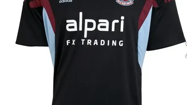
West Ham United have unveiled their new third shirt for the 2013-14 season.
While I loved West Ham’s home shirt, this new West Ham United third shirt seems like a waste of an effort. I like that the Hammers colors of claret and blue and included on the side of the shirt, but the rest of the shirt features an unimaginative design and is yet another me-too black shirt. Simply said, the design lacks creativity.
What’s your opinion about the new West Ham United third shirt? Let us know in the comments section below.
And don’t forget to browse through our World Soccer Talk shop featuring shirts for West Ham United and other clubs.

200+ Channels With Sports & News
- Starting price: $33/mo. for fubo Latino Package
- Watch Premier League, Women’s World Cup, Euro 2024 & Gold Cup

The New Home of MLS
- Price: $14.99/mo. for MLS Season Pass
- Watch every MLS game including playoffs & Leagues Cup

Many Sports & ESPN Originals
- Price: $10.99/mo. (or get ESPN+, Hulu & Disney+ for $14.99/mo.)
- Features Bundesliga, LaLiga, Championship, & FA Cup

2,000+ soccer games per year
- Price: $5.99/mo
- Features Champions League, Serie A, Europa League & Brasileirāo

175 Premier League Games & PL TV
- Starting price: $5.99/mo. for Peacock Premium
- Watch 175 exclusive EPL games per season
Loading...