E pluribus unum. It’s not only the inspiration behind a totally cool country, it’s also Nike’s design process ethos. Many designs were crafted and considered before being culled down to the one chosen to be England’s new 150th anniversary kit. Nike’s meticulous selection system ensures that players and fans alike only put the finest shirt on their backs. Here now is an exclusive look at Nike’s rejected designs.
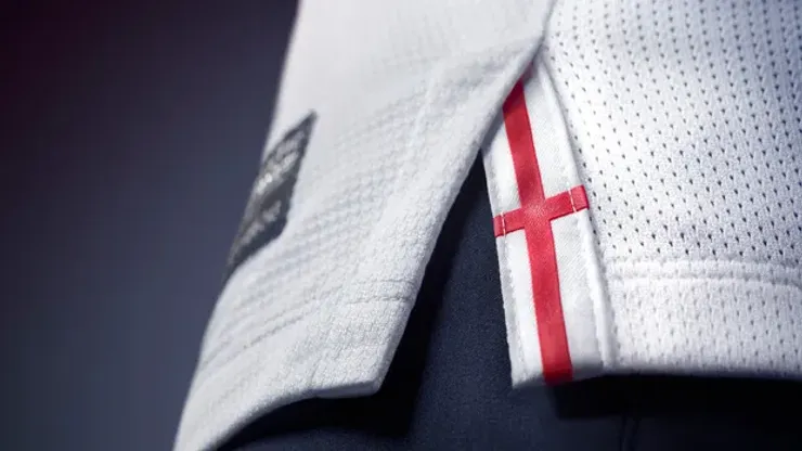
First up, a stark, all-white affair.
It shines with England’s fresh hopes for its heroes in their run-up to the 2014 World Cup. After pitiful performances in their past few tournaments, the shirt symbolizes a fresh new start. But consultant Nigel Tufnel summed up why the design was ultimately rejected, “It’s like, how much more white could this be? And the answer is none. None more white.”
Nike’s team, duly emboldened, then controversially looked to England’s fiercest rival for inspiration.
“We saw this shirt as less of a capitulation,” said Nike artist Tyler Capistrano of the look redolent of West Germany’s mightiest squads, “and more symbolic of a warrior wearing the pelt of his vanquished foe.”
But Nike brass prodded the design team towards more au courant fashion.
So with everything 1990s back in style again, the designers dreamed up this fresh-to-def look. “The ball forcefully flying through the air with fury symbolizes the Route One football that made England famous,” explains Nike designer Taylor Ventura while sipping from a kale-and-hemp-seed smoothie, “and replacing the three lions with three stars symbolizes a future that shines bright.
Plus, dude, italicizing the word ‘England’ totally shows a forward energy that doesn’t look back. Cuz the past is for losers.”
Nike encouraged its designers to take the energy concept and really run with it.
“What symbolizes energy better than our swoosh?” asks designer Brody Hermosa rhetorically, “so in one concept we really emphasized the swoosh, uh, well, swooshing across the chest. In another we replaced the stodgy and staid three lions with three swooshes, which we think, like, better represents today’s fresh and energetic cool Britannia.
But then I was like, ‘yo, what’s better than three swooshes?’ Lots more swooshes!! Having St. George’s Cross comprised of swooshes really updates that symbol and, like, really infuses it with fresh energy. Which is, like, totally awesome.”
Finally, Nike produced a bold new shirt that focuses on one of the three lions enjoying an ice-cold Budweiser.
“Perhaps he’s toasting an England World Cup victory,” theorizes branding specialist Dylan Redondo, “or maybe he’s about to share a round with some friends which symbolizes how Budweiser and soccer, er, excuse me, fútbol, really bring the world together. Either way, this particular design must await a more enlightened future where FIFA allows jersey, er, excuse me, shirt sponsorship for international games. We feel, like, really confident that when Sepp Blatter reviews our proposal he’ll, like, totally be on board.”

200+ Channels With Sports & News
- Starting price: $33/mo. for fubo Latino Package
- Watch Premier League, Women’s World Cup, Euro 2024 & Gold Cup

The New Home of MLS
- Price: $14.99/mo. for MLS Season Pass
- Watch every MLS game including playoffs & Leagues Cup

Many Sports & ESPN Originals
- Price: $10.99/mo. (or get ESPN+, Hulu & Disney+ for $14.99/mo.)
- Features Bundesliga, LaLiga, Championship, & FA Cup

2,000+ soccer games per year
- Price: $5.99/mo
- Features Champions League, Serie A, Europa League & Brasileirāo

175 Premier League Games & PL TV
- Starting price: $5.99/mo. for Peacock Premium
- Watch 175 exclusive EPL games per season