Admiral Capello strides onto the bridge. “Status report, Lieutenant Rooney!” he shouts.
Rooney is grim. “The Croatians have boarded the ship, Sir,” he says. “They’ve already scored two goals.”
“I see,” says Capello. He turns to his chief defensive officer. “Mr Neville raise all shields in the back. I don’t want anything else getting through. And tell Ensign Crouch to set his phaser on ‘bicycle kick!'”
I hesitate to reveal my Inner Sci-Fi Child as such, but Everton and Manchester United’s new home jerseys and whatever the England subs were wearing against Slovenia last Saturday all have me wondering if an out-of-work Star Trek costume designer has turned to designing football kits in order to cope with these tough economic times.
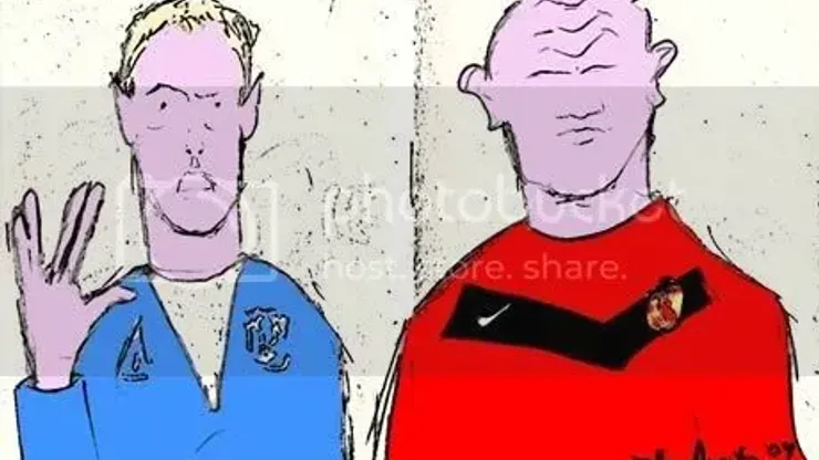
For me, Everton are chief perpetrators of the Beam-Me-Up-Scotty look. The white triangles that sit below these necks make the home jerseys look like somebody’s vision of 23rd century fasion design. That was my first reaction anyway. Runners up for describing the new Everton kit:
1) A Tour de France rider’s jersey when he’s unzipped the front while grinding up a tough climb.
2) An exaggerated v-neck sweater. Give it a white turtle-neck top and hand the Everton players some egg nog and they’re ready to gather around the Christmas tree and sing some carols.
3) The top half of Freddie Mercury’s jumpsuit. If Everton win a cup, they should cut out the white, puff out their chest hair and break into: “We Are The Champions!”
As EPL Talk’s The Gaffer noted when images of this jersey were first leaked, it is a tribute to the Everton home kit of the 1983-85 season. But the original kit, while sporting the white v-neck, was not so overstated as this year’s version. The v-shape was much subtler and, in this writer’s opinion, much more tasteful. The v-shape on the current kit runs too deep, giving it that futuristic Star Trek feel that makes me shake my head every time I see it.
United’s current kit is also a nod to the past. The 1909/10 also had a large v across the front. United are very purposefully paying tribute to the team of 100 years ago. But while the old kit seems to fit in with the designs of its time, the current United kit looks to me like something off the bridge of the Starship Enterprise. Maybe its the combination of modern fabric with the v-shaped design. The old jerseys escape the Star Trek comparison with their distinct cotton look and visible stitching. But with our sleek modern fabrics these new versions call up visions of warp drive, photon torpedoes and those futuristic kitchens that synthesize whatever food you are dreaming of at that moment. Zap! A pint of lager and a nice chicken curry…
Ineveitably we become used to the kits no matter how strange they seem at the start of the season. The supporters of Everton and United will get used to their kits quick enough. After all, loyalty to your club will make one withstand the ugliest of kits until the next design comes out. But as the rest of us see these jerseys each week throughout the season, they will stand out less and less to neutrals and rivals as well. These Sci-Fi sentiments that had struck me early on had already faded over the opening weeks as I became inured t0 what I originally considered strange designs.
Then I was watching England face Slovenia this past weekend. Now, the England home kit is beautiful. If I was English I’d buy it (even though if you knew me and white clothing, you’d know this jersey would quickly become a history of everything I ate and drank while watching matches. I’ve hesitated to by the US home kit for this reason, although I know I’ll eventually succumb). But when the camera cut to England’s bench, there were the subs, wearing some kind of tan warm-up get-up with a layered v-neck design that made them look like rebel troops getting the briefing on how to blow up the Death Star from Admiral Ackbar in Return of the Jedi. (There my Inner Sci-Fi Child has escaped and is running rampant.)
Part of the problem with all of these kits is that exaggerated v-shape. I don’t know what it is about it. But it just screams, “I work on a space ship.”
I doubt the designers really had Star Trek and Star Wars in mind. But maybe there’s an unconsious statement being made. Maybe they are trying to tell us: we’ve looked to the future and football is alive and well. There may be no more national borders in the future we envision – no more wars tearing up the planet. But the battles on the football pitch will always be alive and well. We promise.
Alright, then. Full speed ahead.

200+ Channels With Sports & News
- Starting price: $33/mo. for fubo Latino Package
- Watch Premier League, Women’s World Cup, Euro 2024 & Gold Cup

The New Home of MLS
- Price: $14.99/mo. for MLS Season Pass
- Watch every MLS game including playoffs & Leagues Cup

Many Sports & ESPN Originals
- Price: $10.99/mo. (or get ESPN+, Hulu & Disney+ for $14.99/mo.)
- Features Bundesliga, LaLiga, Championship, & FA Cup

2,000+ soccer games per year
- Price: $5.99/mo
- Features Champions League, Serie A, Europa League & Brasileirāo

175 Premier League Games & PL TV
- Starting price: $5.99/mo. for Peacock Premium
- Watch 175 exclusive EPL games per season