Orange is a color that is symbolic of many things. It is one of those stimulating colors that make the people wearing even more empowered. It invigorates the eyes and stimulates that senses. We also know what the symbolism is behind oranges are based on watching The Godfather.
Well that bit of news was spread before schedule as OKA Football in Yokahama leaked this jersey out on Wednesday. This Japanese soccer shop has quickly earned a reputation after leaking this season’s Italian national team jersey before it was released. to me it just seems a tad too ironic that for the second year in a row, the jersey was “leaked”. I mean these aren’t issues of national security.
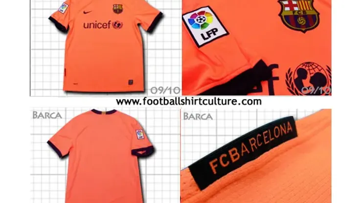
Could Nike be foreshadowing the future? This could be the reason why Barcelona are returning to orange as their away colors come 2009-10, just in time for the club’s 110th anniversary. This was the same pattern that they had the year after their memorable double where they won La Liga and the UEFA Champions League. Orange is also the color that they used when they won the European title back in 1992 against Sampdoria.
Don’t get me wrong, I am not saying that you are going to confuse Thierry Henry with Johan Cruyff, but with those unis there could be a chance that we see Clockwork Blaugrana 1.0 (ironically with no Dutchman on the pitch)
The are differences compared to that design they had in 2006-07. This jersey is more reticent of the dutch influences that have been etched in the footballing culture of the club over the past three and a half decades. Names like Cruyff, Neeskens, Koeman, Van Bronkhorst, come to mind. Those were the names that enamored the world with the style of play. The collar as well as the sleeve cuffs and ends of the jersey in the 06-07 version had the team colors. Its 09-10 counterpart has all of the ends black. This makes it all the more similar to the Dutch jerseys of old (except for that funkadelic version of the ’80’). It does see like they learned their lesson via the KISS method. Silver, albeit fancy, was not the ideal color to use for lettering. That is why they decided to go with black. Good move.
I will tell you all more about it as soon as I know more!

200+ Channels With Sports & News
- Starting price: $33/mo. for fubo Latino Package
- Watch Premier League, Women’s World Cup, Euro 2024 & Gold Cup

The New Home of MLS
- Price: $14.99/mo. for MLS Season Pass
- Watch every MLS game including playoffs & Leagues Cup

Many Sports & ESPN Originals
- Price: $10.99/mo. (or get ESPN+, Hulu & Disney+ for $14.99/mo.)
- Features Bundesliga, LaLiga, Championship, & FA Cup

2,000+ soccer games per year
- Price: $5.99/mo
- Features Champions League, Serie A, Europa League & Brasileirāo

175 Premier League Games & PL TV
- Starting price: $5.99/mo. for Peacock Premium
- Watch 175 exclusive EPL games per season