
Sometimes it’s difficult to remove your team bias and the emotional connection you feel with the colors of your favorite club. But try, for a minute, to be objective and open minded as you read through EPL Talk’s list of the Top 5 Worst Football Shirts of the 08/09 Premier League season (in order from worst to the absolute worst):
5. Portsmouth away.

This cross between a cricket shirt and a polo shirt looks like something your grandfather would wear. The shirt won’t strike fear in opponents. Instead it’ll create a few laughs especially when you’ll see Peter Crouch wearing this ridiculous shirt. The biggest problem about the shirt is the collar. Make it a modern v-neck and the shirt wouldn’t look so outdated.
4. Liverpool away.

Before Liverpool fans bite my head off and school me on the years when the Reds previously wore a gray away strip, I still feel it was a bad idea then and it’s a bad idea now. Gray doesn’t evoke any emotions. Instead, it’s depressing and puts me to sleep. Hopefully it won’t sum up Liverpool’s performance during the 08/09 season. Of all of the colors available, why choose gray?
3. Liverpool third.

In a normal season, Liverpool’s third strip would have been voted worst kit of the year but this year the Reds face some stiff competition. Just as it’s puzzling why Liverpool and Adidas would promote a gray away shirt, it makes you wonder what they were smoking when they decided to manufacture a green third shirt which resembles a goalkeeper’s shirt more than something that Steven Gerrard would model.
2. Newcastle United away.

The above picture of Newcastle’s away shirt doesn’t accurately portray how abysmal the shirt color is. It’s purple. Yes, purple. Why on earth a club would pick purple as the color of its away shirt is beyond me. Cue a thousand Barney The Dinosaur jokes. Newcastle is already the laughing stock of the Premier League in recent years. Why give fans of the 19 other Premier League clubs such an easy target as a purple away shirt to ridicule?
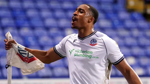
1. Bolton Wanderers home.

It’s obvious that Bolton didn’t run a focus group to seek people’s opinions about the new home jersey. Or if they did, they must have surveyed sports bra enthusiasts because this is one of the worst home shirt designs I can recall in recent memory. The shirt design is best summed up by the actual descriptions from EPL Talk readers: training top, big girl’s blouse, a harness and a junior school shirt.
What are your thoughts about the above designs and are there any other ones that you feel belong in the worst shirt category? Click the comments link below and share your feedback.