Last week it was Aston Villa updating its crest. This week it’s Middlesbrough. The northeast club has decided to follow a similar tactic to Villa by unveiling a radically different logo that plays up the team’s proud history. While I liked Aston Villa’s new crest, I’m not won over by Boro’s new one. To me, the new Boro crest looks more like a crest you’d see on a blazer of a public school in England than a football shirt. Sure, it’s an improvement over the old Boro logo (pictured below) but it could have been more aesthetically pleasing than this version.
I like that the medieval lion now has more white space around it so it’s more prominent and the crest is less cluttered. But I’m not a fan of the shield.
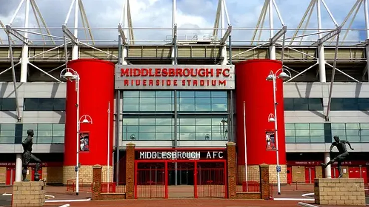
Obviously, Boro is trying to cash in on being a club with a long history and they’re hoping that the new crest will sell more shirts and clothing merchandise. If I was a Boro supporter, I’d be more likely to wear a shirt with the new crest rather than the previous one. But it’s on the pitch where it really matters. Or is it?

200+ Channels With Sports & News
- Starting price: $33/mo. for fubo Latino Package
- Watch Premier League, Women’s World Cup, Euro 2024 & Gold Cup

The New Home of MLS
- Price: $14.99/mo. for MLS Season Pass
- Watch every MLS game including playoffs & Leagues Cup

Many Sports & ESPN Originals
- Price: $10.99/mo. (or get ESPN+, Hulu & Disney+ for $14.99/mo.)
- Features Bundesliga, LaLiga, Championship, & FA Cup

2,000+ soccer games per year
- Price: $5.99/mo
- Features Champions League, Serie A, Europa League & Brasileirāo

175 Premier League Games & PL TV
- Starting price: $5.99/mo. for Peacock Premium
- Watch 175 exclusive EPL games per season